
Bright Forge
Created at Blackbird Digital
Bright Forge is a legal and business formation company that helps entrepreneurs build a strong foundation for their businesses. Their services cover business formation, compliance, contracts, succession planning, and the legal structure businesses need to grow.
The name Bright Forge already carried a strong visual idea. Inspired by Dwarven craftsmanship, the brand needed to feel grounded, enduring, and refined without leaning so far into fantasy that it lost the trust and professionalism expected from a legal company.
Building The Mark
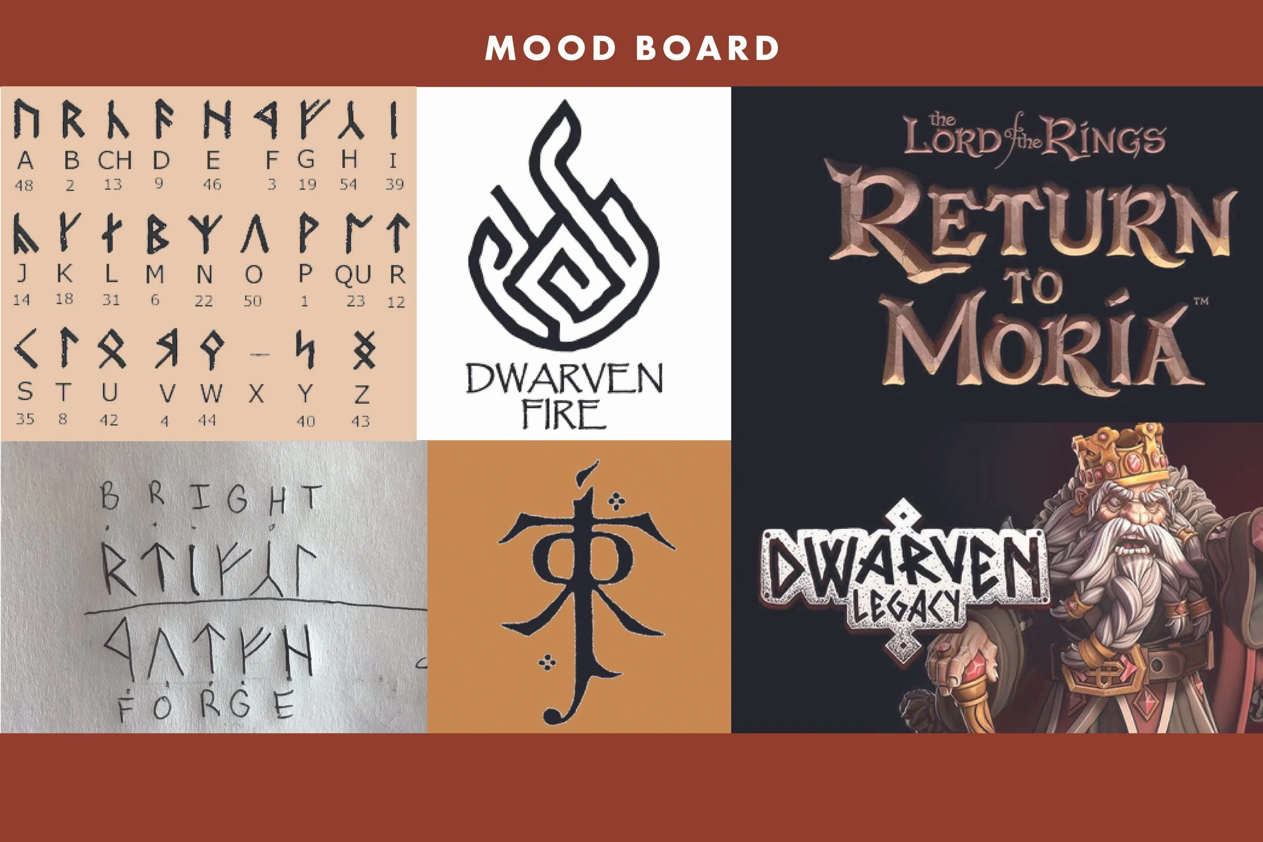
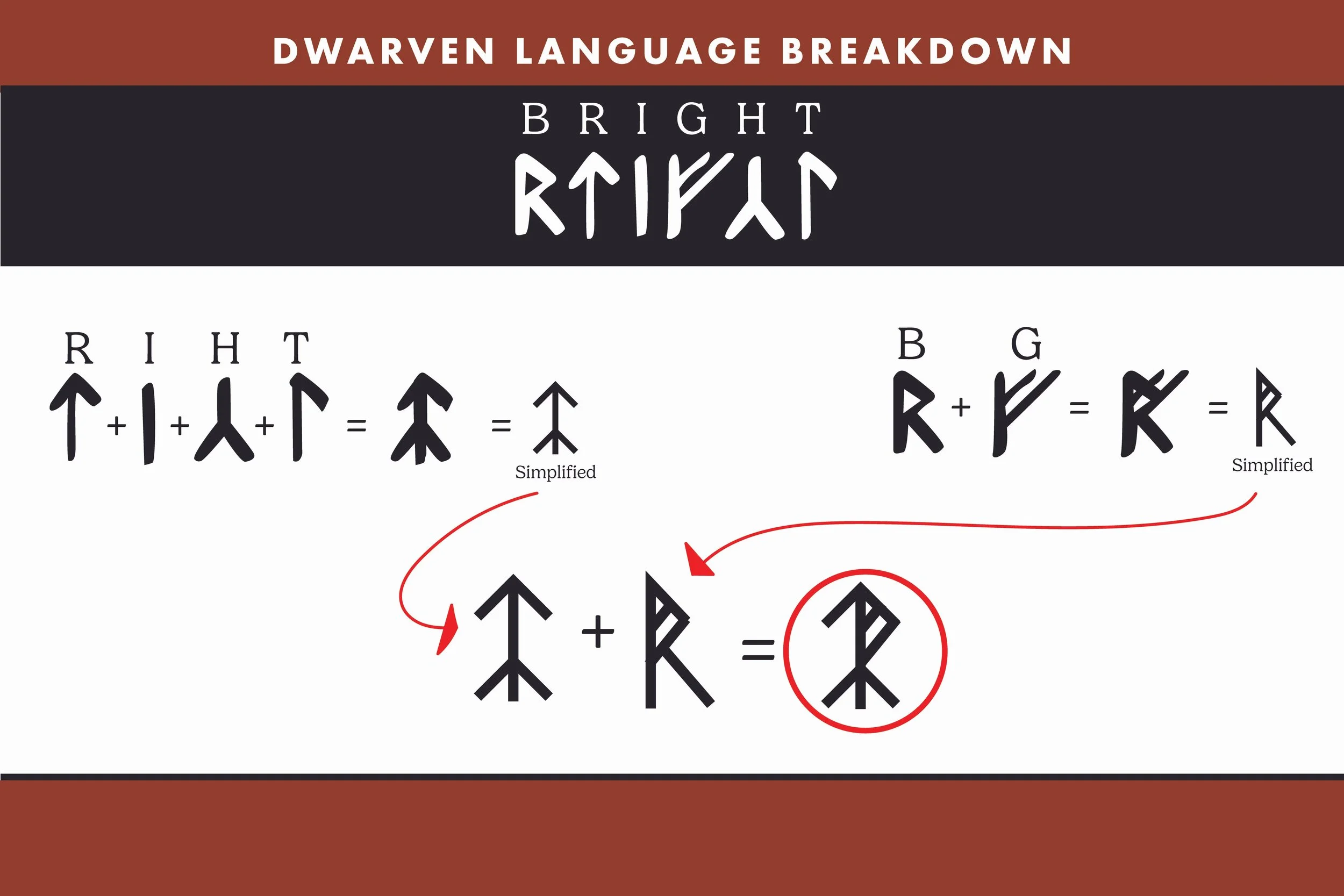
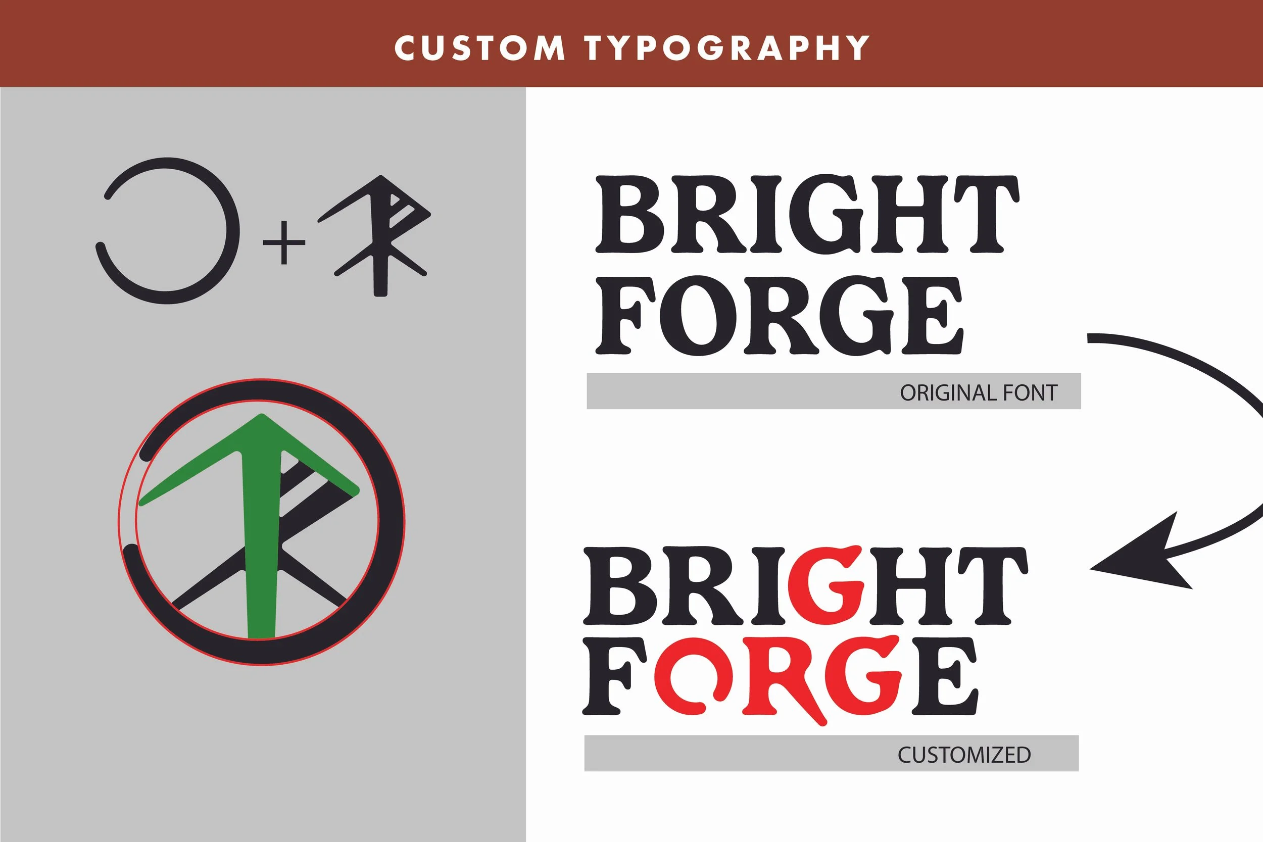
The logo started with J.R.R. Tolkien’s Dwarven writing system. I translated each letter in BRIGHT into its corresponding character, then layered all six on top of one another to create a single unified mark. This gave the logo a deeper connection to its inspiration rather than relying on fantasy aesthetics alone.
As the characters came together, they also happened to form an upward arrow within the mark. That unexpected detail became a natural representation of growth and forward progress, tying the symbol back to what Bright Forge helps businesses achieve.
The Logo System
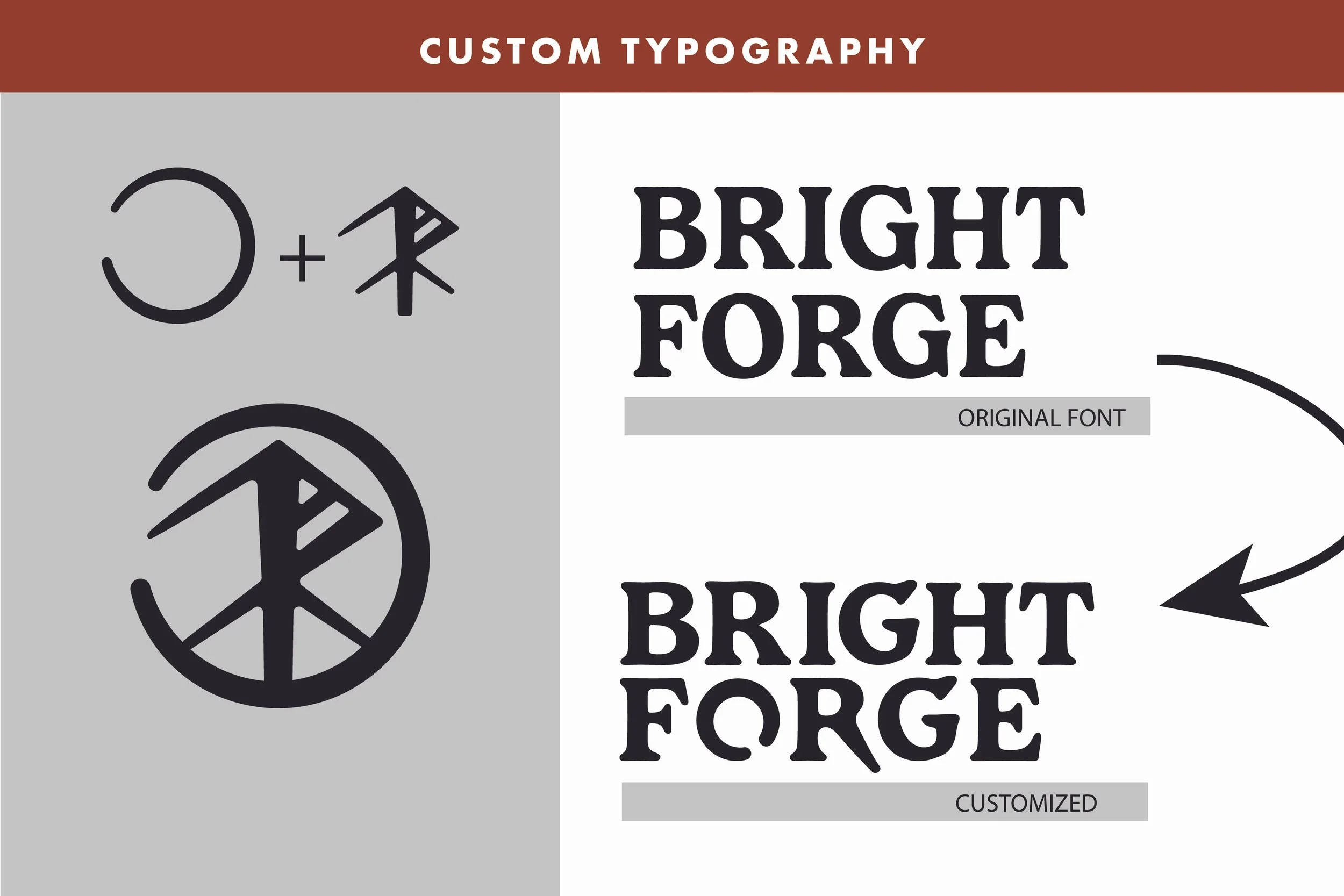
The wordmark began with Gelica, but I didn’t want to leave the typeface untouched. I customized several of the letterforms to give the logo more character, including reshaping the O in Forge to resemble a forge and add another subtle reference to the company name.
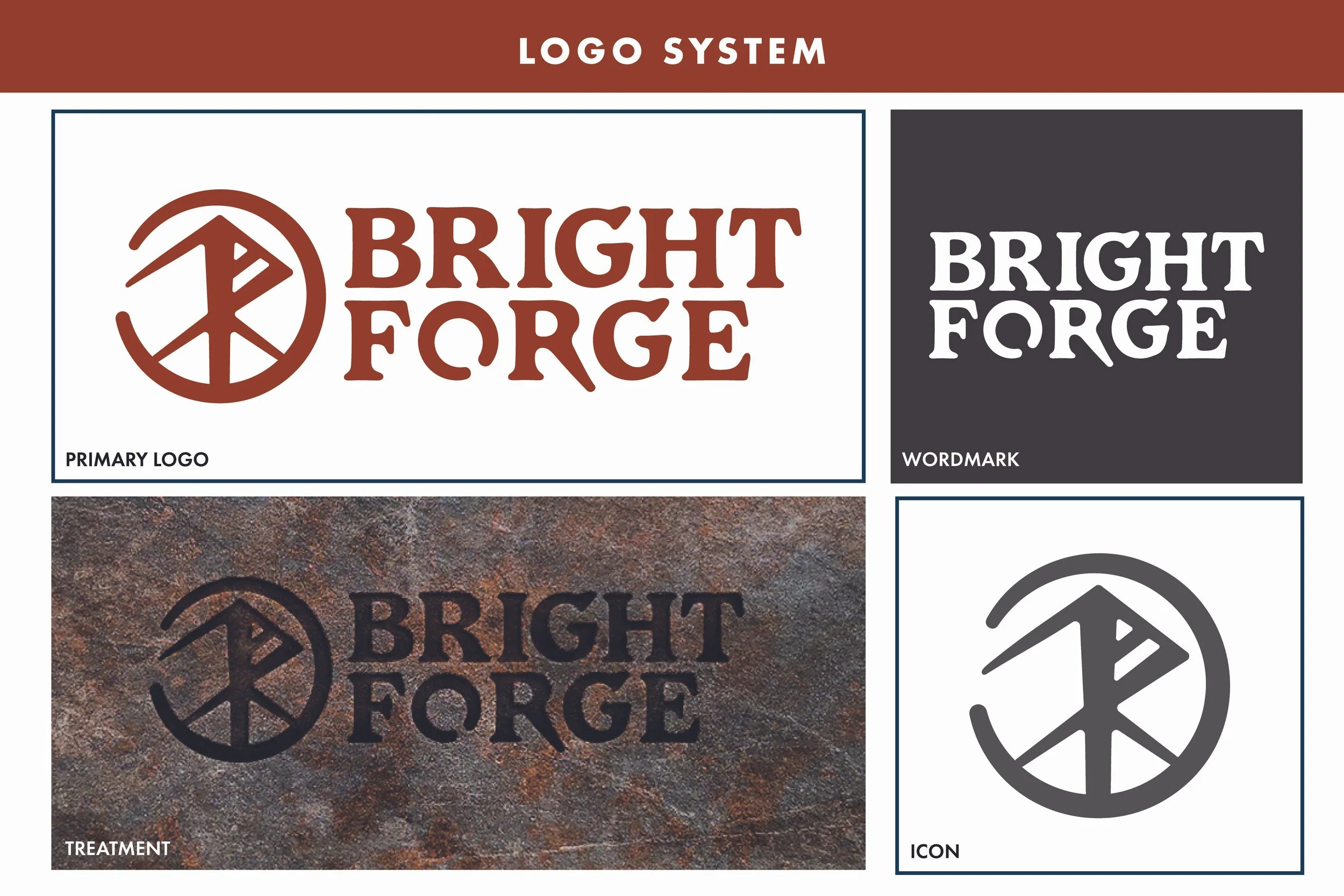
I developed the finished identity into primary, wordmark, and icon variations for use across different applications. I also created a dimensional treatment that makes the logo appear carved into stone, leaning further into the Dwarven craftsmanship behind the brand and giving the mark a more tangible quality.
Typography & Colors
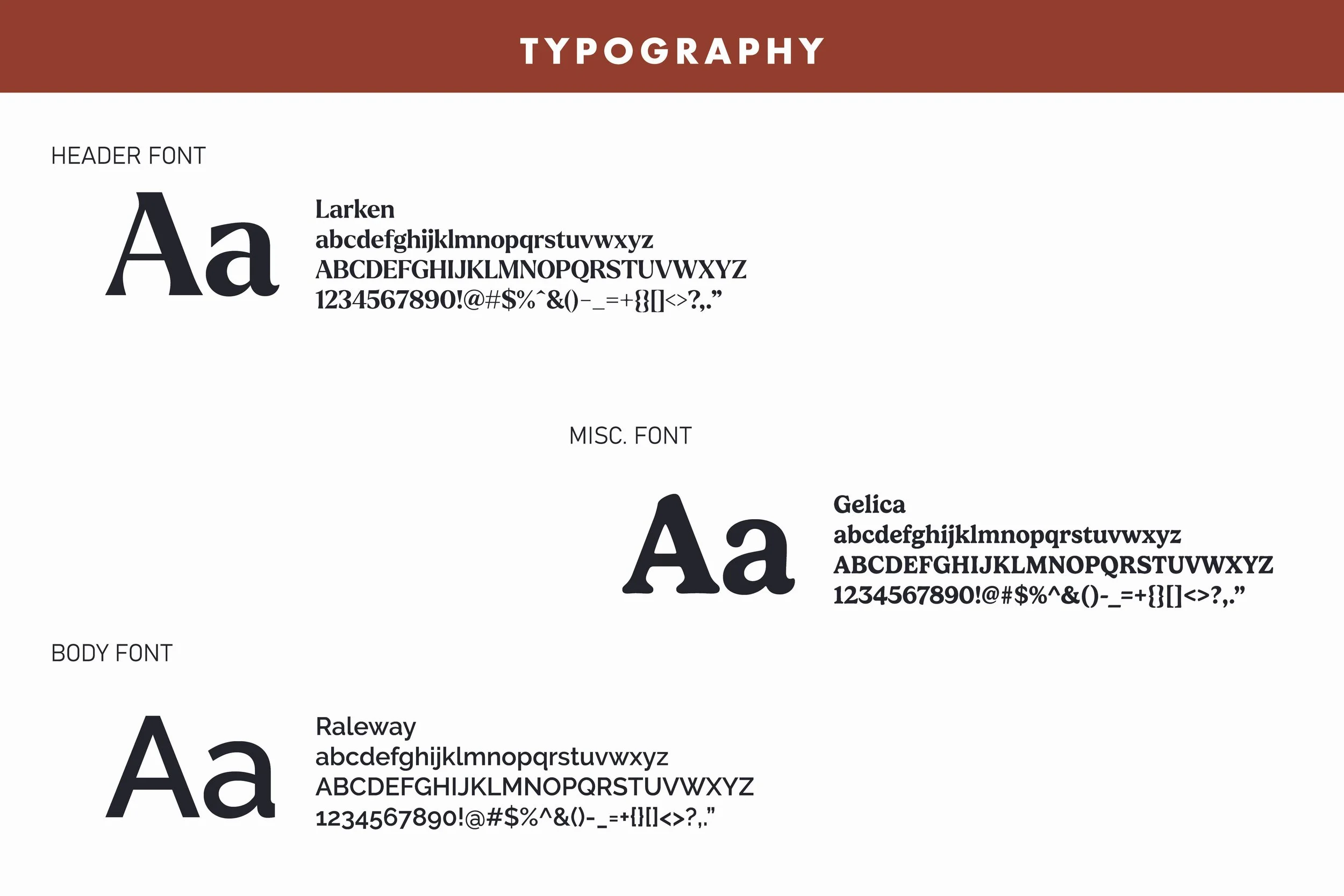
The broader typography system pairs the more distinctive character of the logo with typefaces that can handle the brand’s everyday communication. Larken is used for main headings, Gelica as a secondary typeface, and Raleway for body copy.
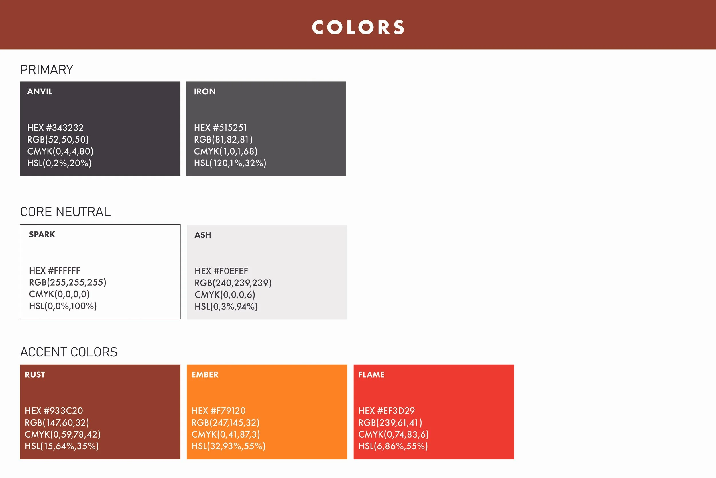
The color palette draws from the forge itself, combining dark charcoal and stone tones with warm reds, oranges, and rust inspired colors. Together, the typography and palette keep the identity grounded in its original inspiration while still feeling polished and professional.
Business Cards
The business cards bring the identity into a tactile application, using a textured stone surface and raised red icon to reinforce the materials and craftsmanship that inspired the brand.
Project credit: Created for Bright Forge during my time at Blackbird Digital.
