
Giles Law Group
Created at Blackbird Digital
Giles Law Group is a personal injury and criminal defense firm serving North Idaho. But Chip Giles isn’t your typical attorney. He’s also a cowboy with a background in rodeo, and that gave us an opportunity to build a brand that felt just as distinct as the person behind it.
The challenge was balancing those two sides of Chip. The identity needed to feel polished and professional in the courtroom while still leaving room for his boots, buckle, and Western personality to show through. We landed on a sophisticated Western direction inspired by rodeo culture, Americana, engraved ornamentation, and traditional belt buckles. Rather than giving Chip another traditional law firm identity, we wanted to create something that felt unmistakably his.
The Logo System
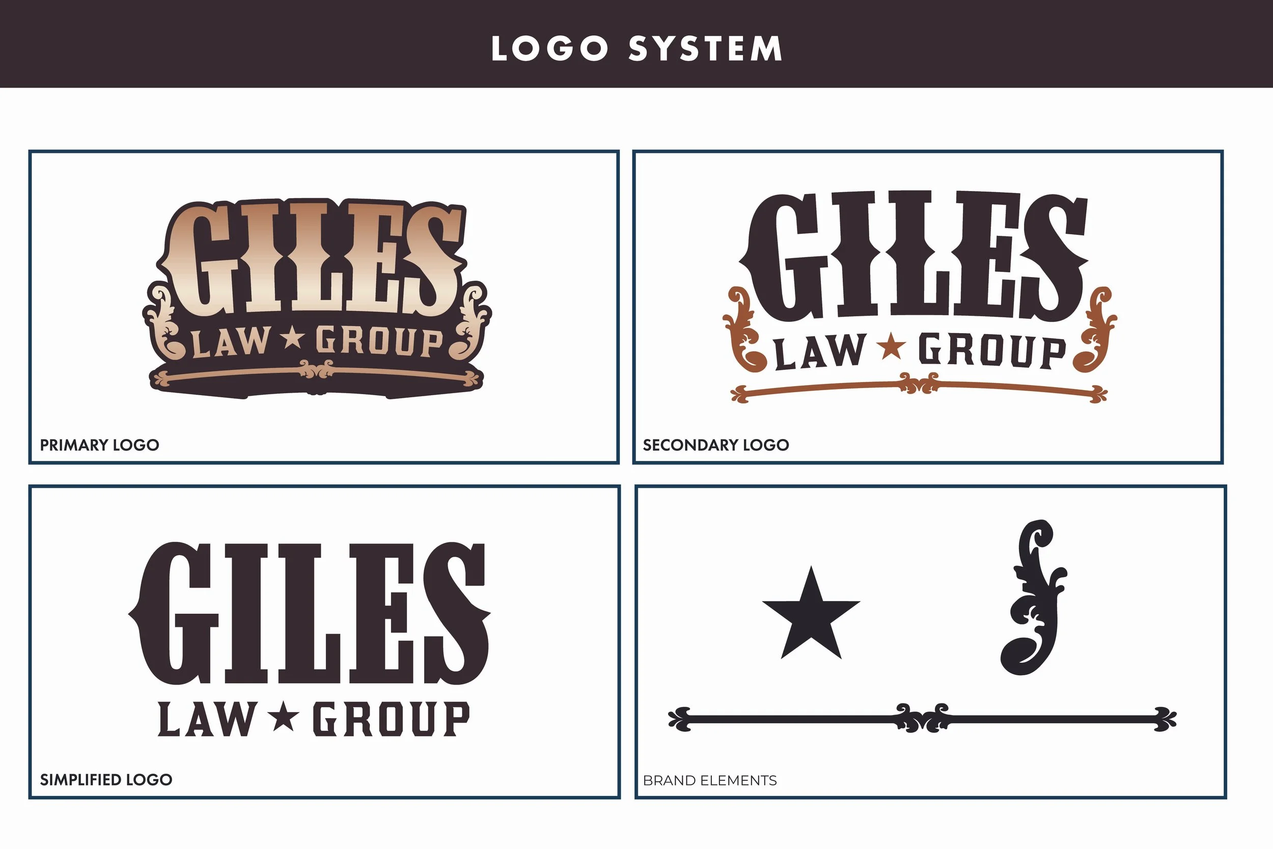
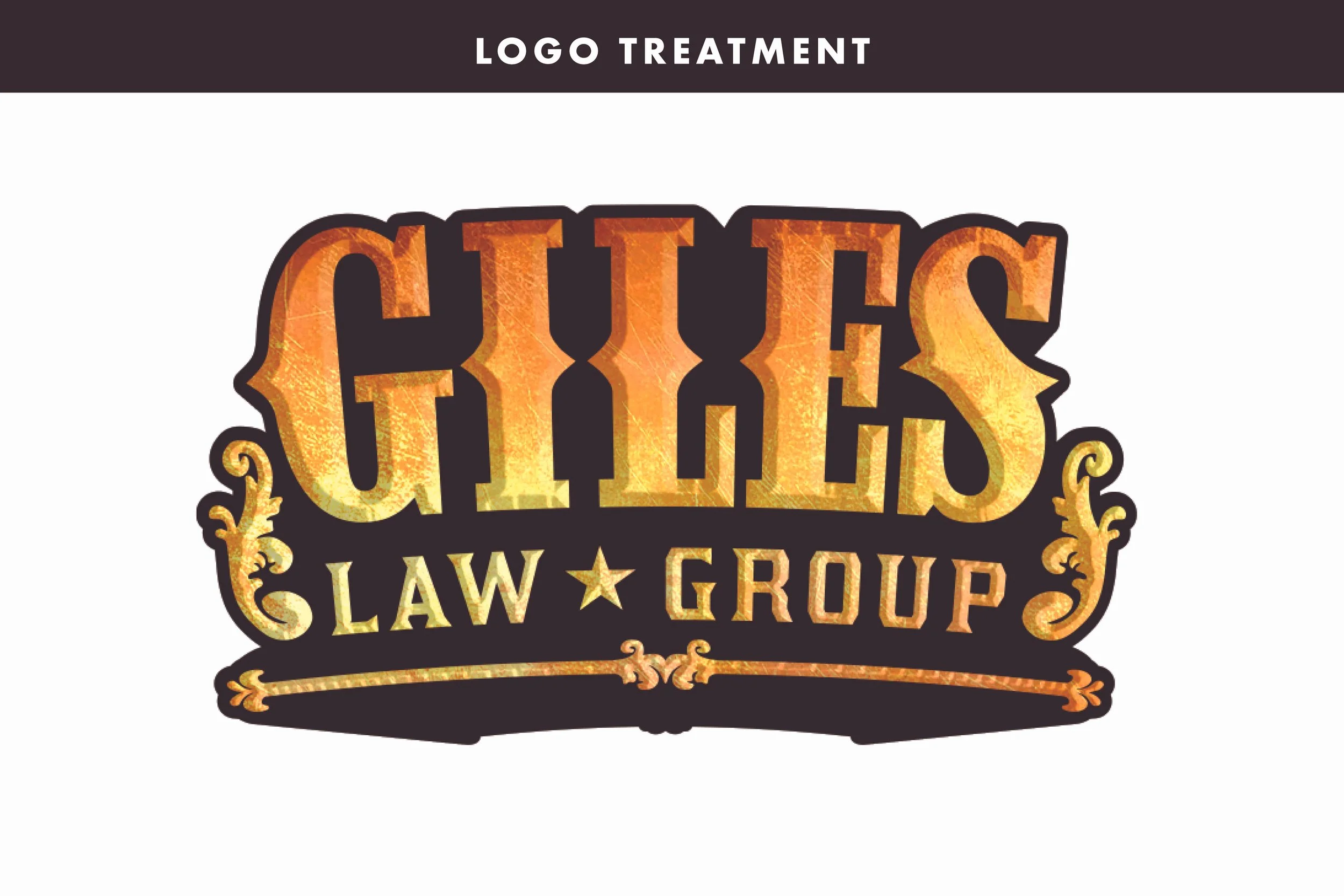
Belt buckles became one of the biggest influences behind the logo, from the tall Western typography to the ornamental details framing the name. It felt like a natural connection to Chip’s rodeo background, and I loved the idea that the mark could genuinely become one of his own belt buckles someday.
I built the identity as a flexible logo system rather than relying on a single mark. The most detailed version leans fully into the Western aesthetic, giving us something with plenty of personality for advertising and more expressive applications. From there, the system scales back into simpler wordmarks that retain the character of the brand while feeling more appropriate for professional settings.
That range gave Giles Law Group room to have fun without losing the credibility expected from a law firm.
Color & Typography
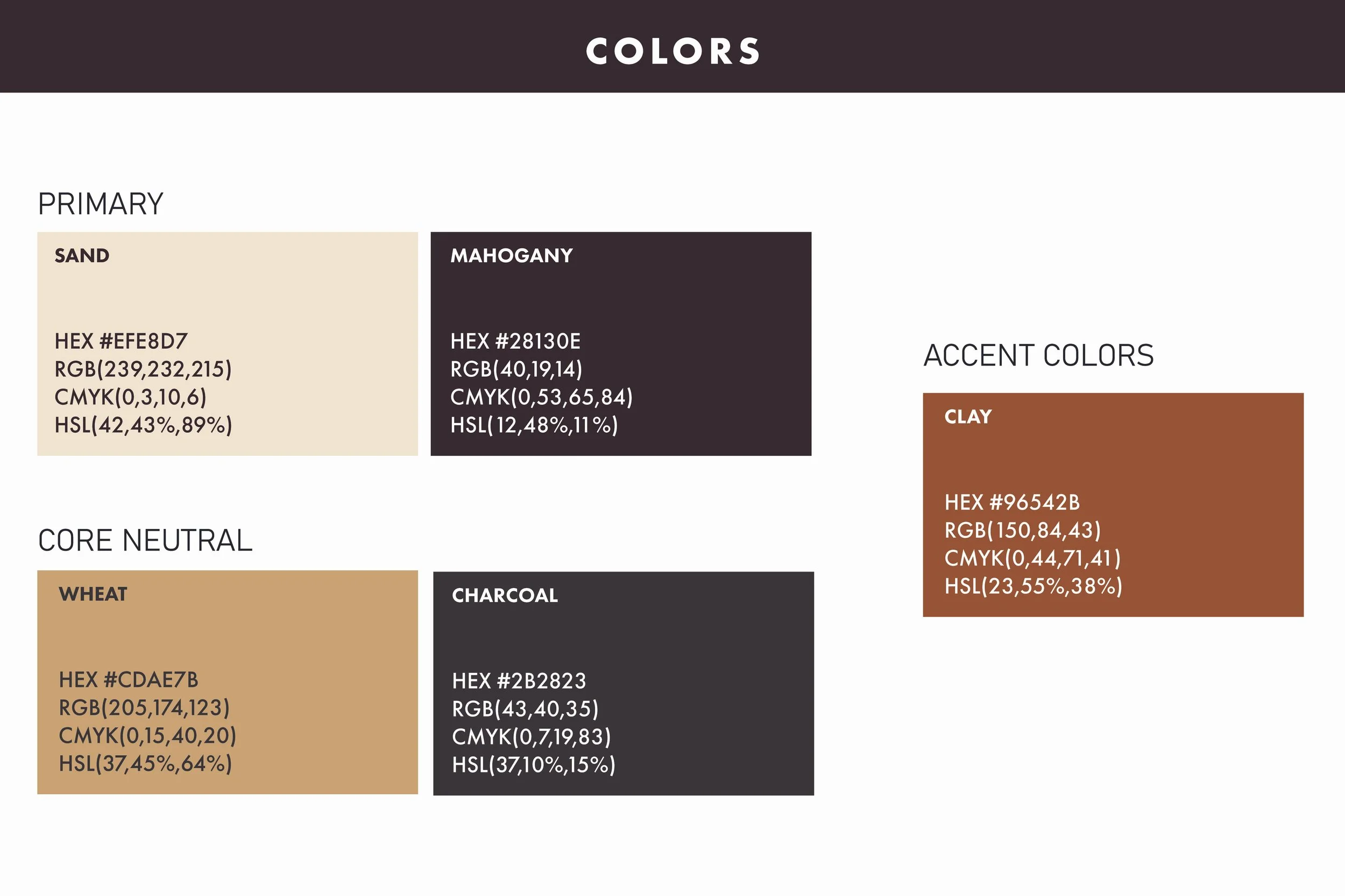
The color palette continues the Western influence through deep brown, bone, tan, weathered black, and muted rust. Together, the colors feel warm and rugged without pushing the identity into novelty Western territory.
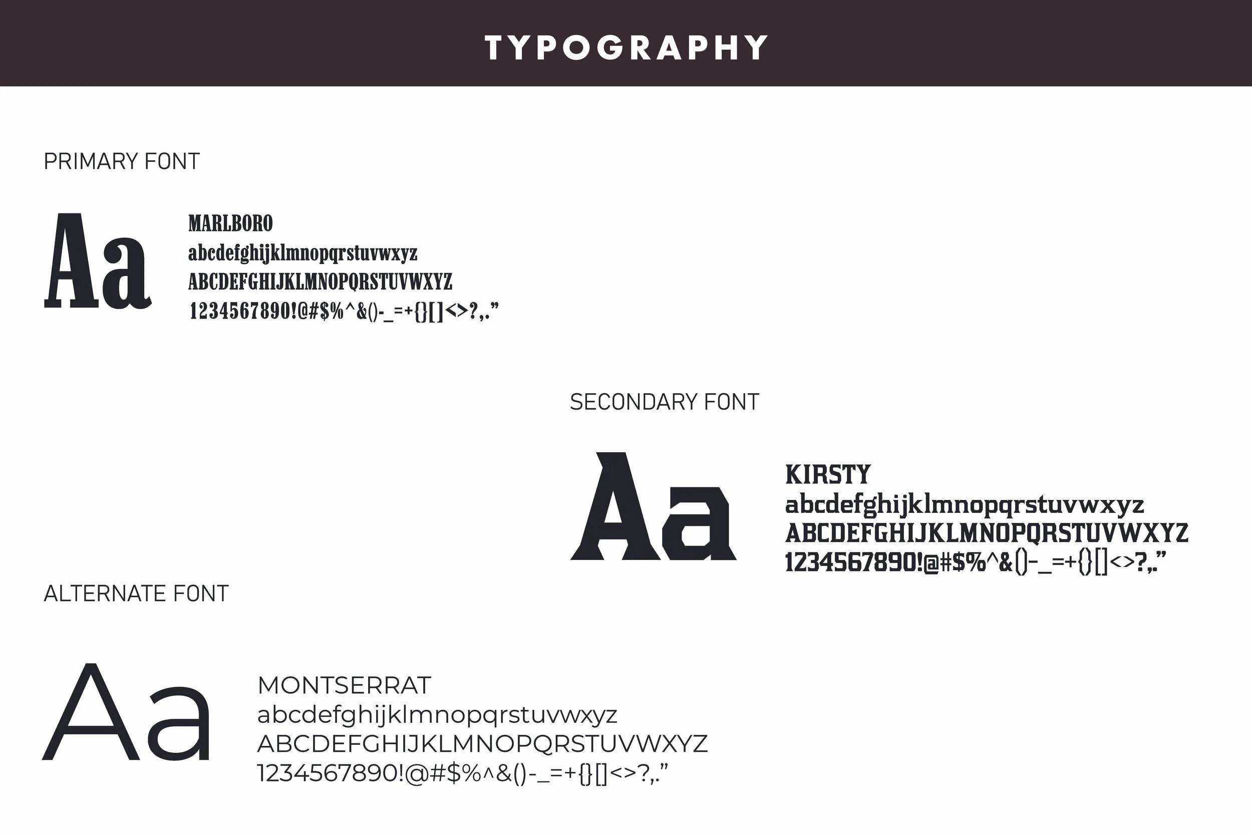
Typography follows the same balance. Marlboro brings the strongest Western personality to display applications, while Kirsty offers a softer, more refined interpretation of that character. Montserrat rounds out the system as the everyday typeface, providing a clean and highly readable option for body copy and more functional applications.
The Website
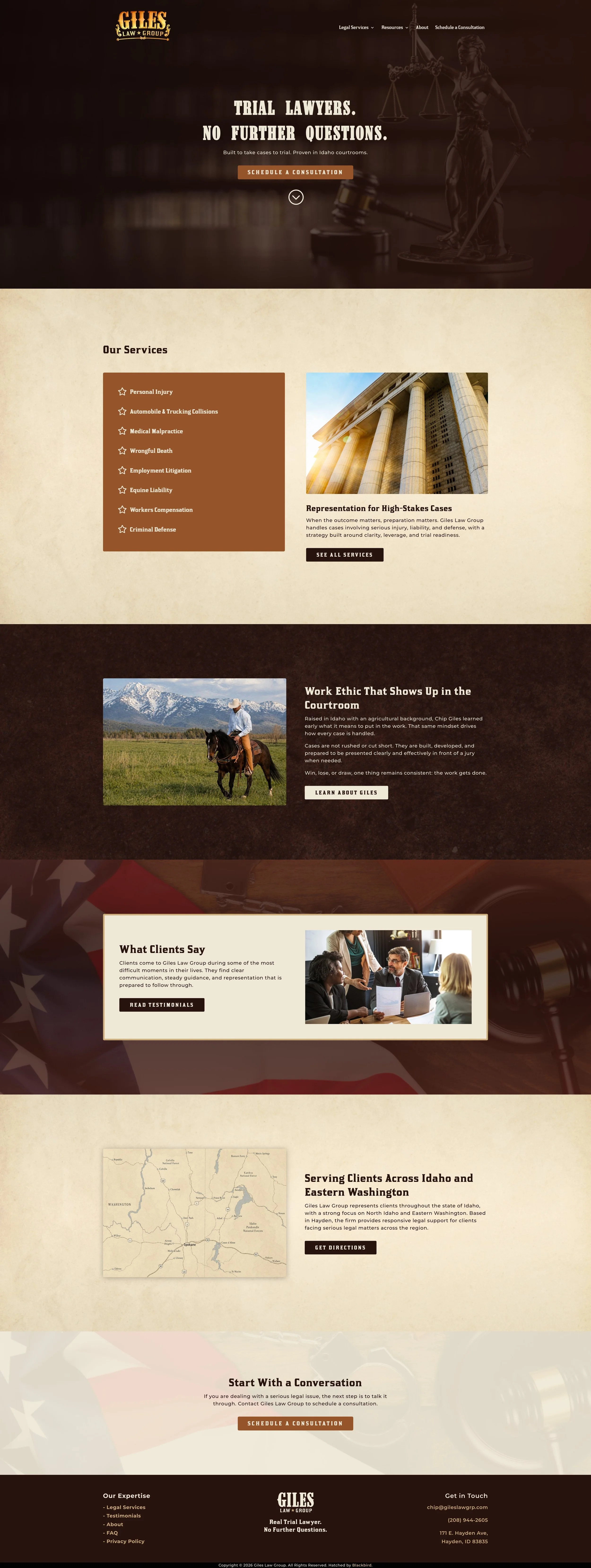
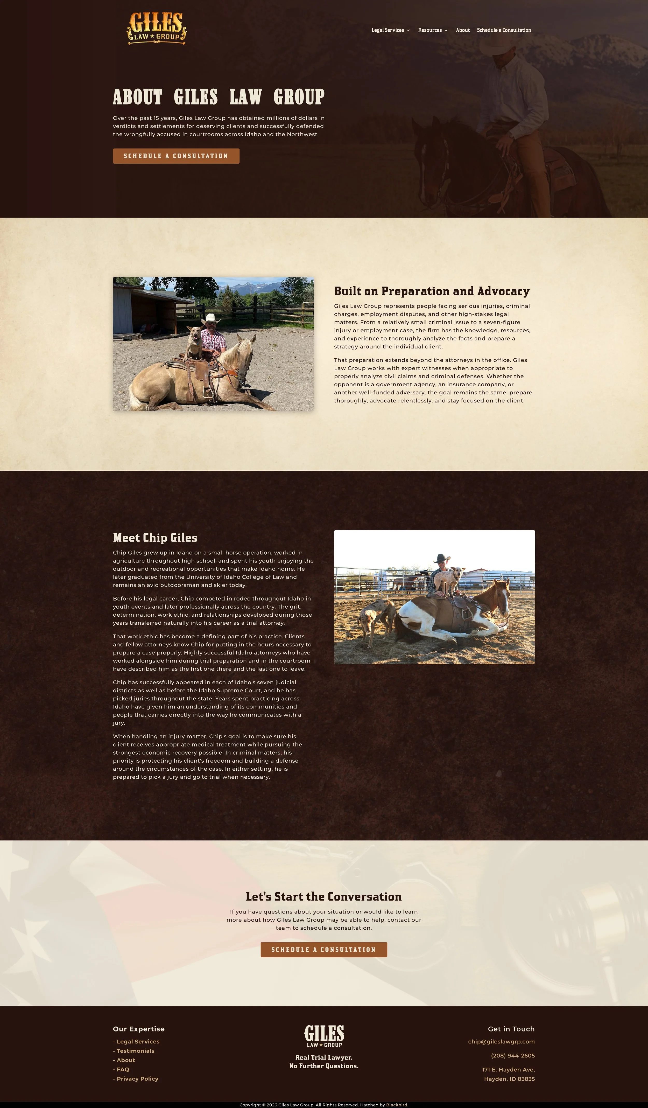
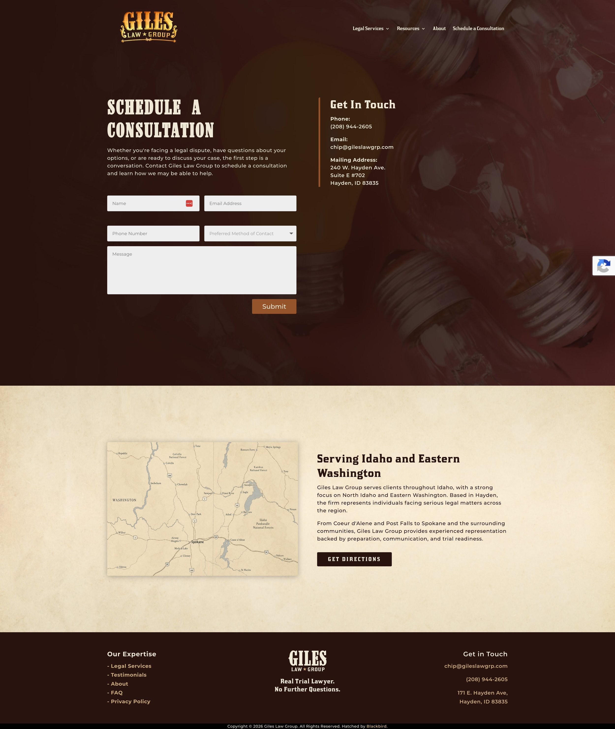
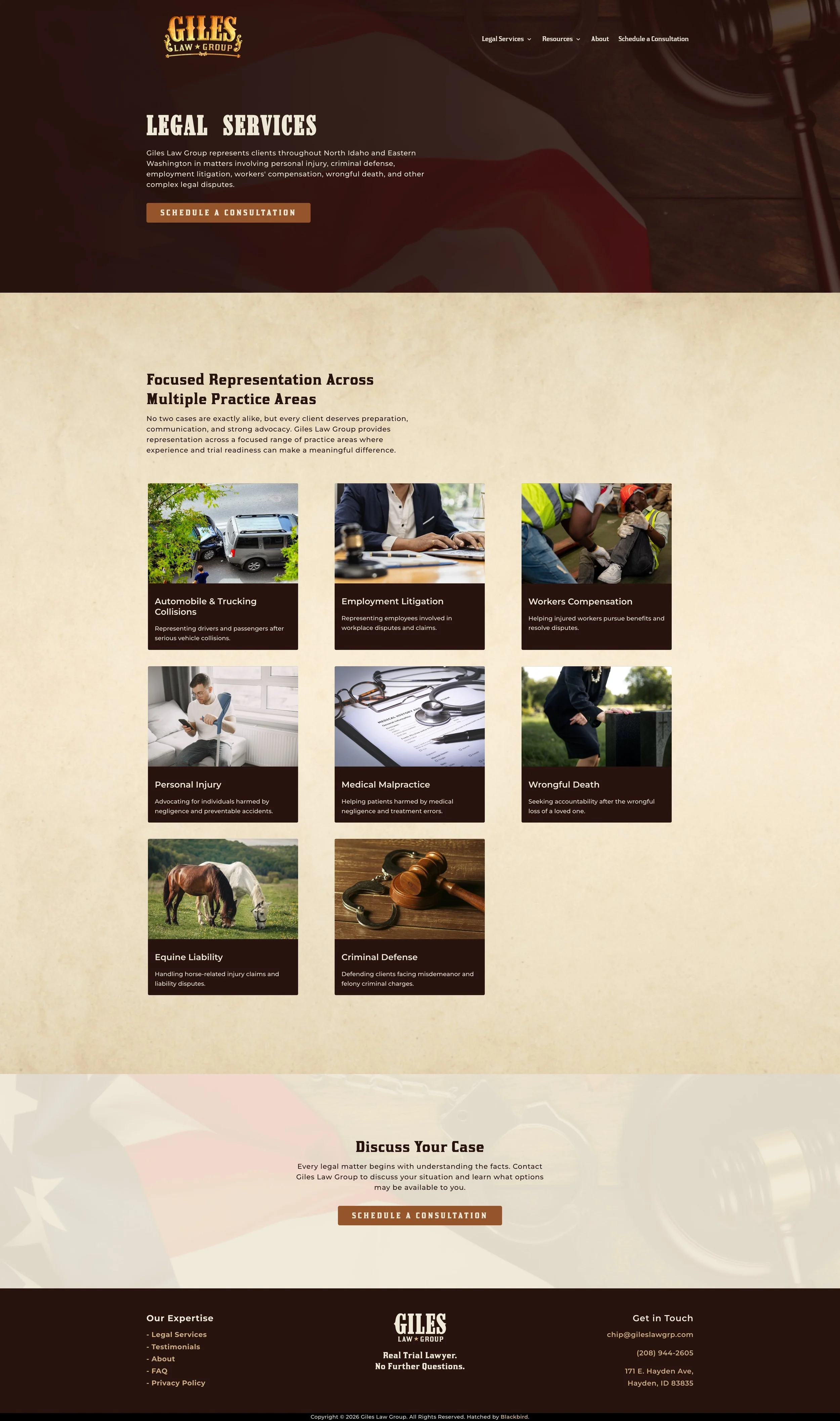
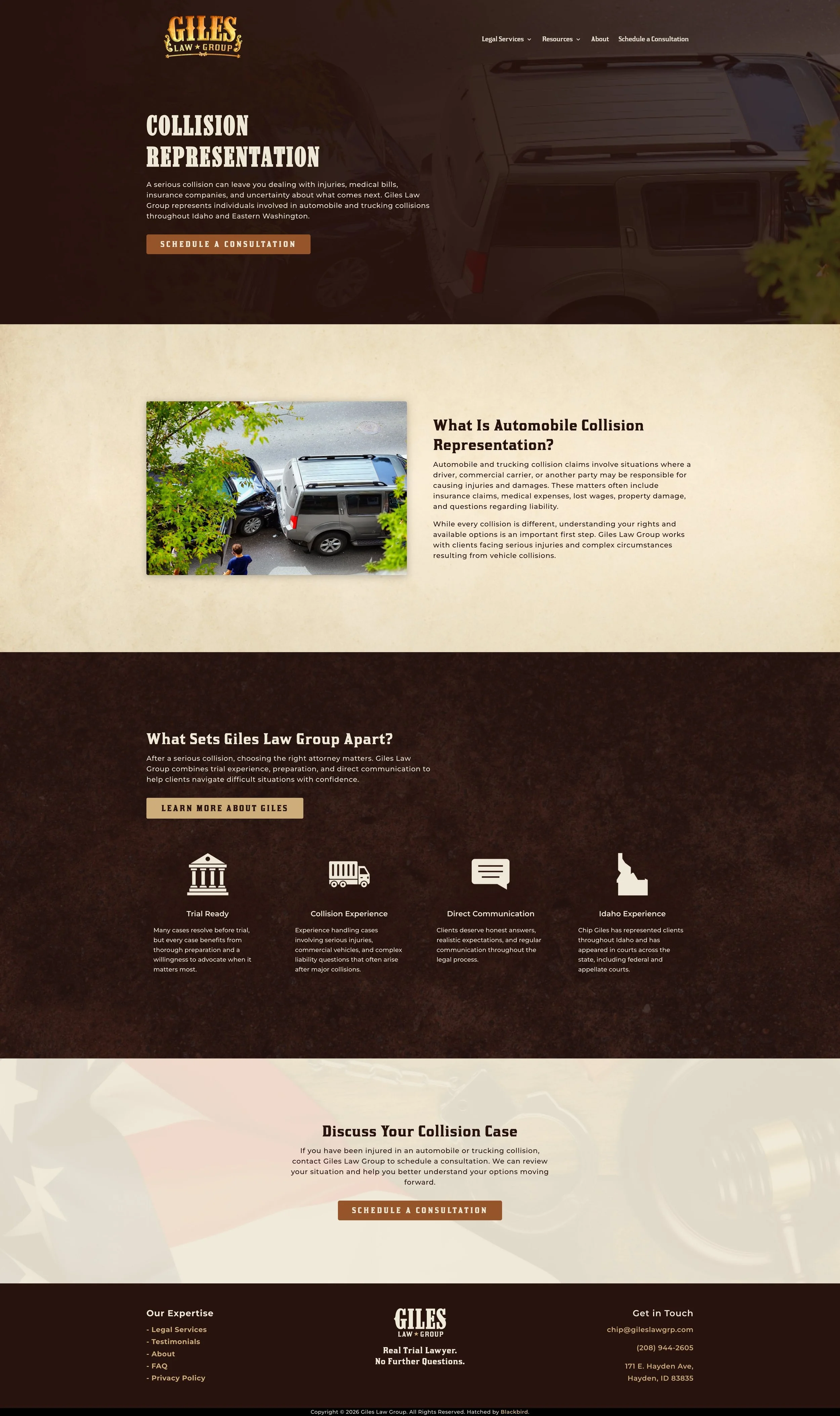
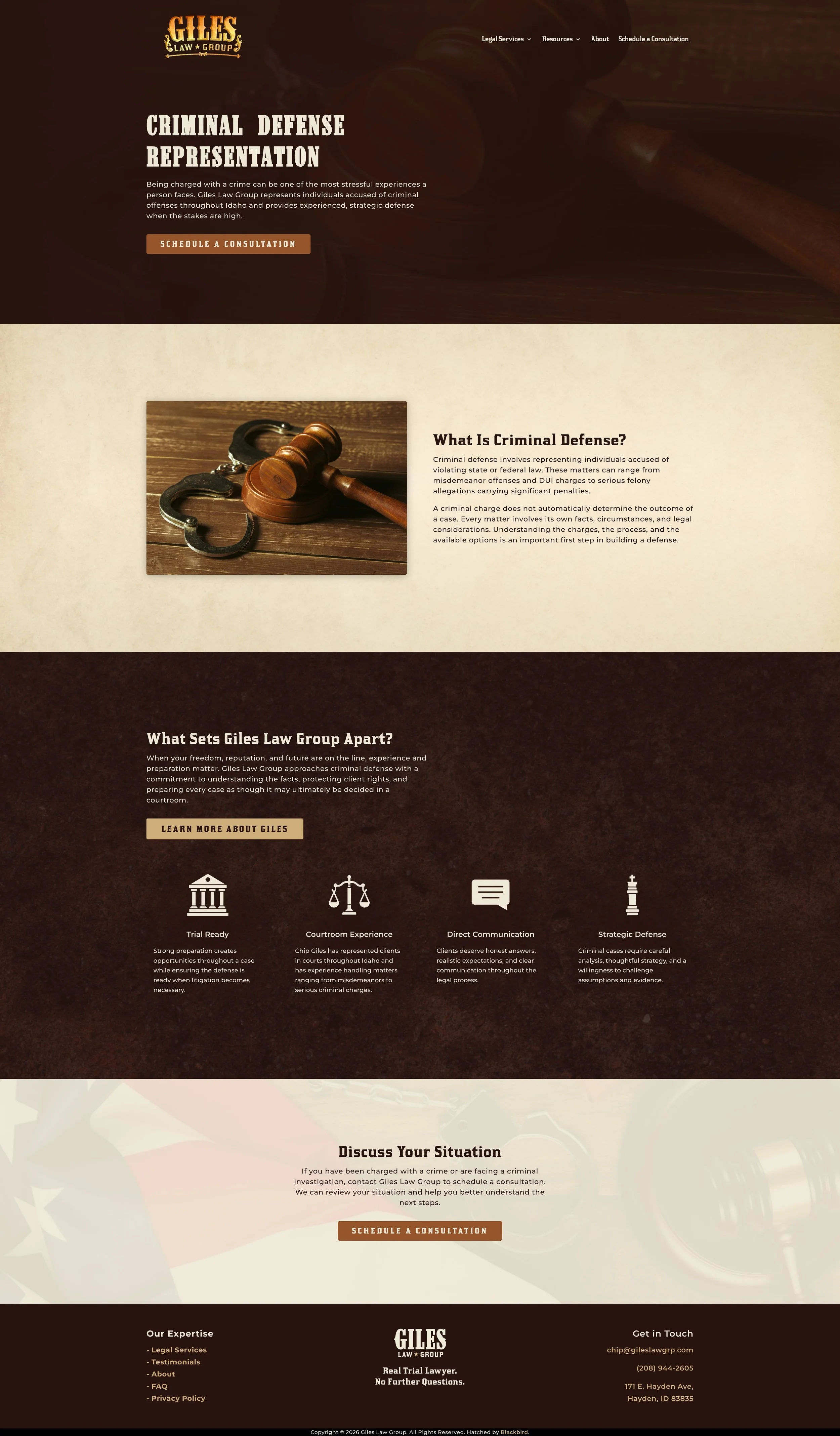
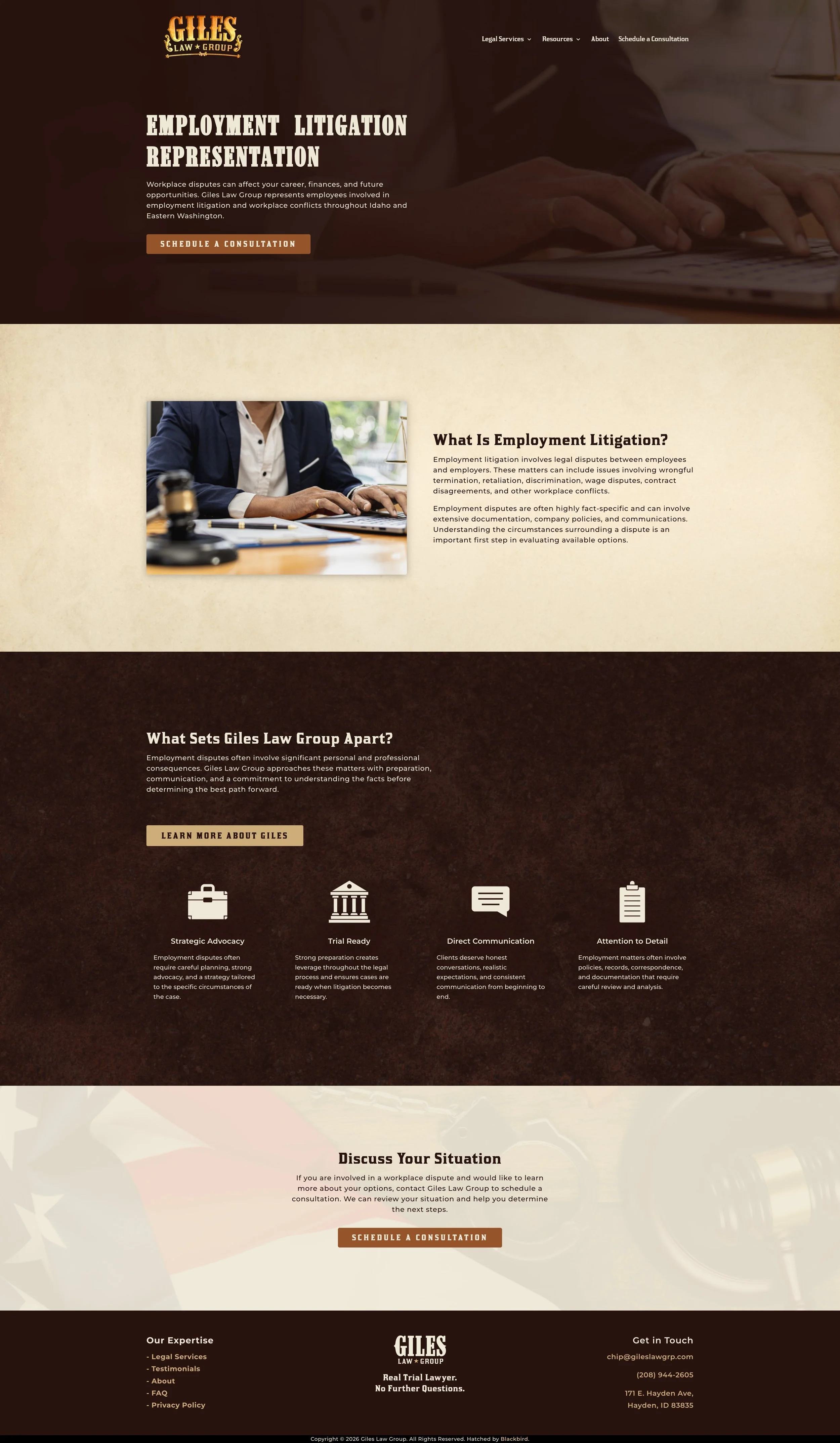
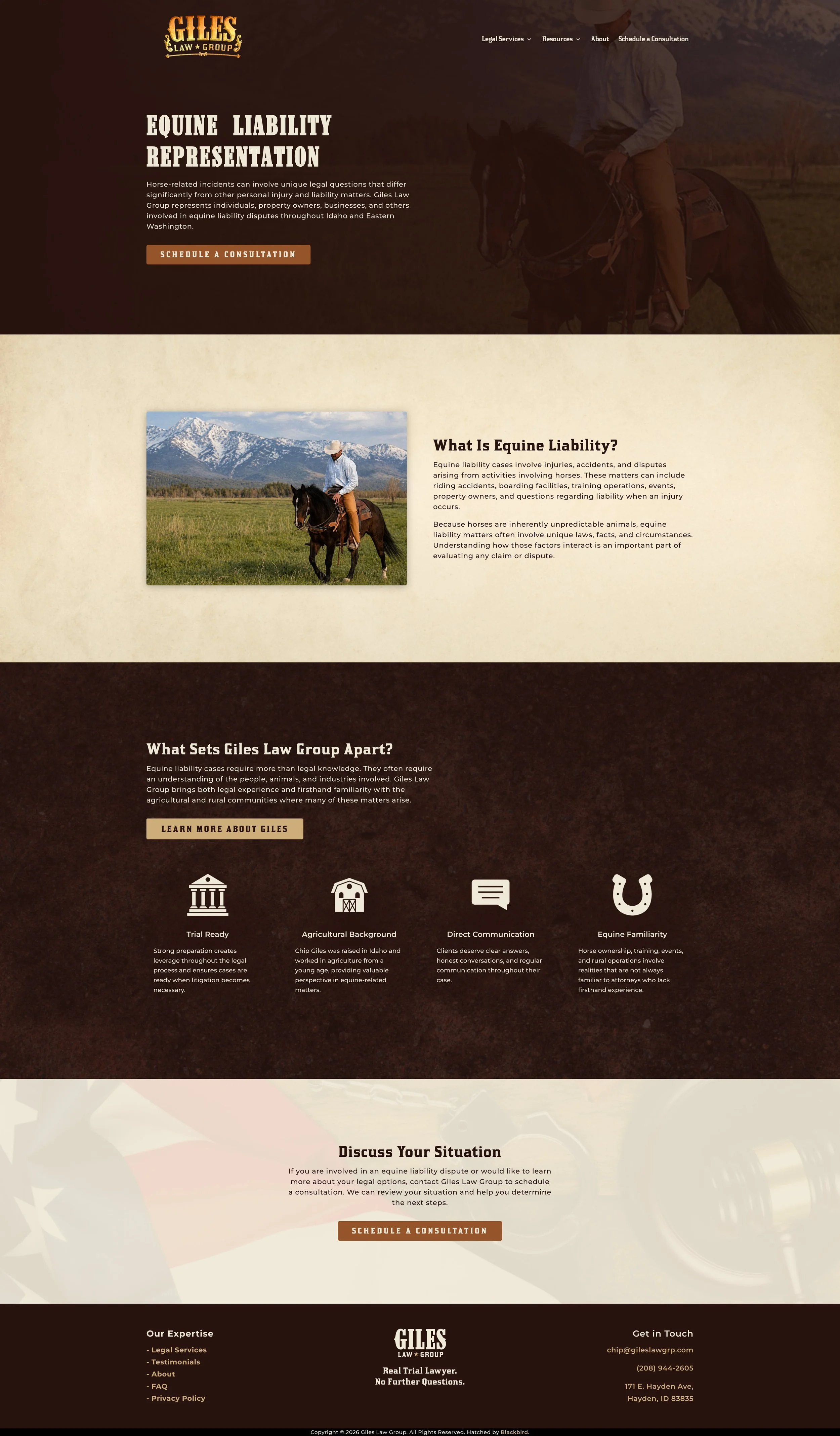
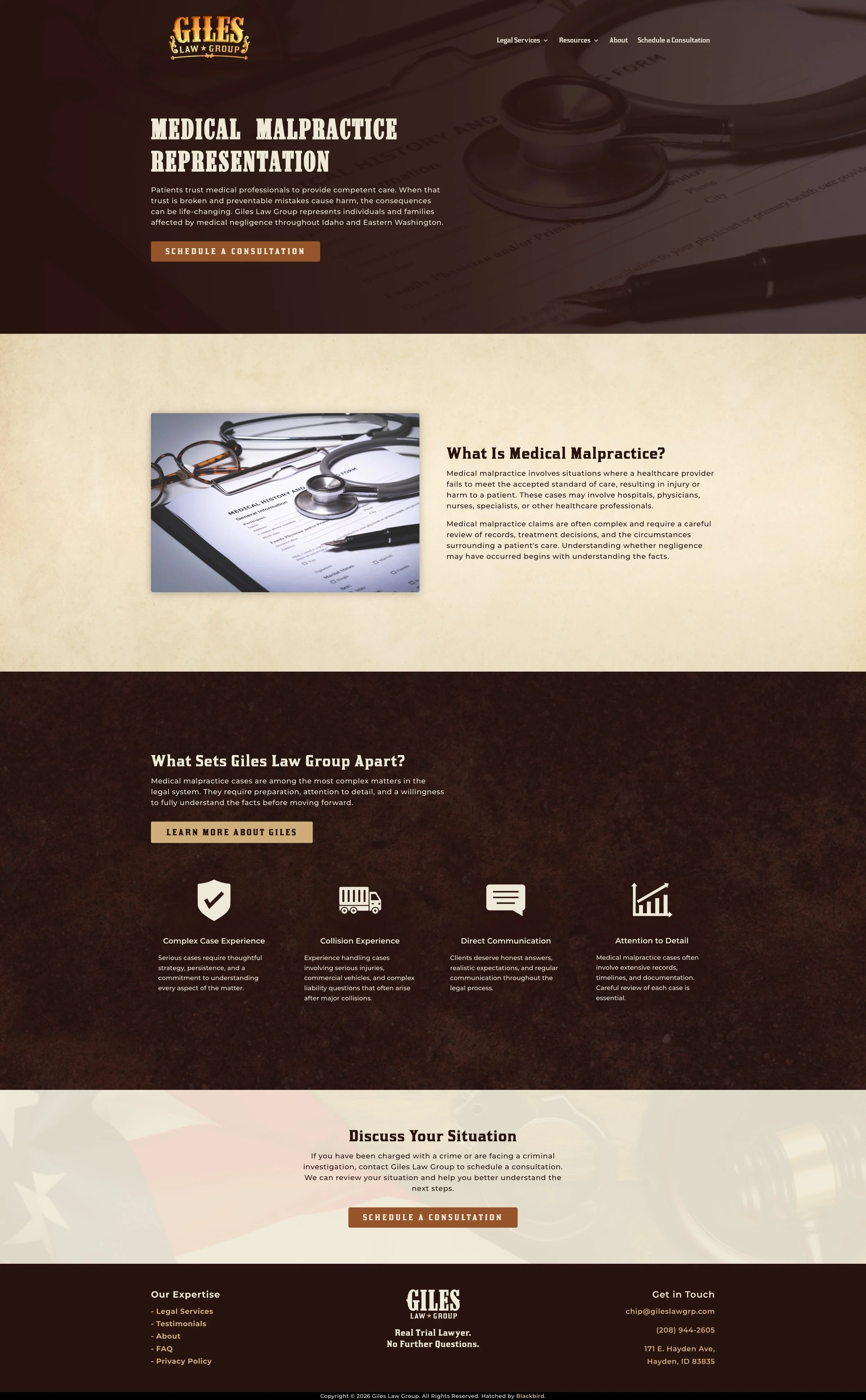
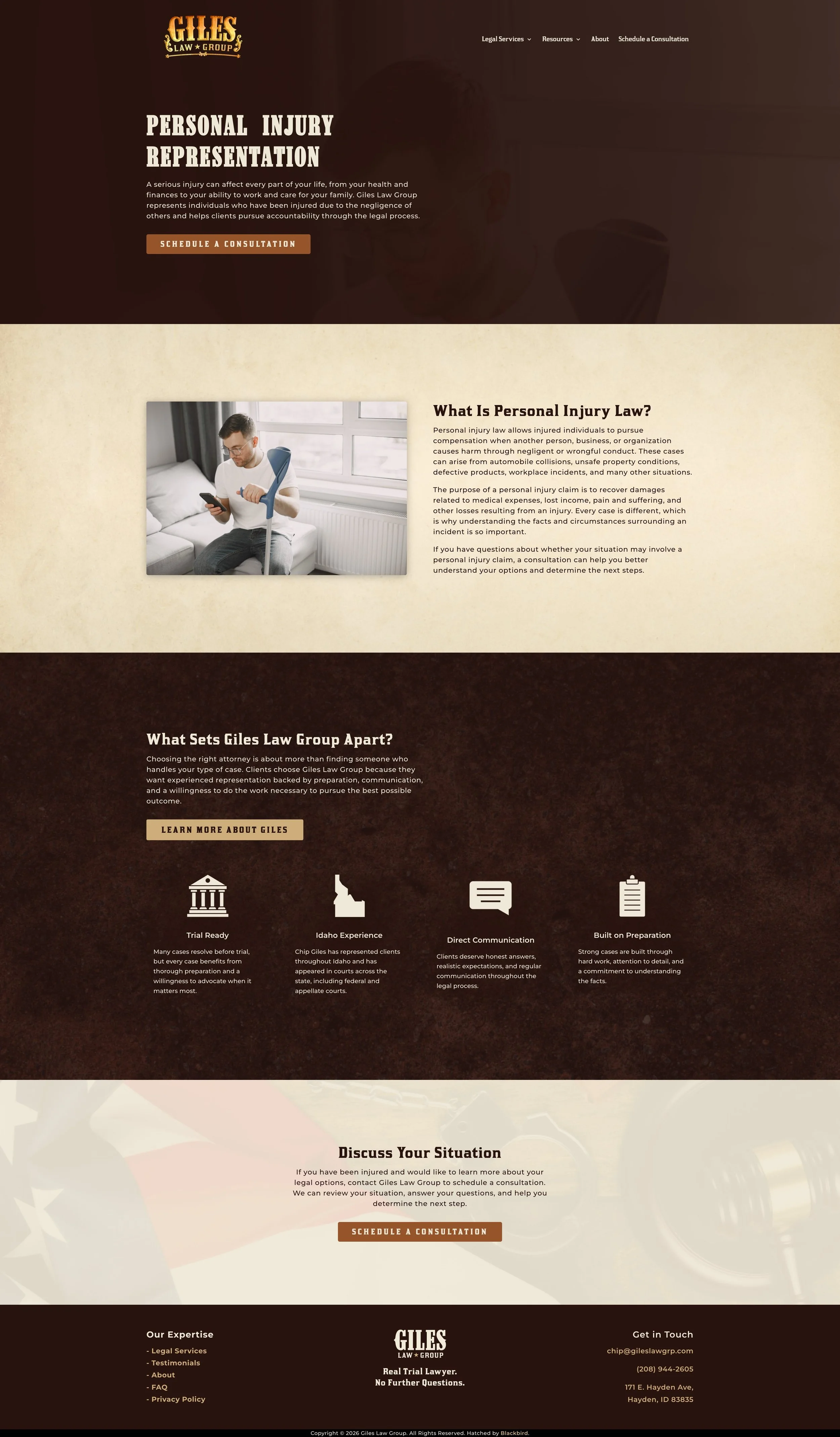
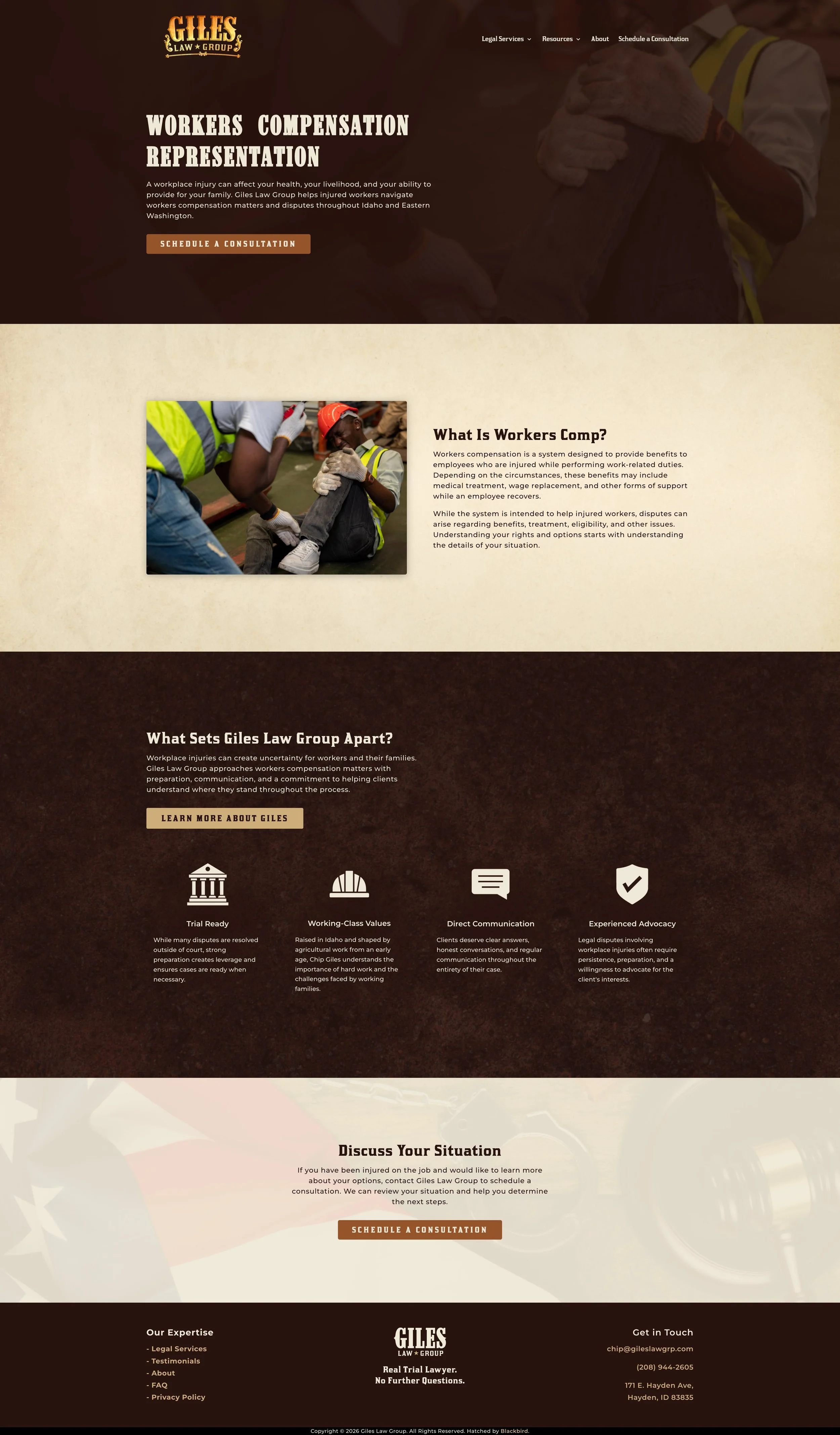
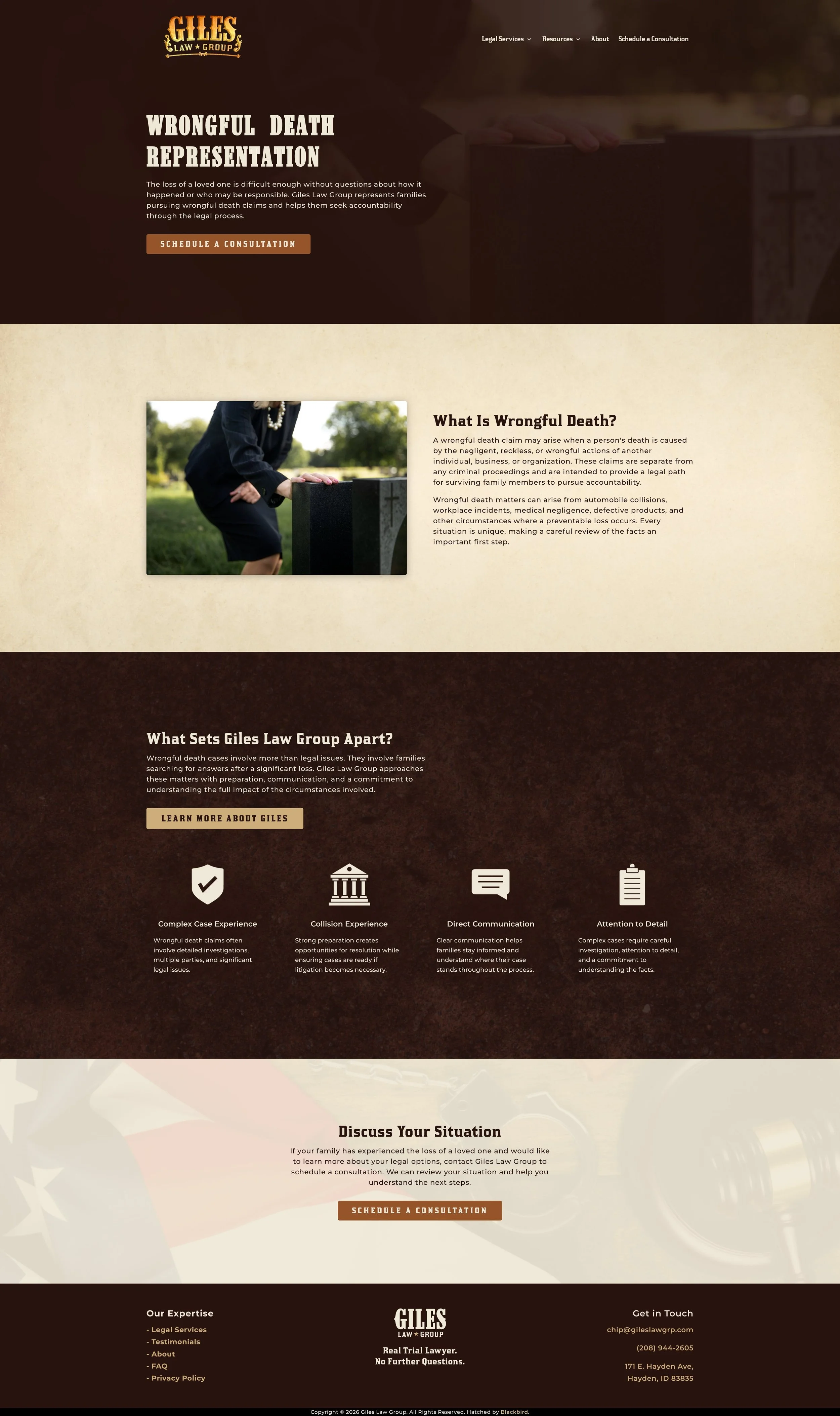
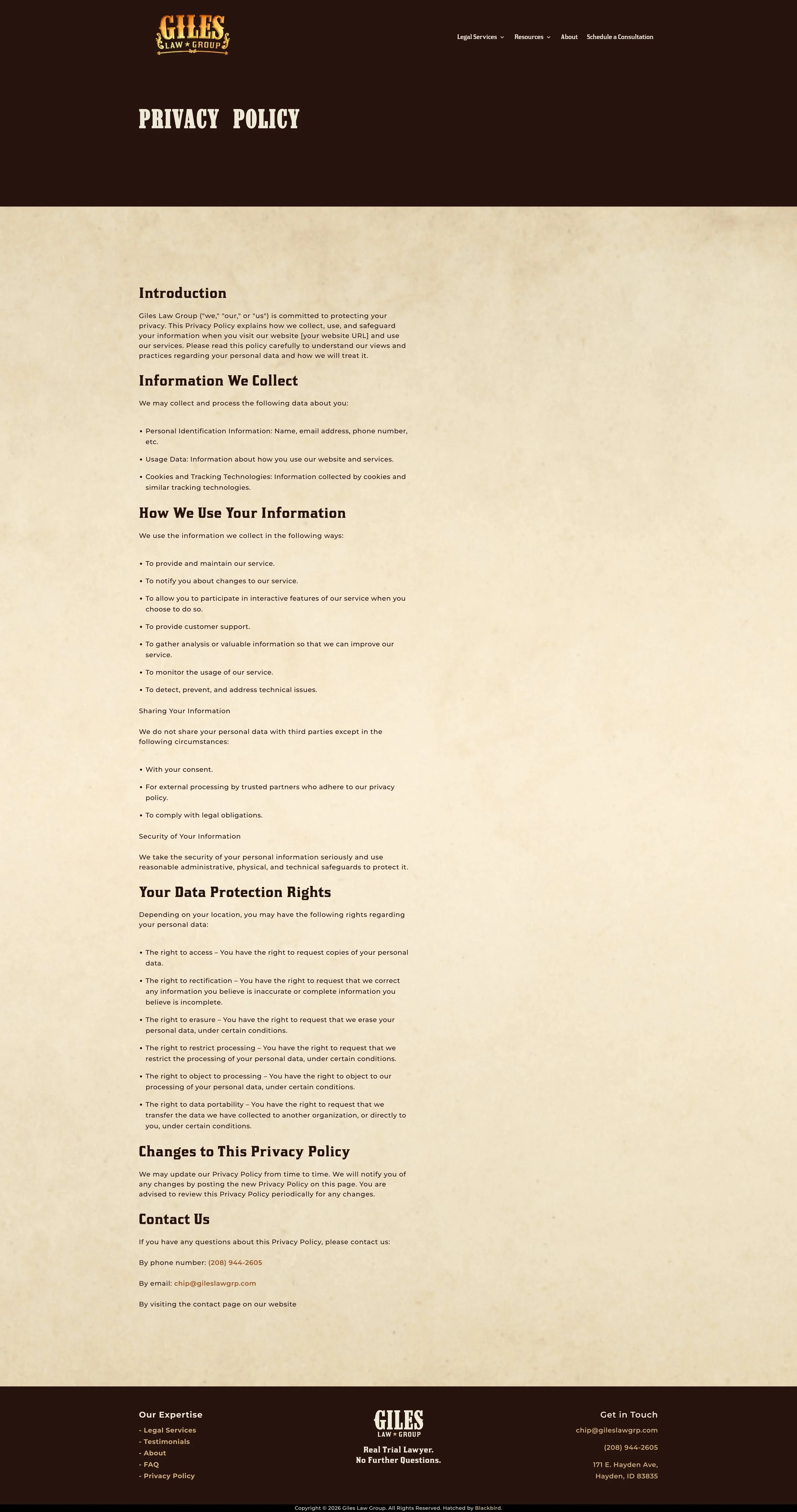
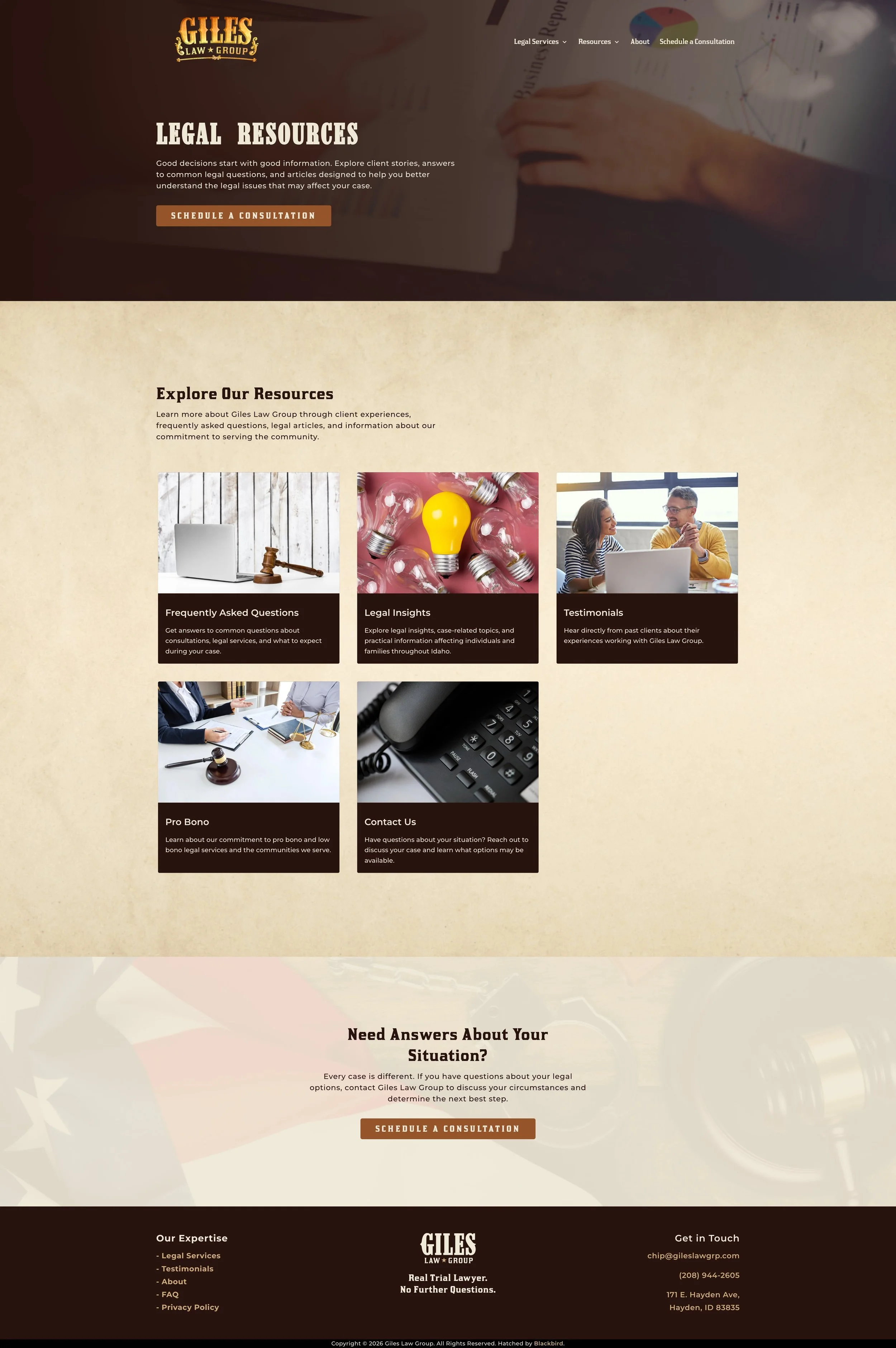
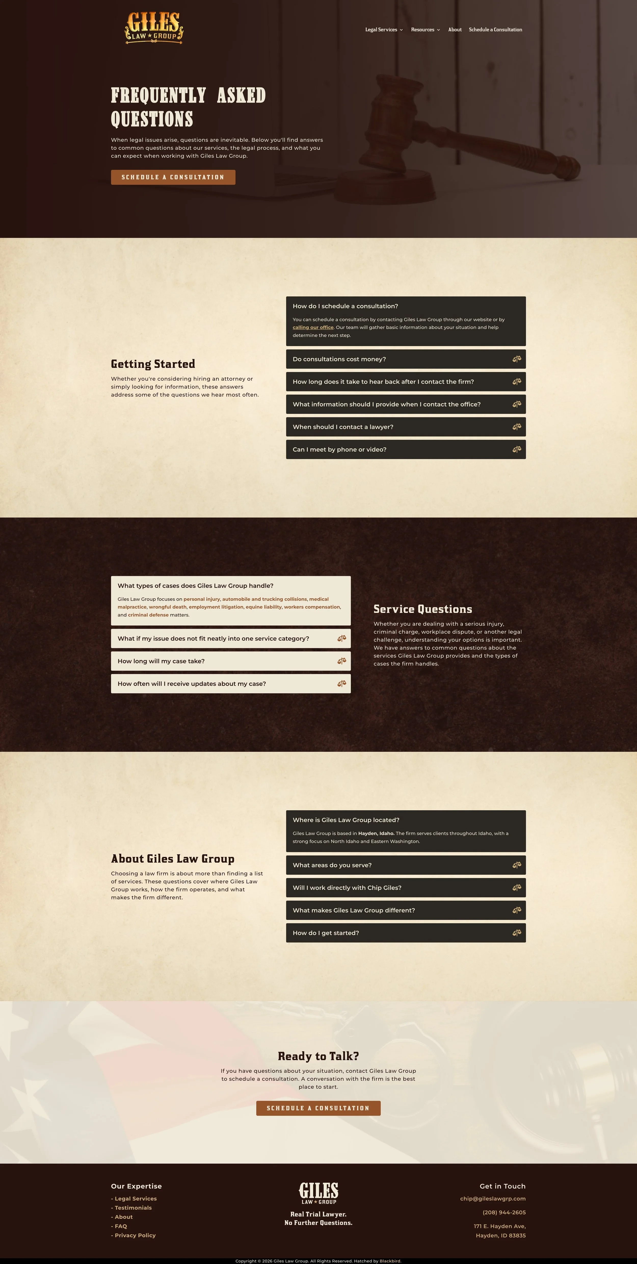
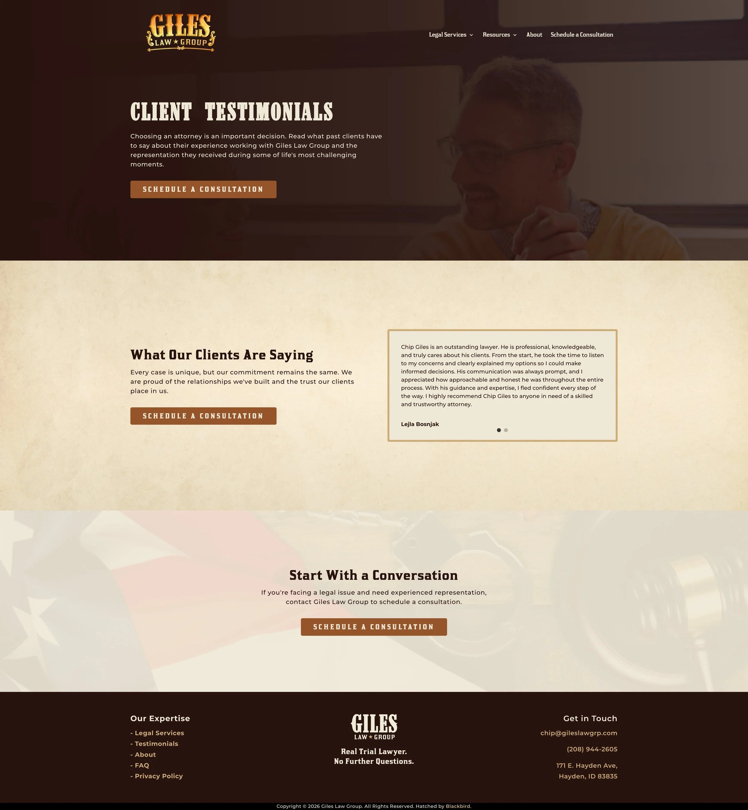
Once the identity was established, I carried the same personality into a custom website for Giles Law Group. The color palette, typography, imagery, and Western details gave the site a distinct visual language while keeping the information clear and easy to navigate.
I designed and built the site in WordPress using Divi, hosted through Cloudways, and connected Chip’s GoDaddy domain. I also handled the supporting setup for email delivery, security, caching, and SEO.
Brand In Action
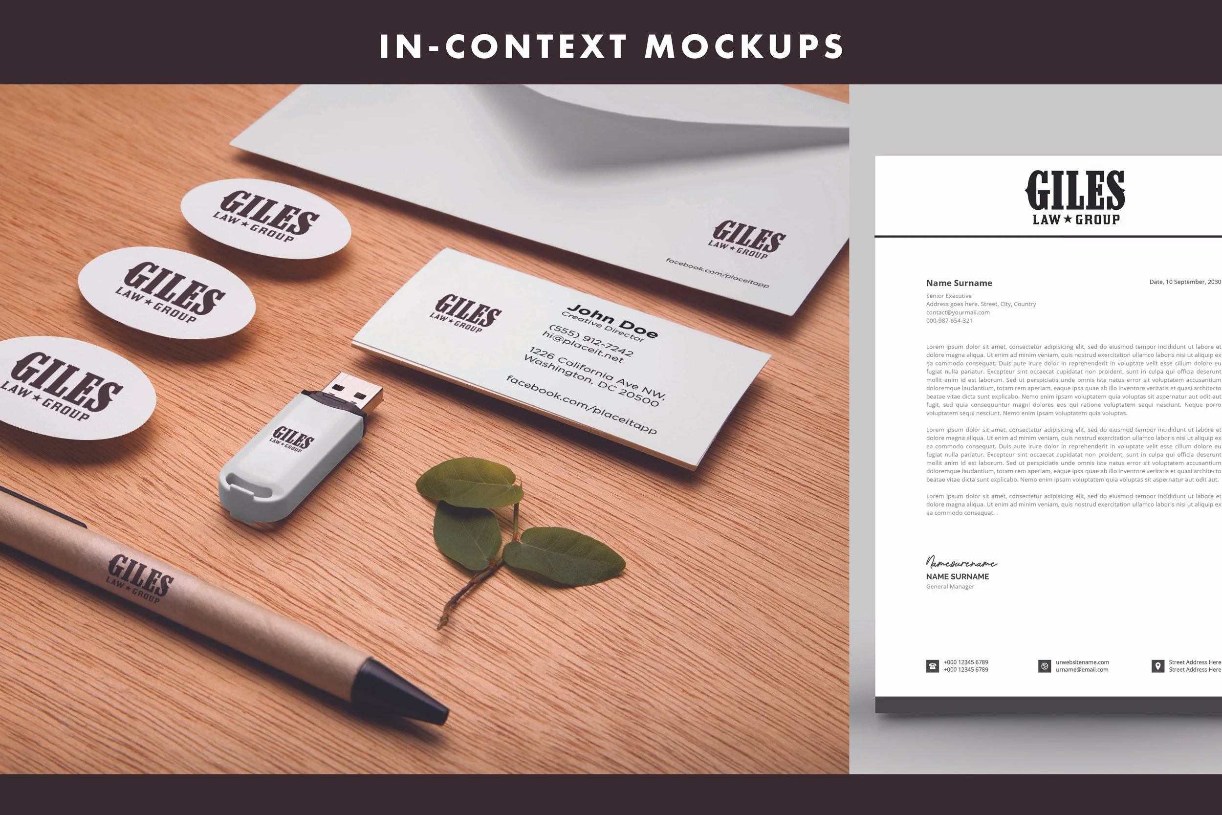
The identity was designed to shift depending on where it showed up. For more traditional legal settings, I created a concept mockup to show how the simplified Giles identity could work across professional applications. By stripping back some of the Western ornamentation, the brand could feel clean and restrained without losing its character.
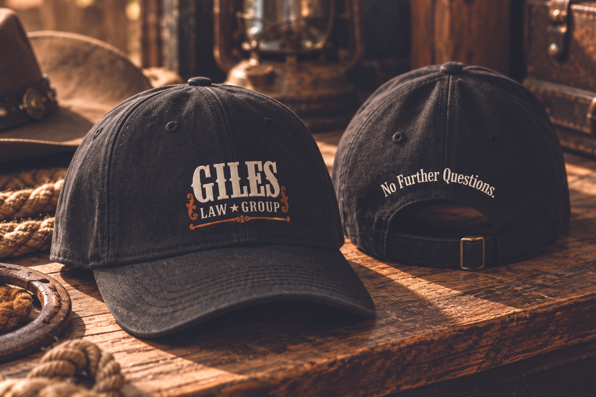
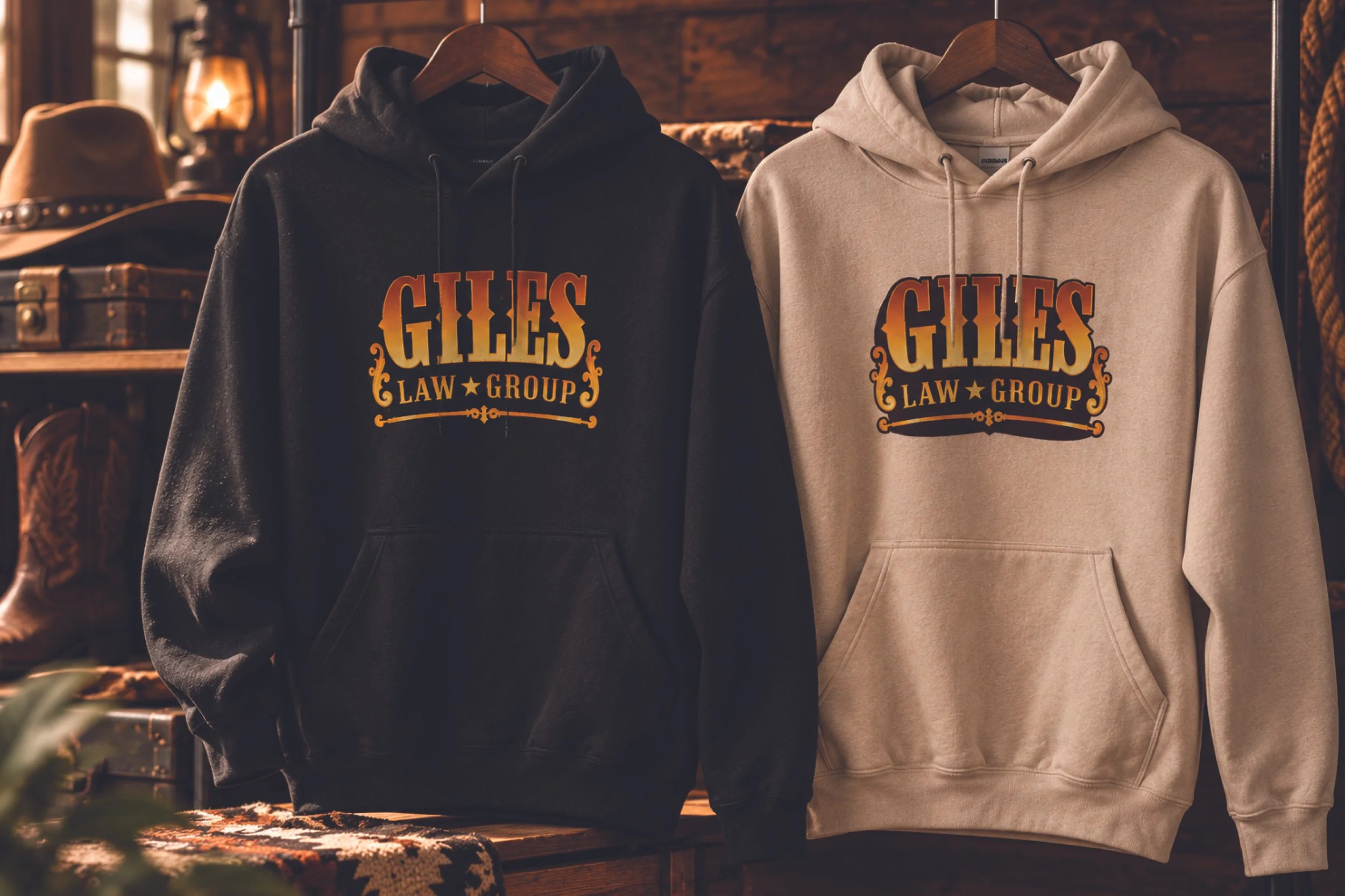
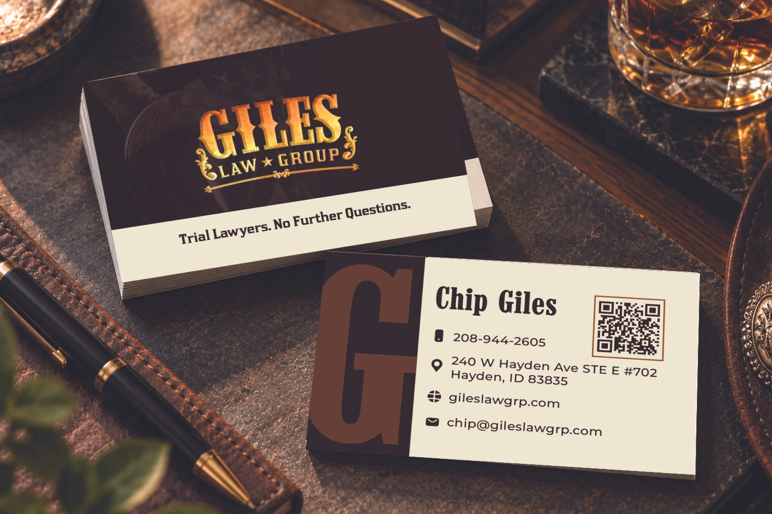
That same flexibility carried into the pieces I designed for Giles, including business cards, hoodies, and hats. The business cards lean into the more refined side of the identity, while the apparel gives the Western personality more room to come through. Different versions of the logo could be used depending on the application, allowing Giles to move between professional and expressive without feeling like two different brands.
Project credit: Created for Giles Law Group during my time at Blackbird Digital.
