
BaffleCraft Industries
Created at Blackbird Digital
BaffleCraft Industries takes 3D printing far beyond plastic prototypes. They use advanced metal 3D printing to manufacture suppressors, firearm components, and precision parts built around some seriously interesting technology.
The brand needed to feel just as innovative as the products themselves. Rather than falling into the hypermasculine, tactical look common throughout the firearms industry, BaffleCraft wanted an identity that felt technical and performance driven while still being approachable and inclusive. That opened the door for a visual direction that paired dark, industrial foundations with unexpected color, futuristic typography, and geometry inspired directly by how their products work.
Building The Brand
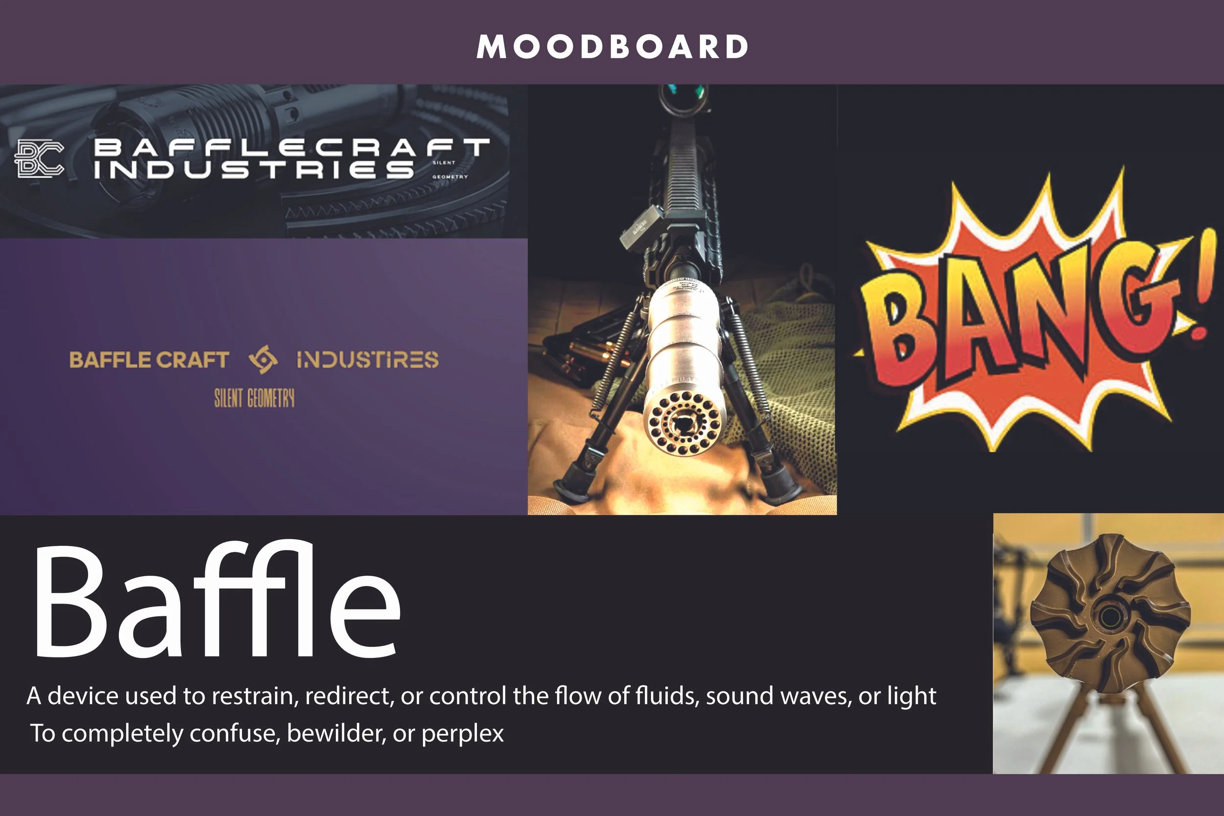
The identity started with the function of a baffle itself. A baffle controls and redirects the flow of sound, which reminded me of the way a camera shutter controls the flow of light through a lens.
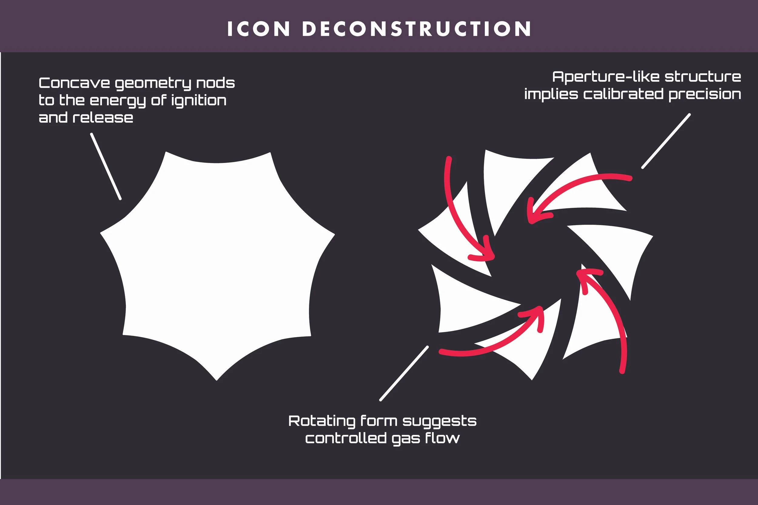
That connection became the foundation for the entire brand. I built the emblem around an aperture inspired shape, translating the mechanics of controlling sound into a visual language associated with controlling light. The rotating form also references gas flow, ignition, and the precision behind BaffleCraft’s products.
Logo System
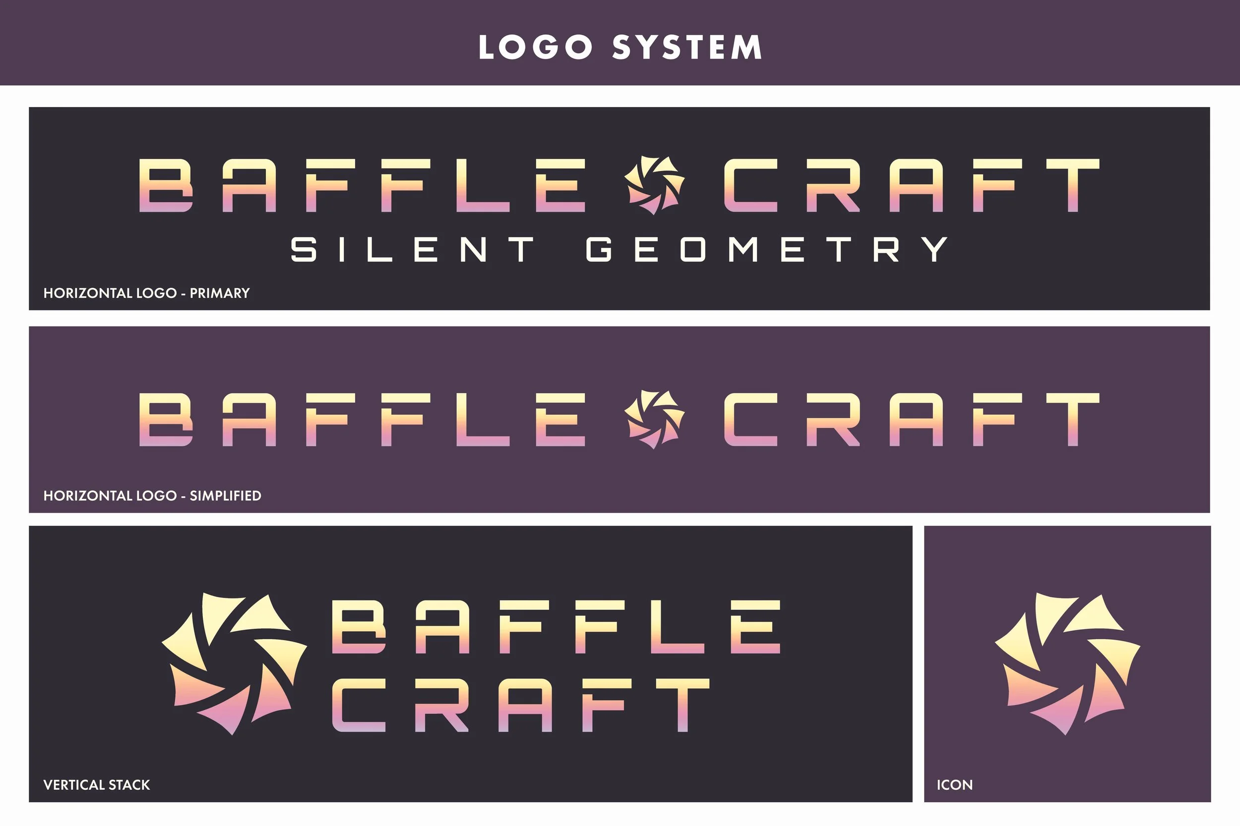
From there, I expanded the concept into a flexible logo system designed to work across different spaces and applications. The primary logo places the emblem directly within the BaffleCraft name, making the icon part of the identity rather than treating it as a separate addition.
The final system includes a primary horizontal logo with the tagline, a simplified horizontal version, a vertical stack, and a standalone icon. Each variation gives the brand room to scale while keeping the same recognizable geometry at its core.
Color + Typography
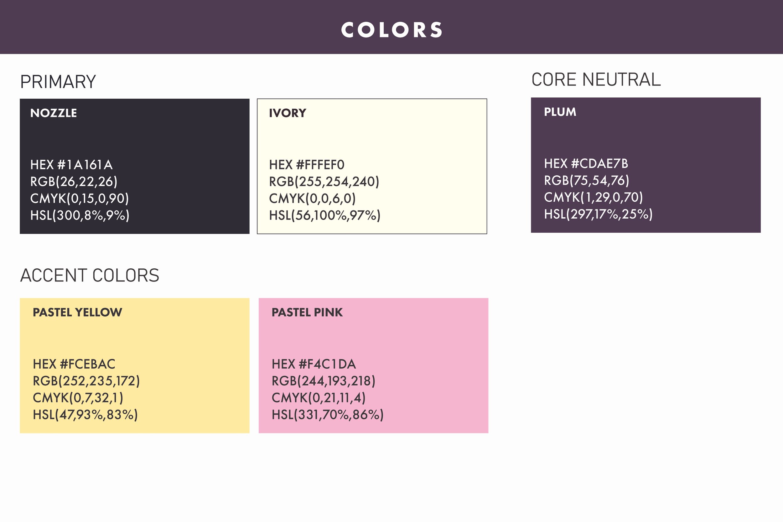
Rather than relying entirely on the black, gray, and military inspired colors commonly associated with the industry, I paired BaffleCraft’s dark foundation with plum, pastel yellow, and pastel pink. The softer colors create an unexpected contrast against the technical and masculine elements of the identity while still feeling cohesive with the brand.
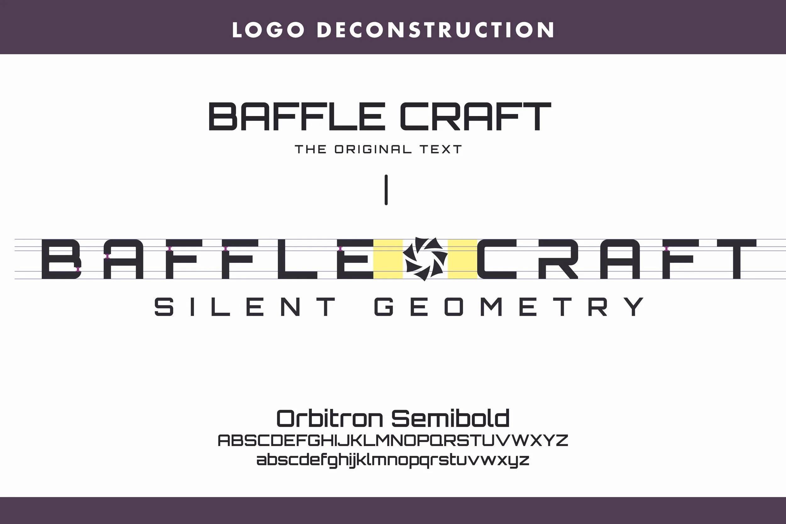
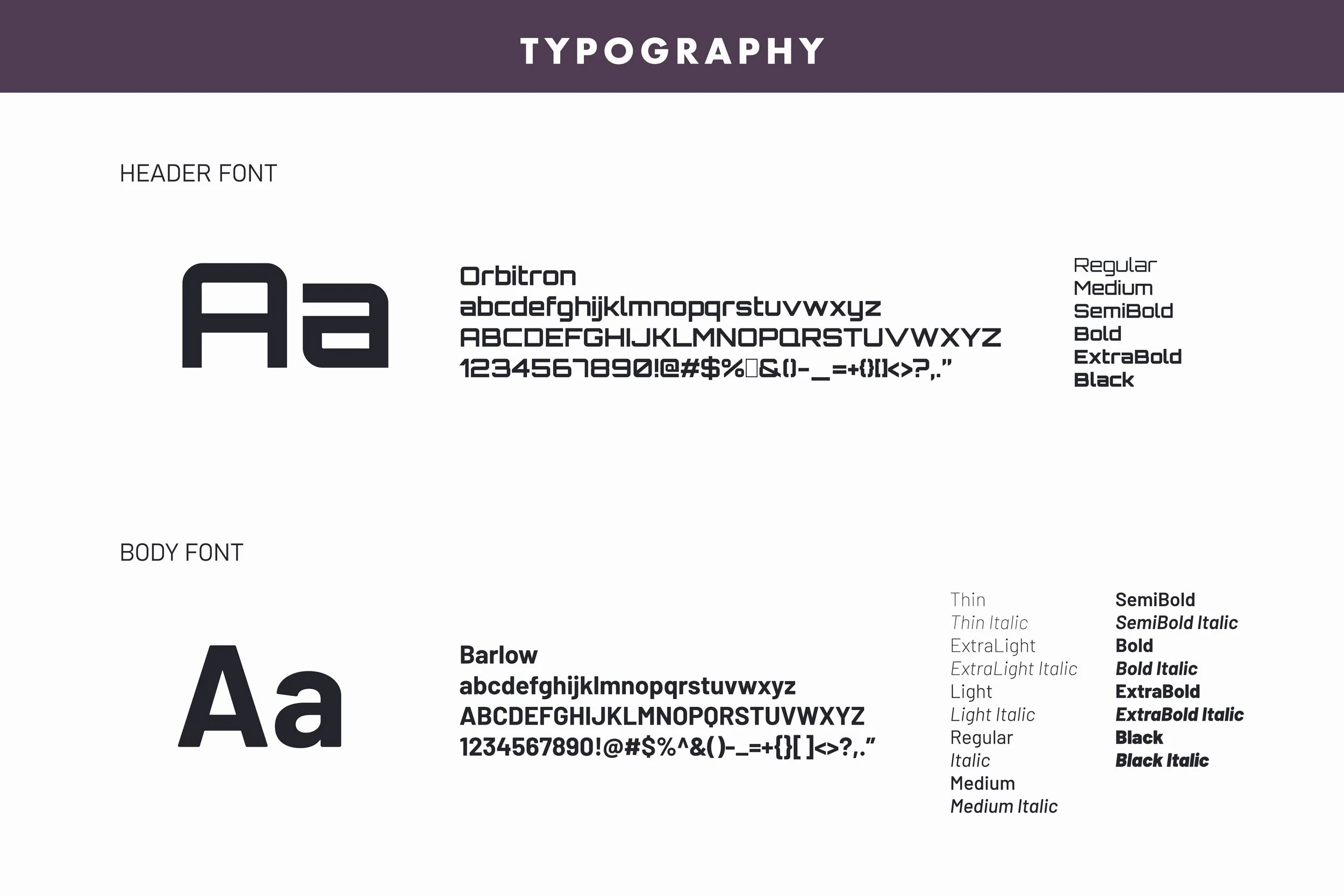
Orbitron reinforces the geometric, engineered quality of the logo, while Barlow provides a clean and functional typeface for longer content.
Brand In Practice
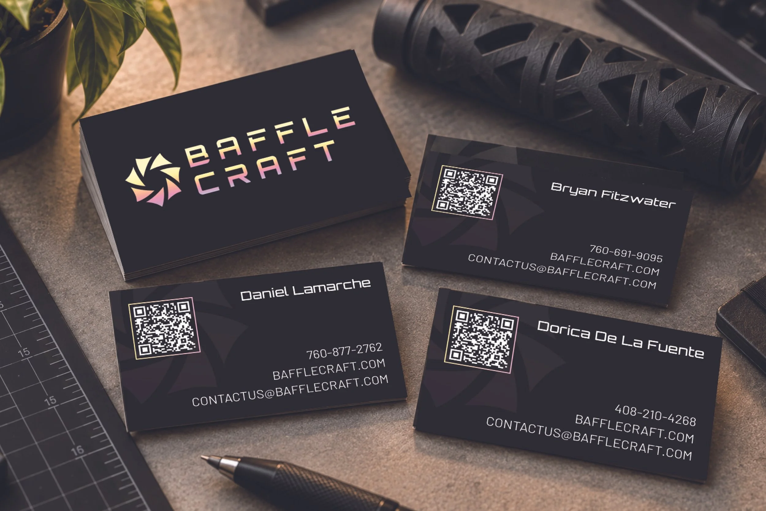
I carried the identity into BaffleCraft’s business cards, using the emblem as an oversized background element alongside the established typography, gradient details, and a QR code. The cards gave the brand a real world application while keeping the technical, futuristic feel of the larger system.
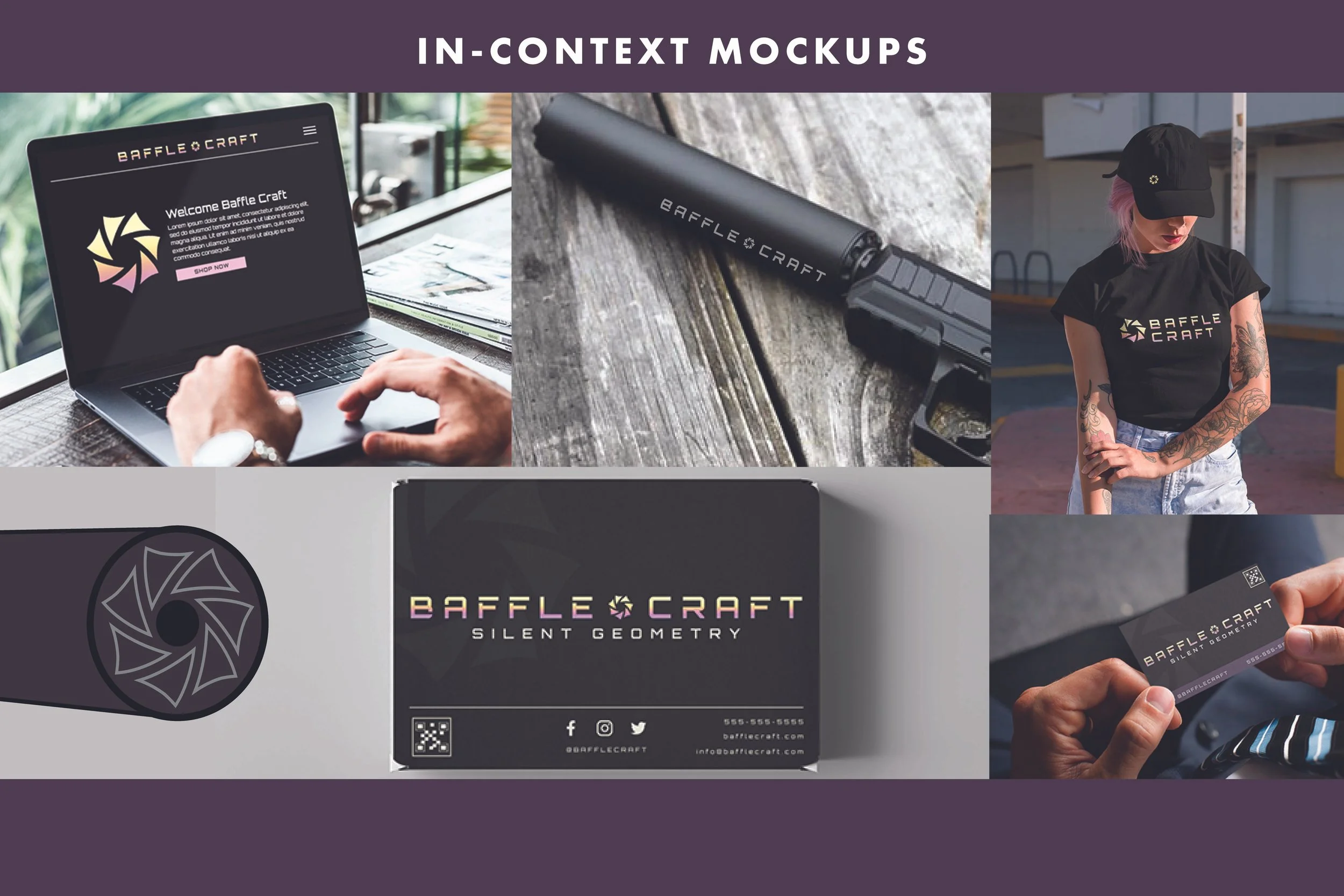
I also created a series of mockups to show the client how the identity could translate beyond the initial deliverables. These weren’t produced pieces, but visual examples of how the brand could live across merchandise, digital spaces, packaging, and products as BaffleCraft continued to grow.
Project credit: Created for Baffle Craft during my time at Blackbird Digital.
