
Shorts’ Lakehouse Cabins
Created at Blackbird Digital
Shorts Lakehouse Cabins is a family owned lakefront property in northwestern Montana, nestled in the Cabinet Mountains along Middle Thompson Lake. The property serves as both a lakeside event destination and an outdoor retreat, hosting weddings, private events, family gatherings, and overnight stays alongside hunting camps, fishing derbies, and other outdoor experiences. It brings together the more refined side of events and hospitality with the rugged character of its Montana setting.
Logo System
The Short family liked the idea of incorporating a bear paw into the identity, but I wanted to take it beyond a basic paw graphic and make it meaningful to their family and property.
Inside the paw, I created a small landscape based on their actual property along Middle Thompson Lake. The water cuts through the landscape in the shape of an S, representing both the lake and the Short family name, while the five claws represent the five members of the family. Together, those details turned a familiar outdoor symbol into something much more personal to them.
Because the property serves such different purposes, from weddings and private events to hunting and fishing trips, the identity also needed to feel gender neutral and versatile. I wanted it to have enough elegance for a wedding without feeling overly feminine, while still feeling natural in the more rugged side of the business.
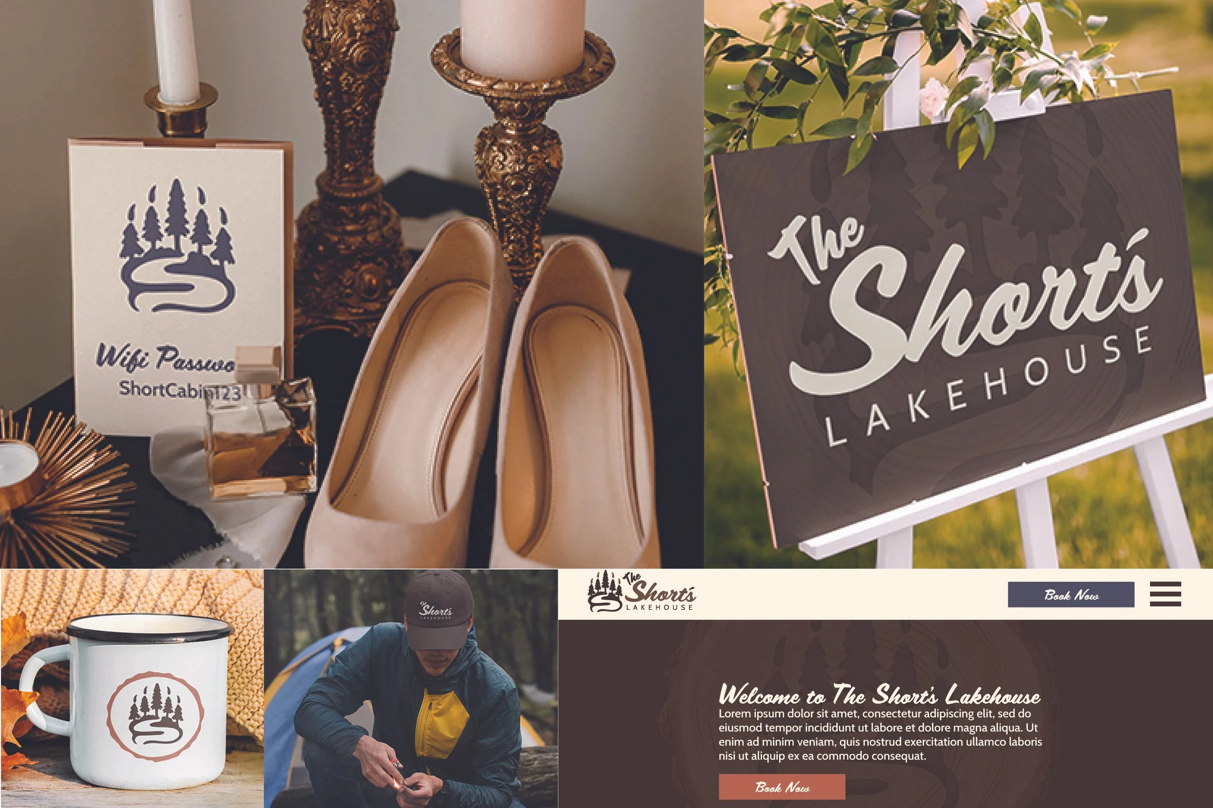
I expanded the concept into a flexible logo system with primary, vertical, wordmark, badge, icon, and emblem variations, giving the brand options for different spaces and applications.
Colors And Typography
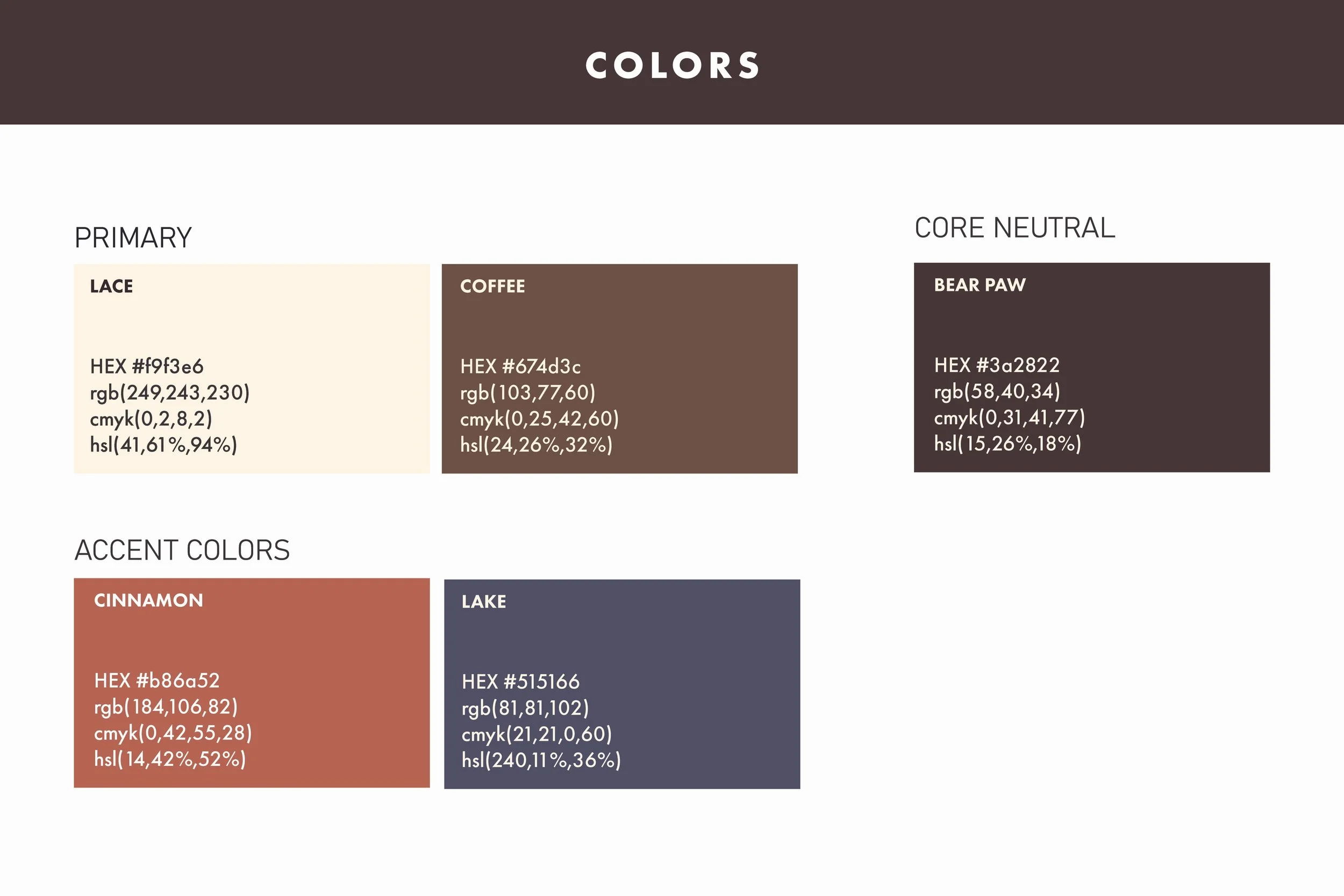
The visual system needed to work across very different sides of the business, from weddings and private events to hunting, fishing, and cabin stays. I used earthy browns and warm neutrals alongside muted terracotta and blue to keep the palette connected to the landscape while still giving it enough range for more elevated applications.
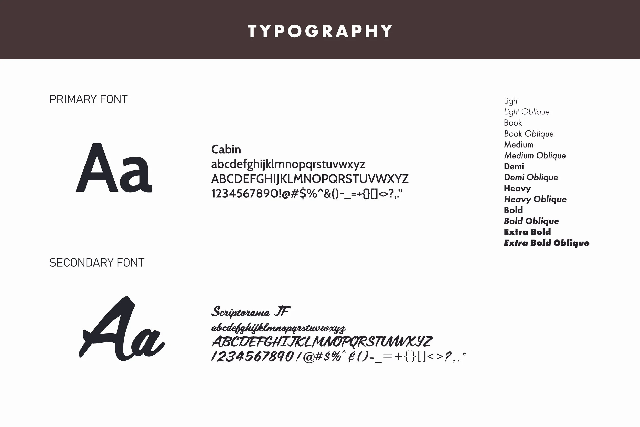
The script typography adds warmth and personality, while the supporting type keeps the system clean and easy to read. Together, they help the brand feel rustic and welcoming without leaning too far into traditional Western or novelty outdoor branding.
In Context
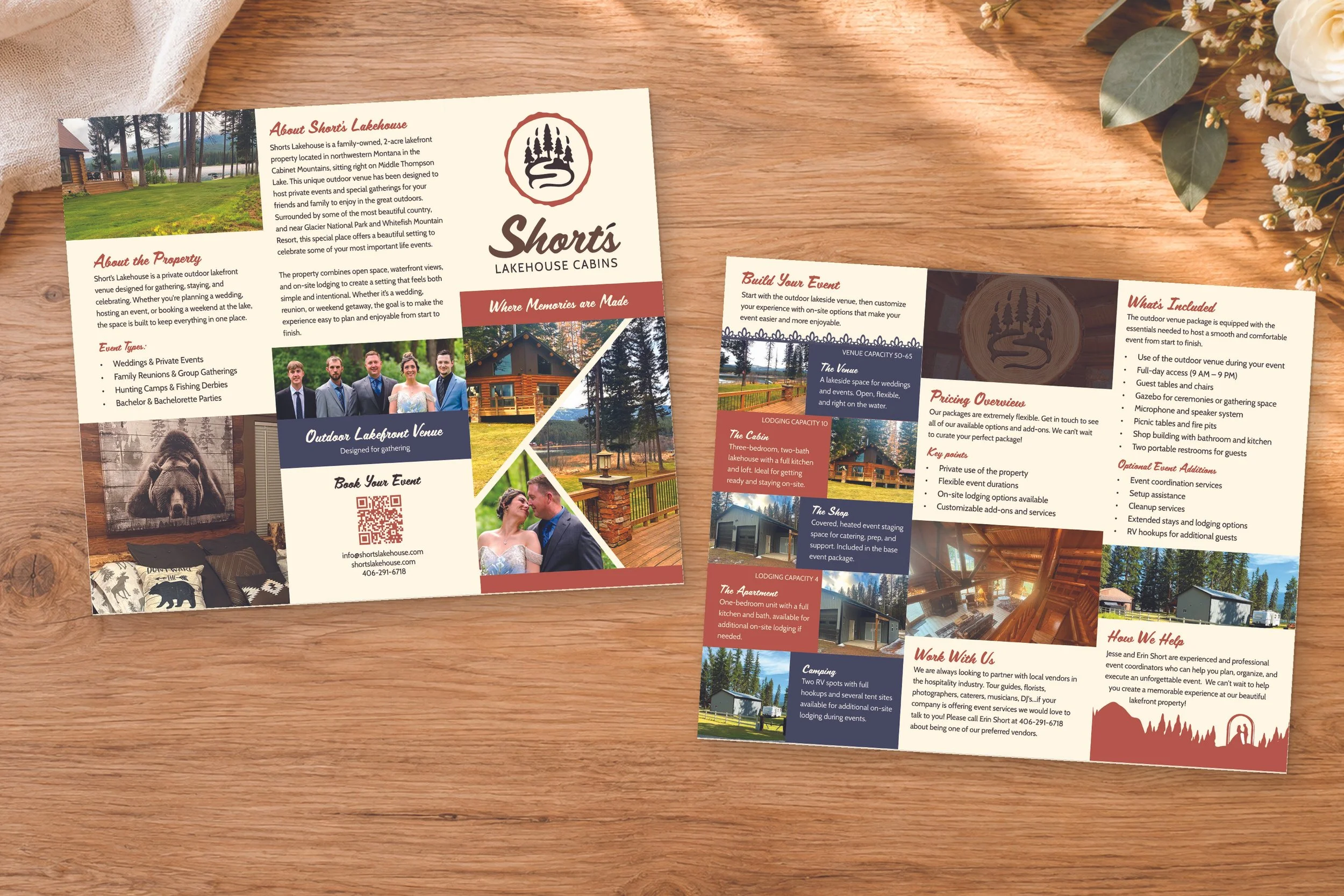
I carried the identity into a brochure designed for the property, using the full visual system to organize information about the venue, lodging, events, and available options.
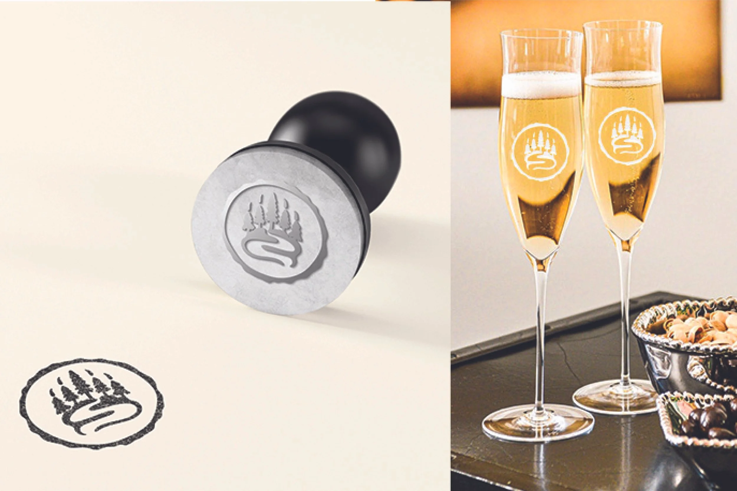
I also explored how the brand could extend beyond the brochure through in context mockups, including a branded stamp and champagne flute. These examples show how the identity could translate into smaller details throughout the guest and event experience without presenting them as produced deliverables.
Project credit: Created for Short’s Lakehouse Cabins during my time at Blackbird Digital.
