
Platinum Training & Fitness
Created at Blackbird Digital
Platinum Training & Fitness is a boutique gym in Post Falls focused on creating a more comfortable, premium approach to fitness. Formerly known as Shift, the business had grown beyond personal training and needed an identity that could grow with it.
Before I started designing, I met with Cameron Ripatti, one of Platinum’s founders, at the facility and toured the space to understand the environment firsthand. He wanted something that felt new age, appealed to a younger audience, and carried a sense of exclusivity without becoming intimidating.
Finding The Concept
From the beginning, I knew Platinum needed to mean something. Metals were already part of the business, including the way its training packages were named, so I started exploring how that idea could become part of the identity.
My moodboard pulled together fitness brands, simple recognizable marks, platinum itself, and different examples of scientific inspired design. I was especially drawn to brands like Spiceology and the way scientific notation could become part of a visual system rather than just decoration.
That led me to start researching platinum itself. I looked into the element, its symbol, and the numbers associated with it until I landed on two pieces that immediately stood out:
Pt. Element 78.
From there, I finally had something I could build on.
Logo System
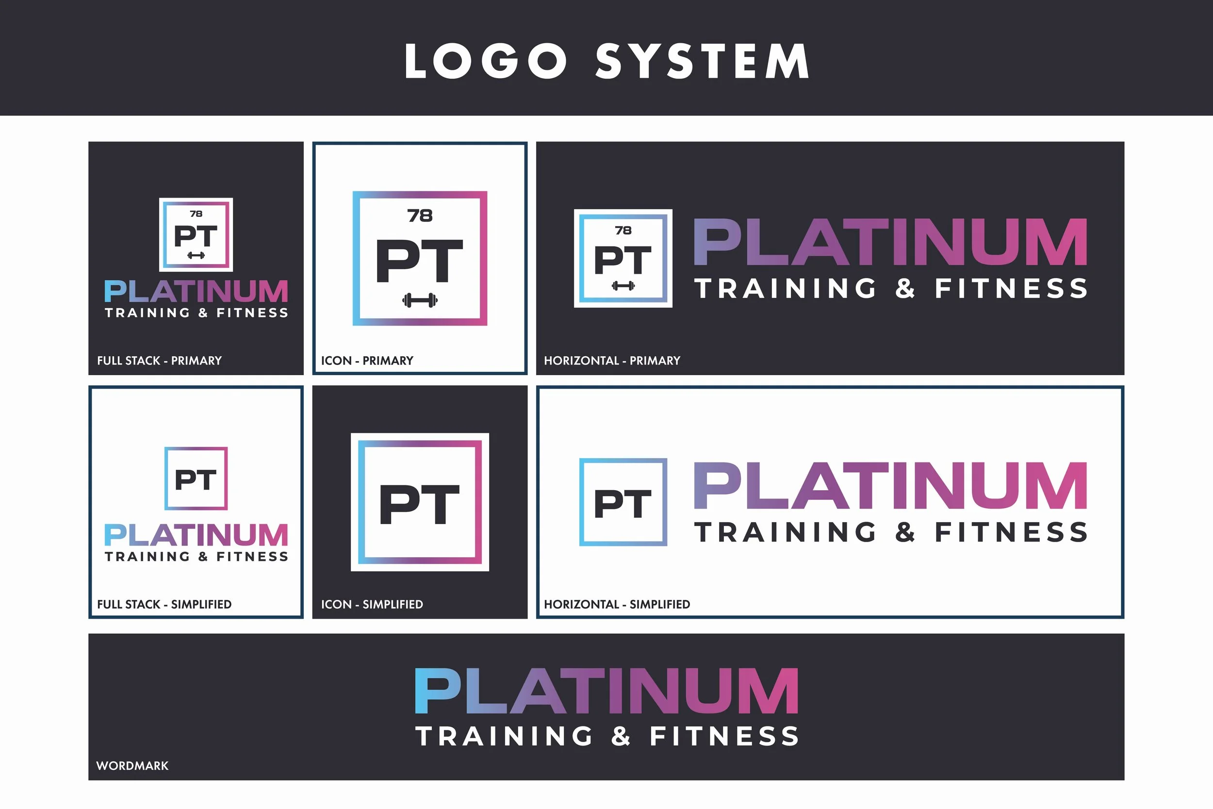
The periodic table became the foundation of the identity. I combined PT with platinum’s atomic number, 78, and a simplified barbell to create a mark that connects the name directly back to fitness.
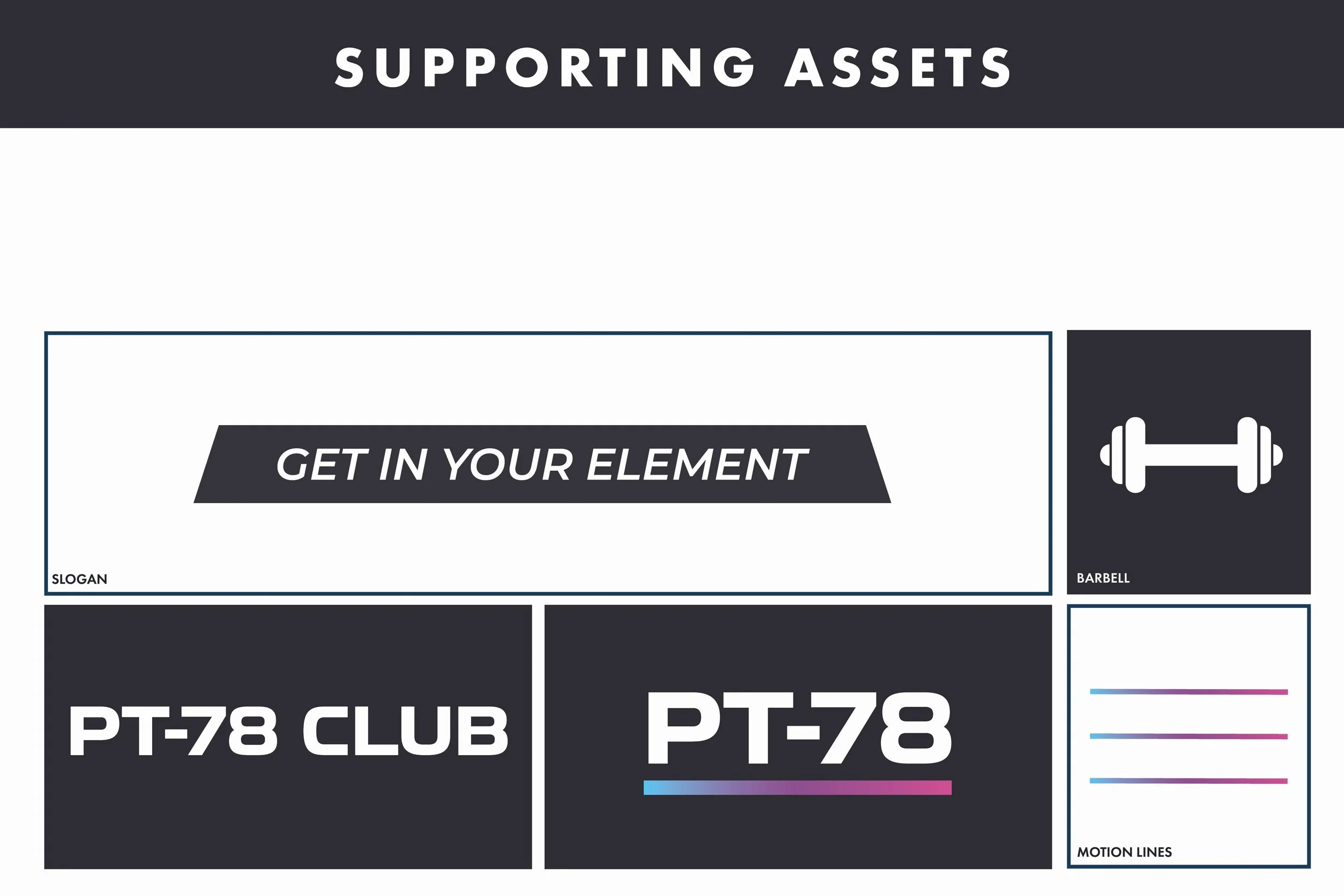
That idea eventually became something bigger: PT 78 Club. The number felt almost like a code, giving the identity the modern, slightly mysterious quality I had been looking for. Turning it into a club also brought in the sense of exclusivity Cameron wanted from the beginning. Instead of Platinum simply being the name of the gym, PT 78 became something members could belong to.
I developed the concept into a full logo system with stacked, horizontal, wordmark, icon, and simplified variations so the identity could adapt across everything from large signage to small applications.
The system also grew to include dedicated PT 78 Club and PT 78 marks, a platinum ingot, barbell, and motion lines. During that same exploration, I landed on Get In Your Element and immediately fell in love with it. The phrase feels empowering in the context of fitness while carrying a second meaning within the brand: platinum is quite literally an element.
Color & Typography
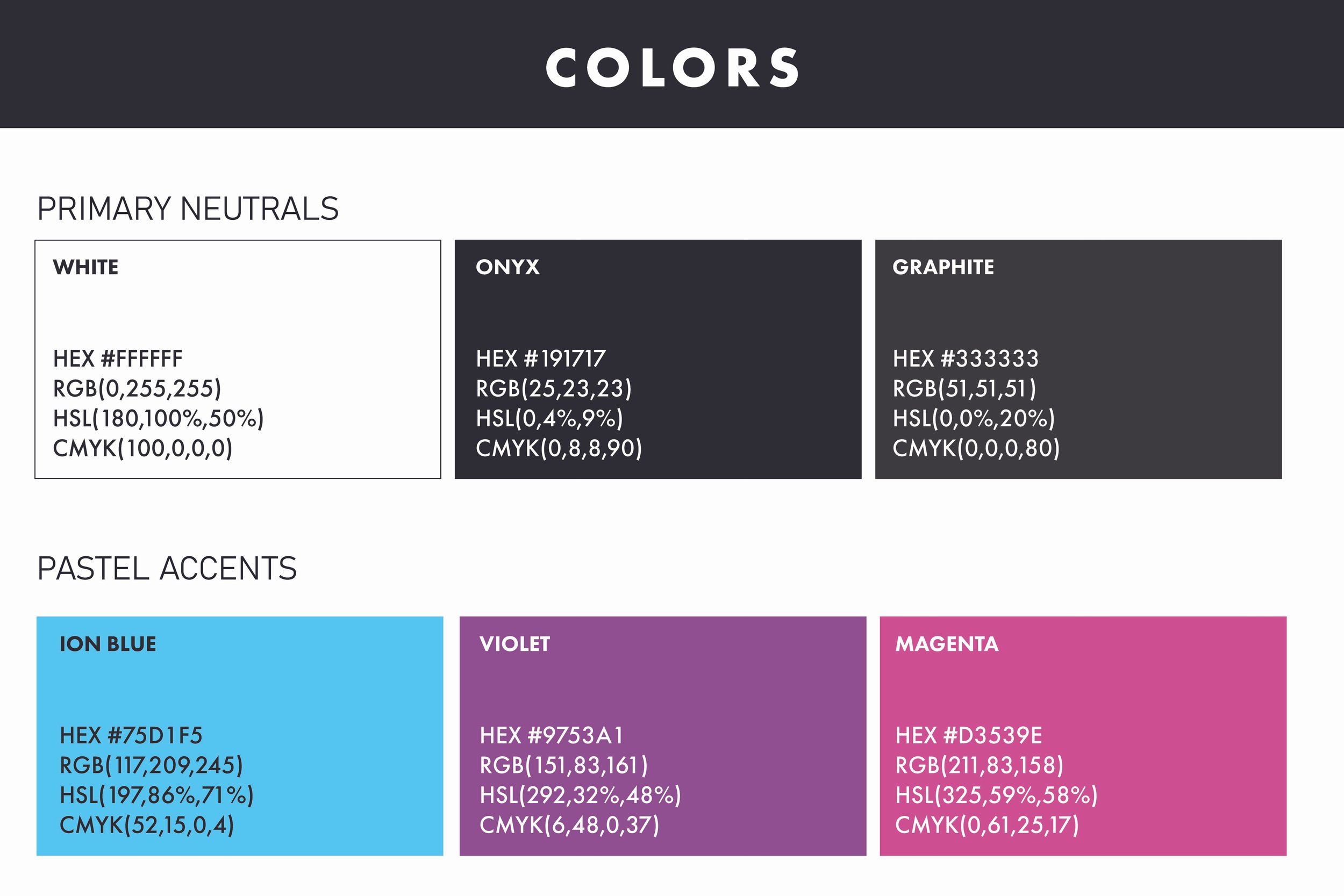
The color system builds from a dark, neutral foundation of black, white, and graphite, with Ion Blue, Violet, and Magenta bringing energy into the identity. I blended the accent colors into a signature gradient that almost glows against the darker backgrounds, helping the brand feel vibrant and modern while maintaining the premium feeling we were after.
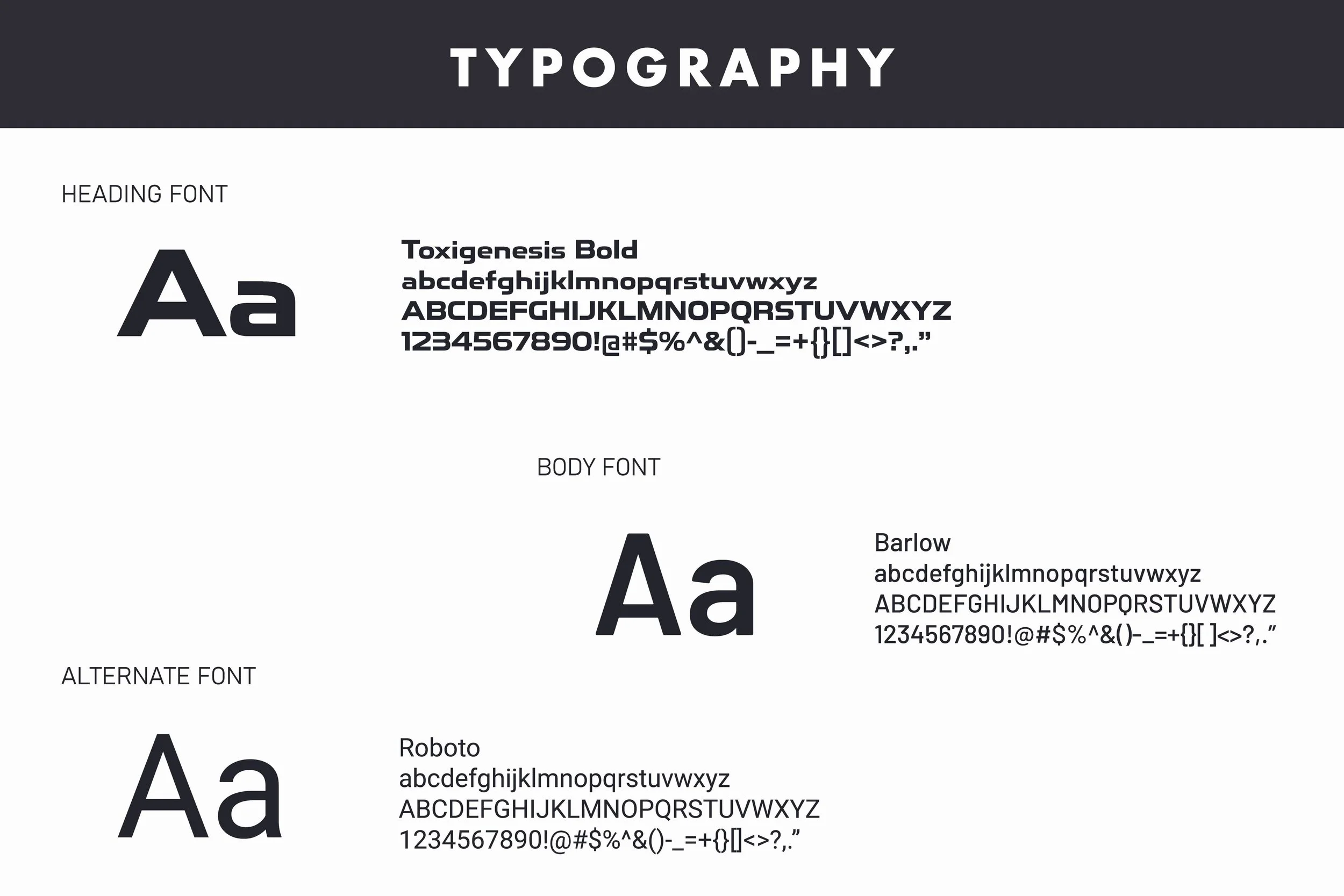
For typography, I paired Toxigenesis Bold with Barlow. Toxigenesis brings in the futuristic, athletic personality of the identity, while Barlow keeps supporting information clean and easy to read. Together, they give Platinum a bold fitness presence without relying on the aggressive visual language often associated with gyms.
Taking The Brand Online
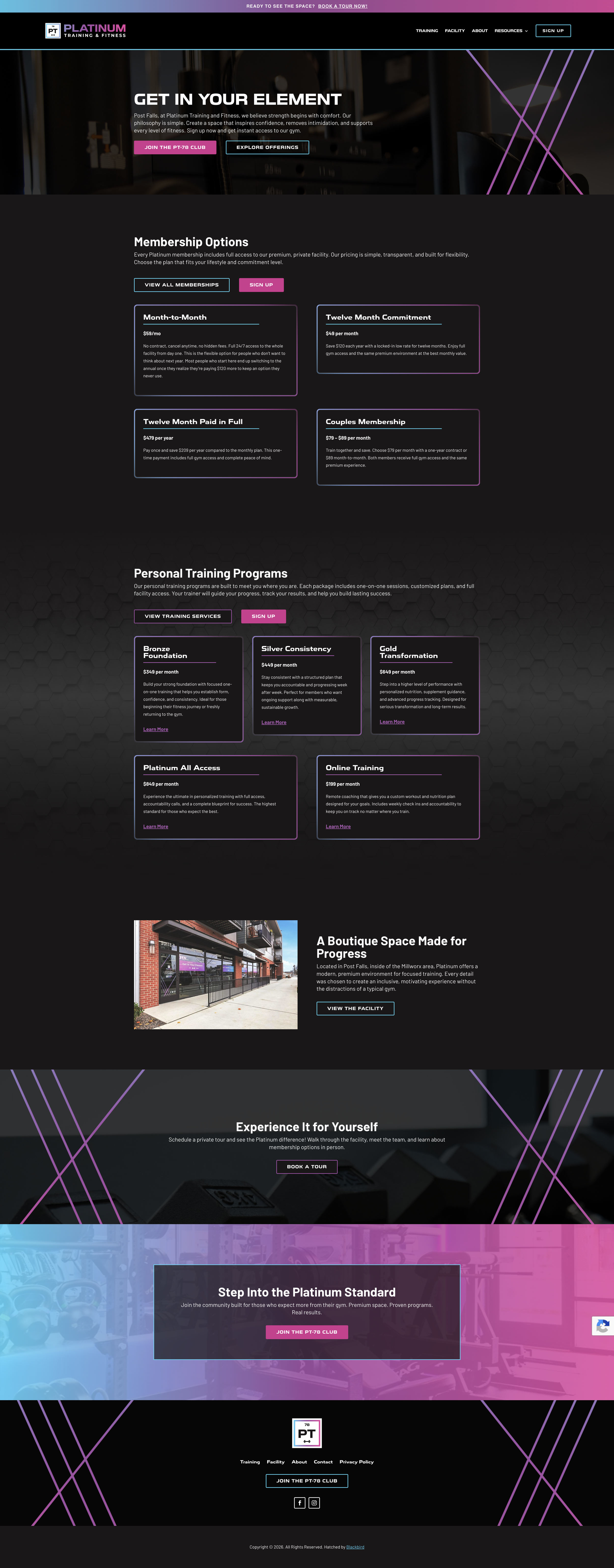
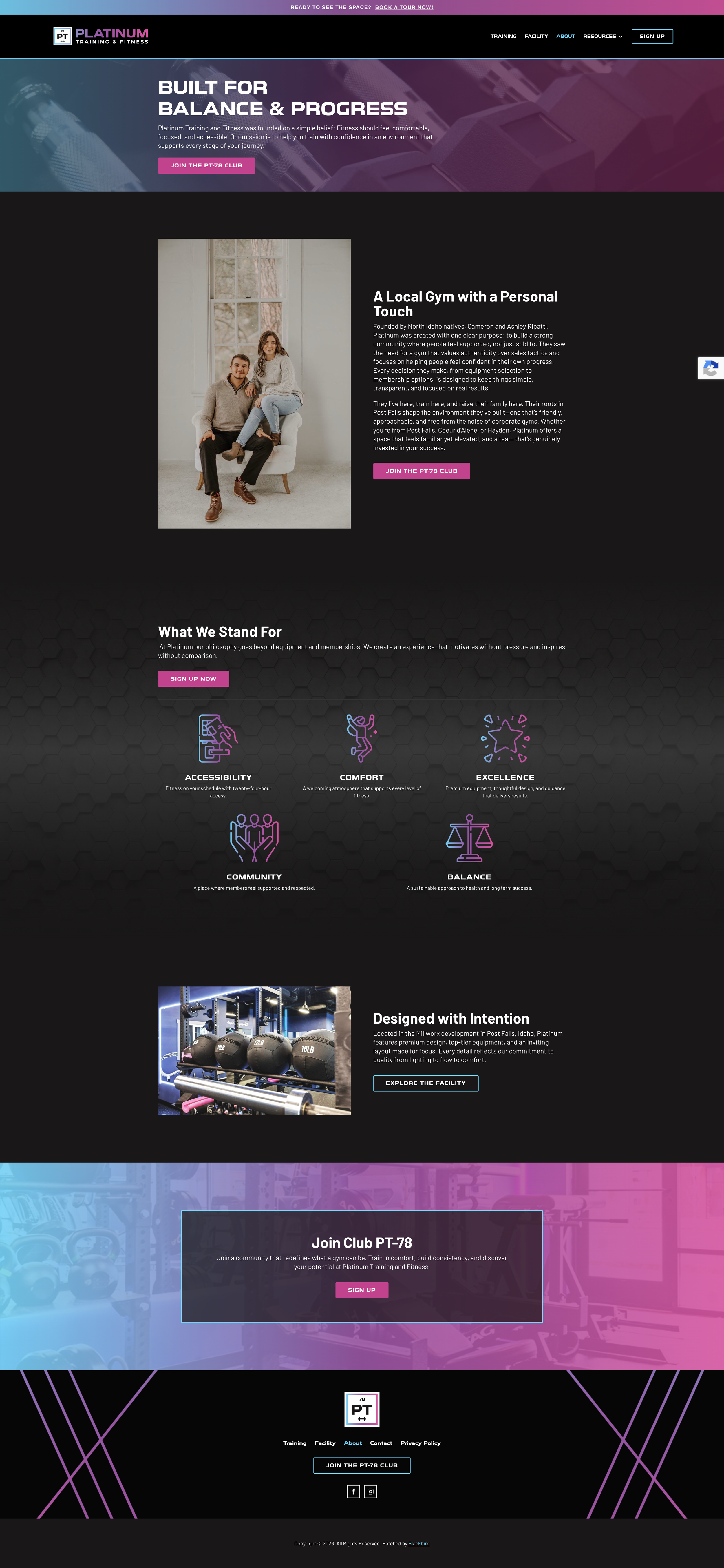
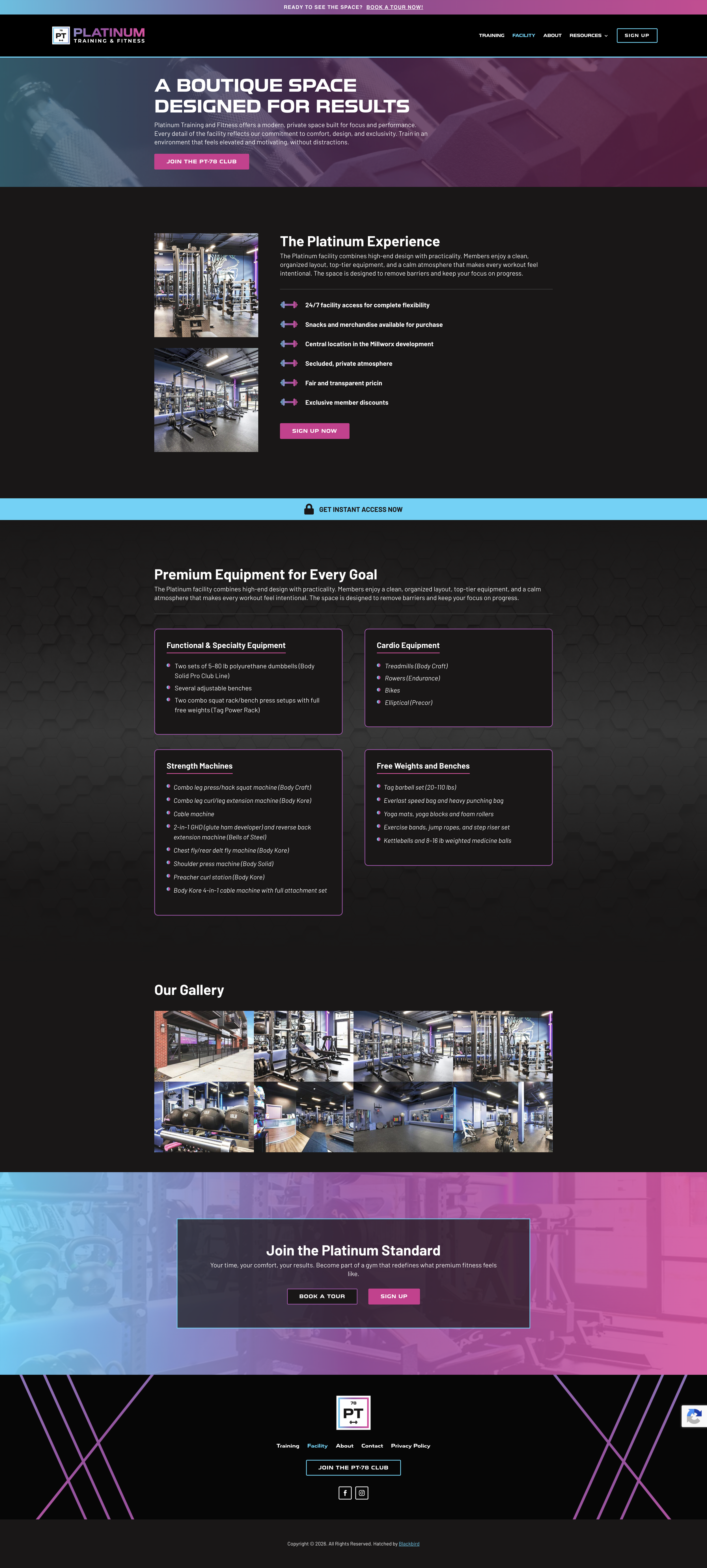
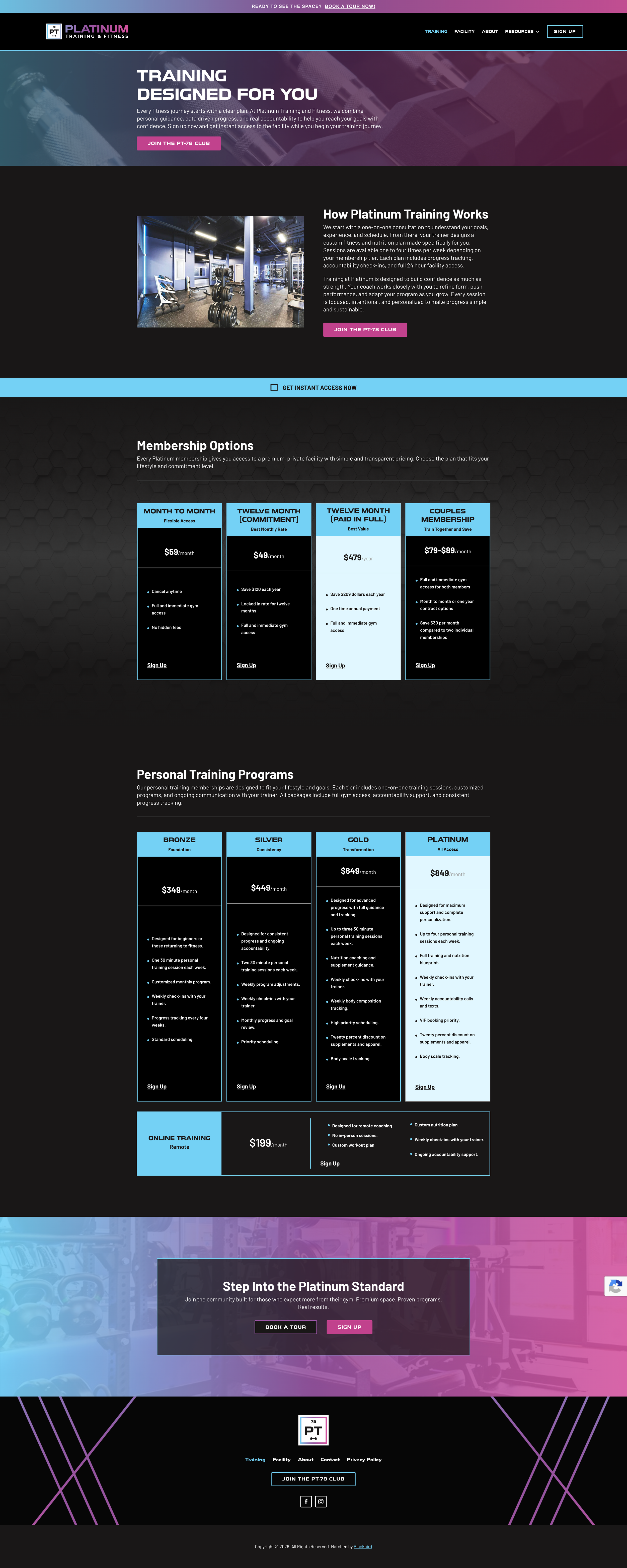
Once the identity was established, I carried the system into a full website for Platinum.
The dark foundation, glowing gradient, bold typography, and graphic elements gave me a strong visual language to work with, while the structure of the site focused on making the gym itself feel approachable and easy to explore.
I also carried the brand language into the experience. Get In Your Element became a central message, while PT 78 Club helped frame membership as belonging to something rather than simply signing up for a gym.
The finished site brings the identity and the business together, giving Platinum a digital presence that feels like the same brand members experience when they walk through the door.
Bringing The Brand To Life
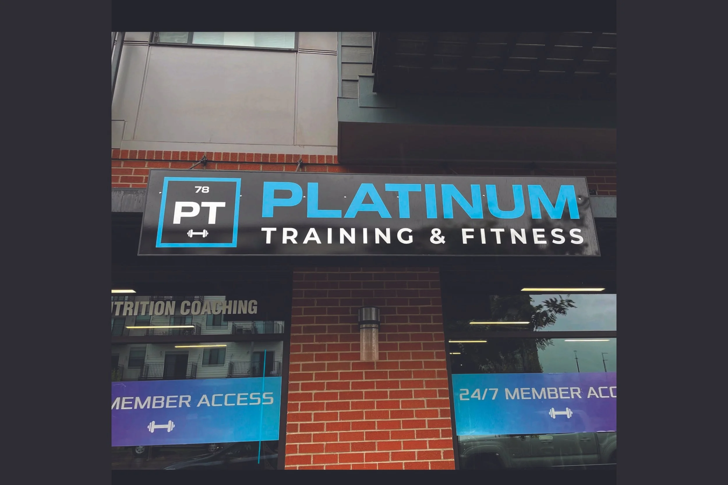
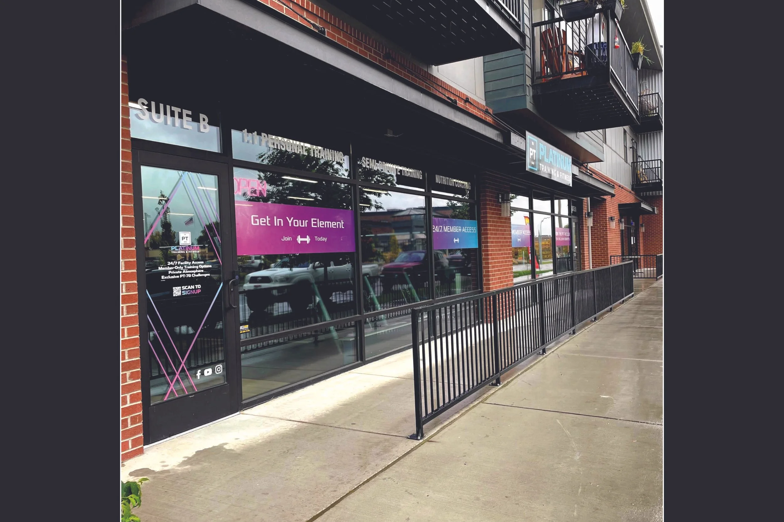
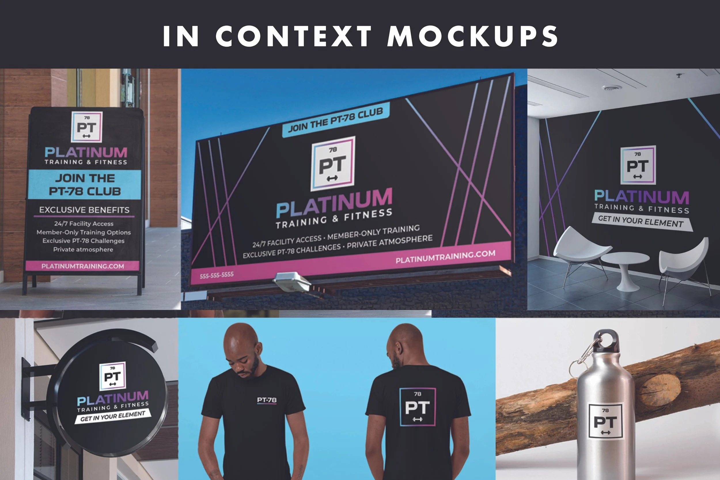
Beyond the website, I carried the identity into a mix of real applications and concept mockups to explore how the system could live at different scales.
I designed a large scale window wrap for the facility along with branded T-shirts using the new identity. I also created concept mockups for for a range of items to visualize how Platinum could extend into the physical space, merchandise, and advertising.
Project credit: Created for Platinum Training & Fitness during my time at Blackbird Digital.
