
Quirkie Dough
Created at Blackbird Digital
Quirkie Dough is a dessert shop serving safe-to-eat raw cookie dough and specialty treats in a space designed to be just as fun as the desserts themselves.
The owner, Sabrina Whitcomb, came to Blackbird Digital with a vision for something loud, colorful, maximalist, and unapologetically playful. Inspired by a girly, Y2K, dopamine theme, we set out to create an identity packed with personality, self-expression, and a little bit of quirk.
Logo System
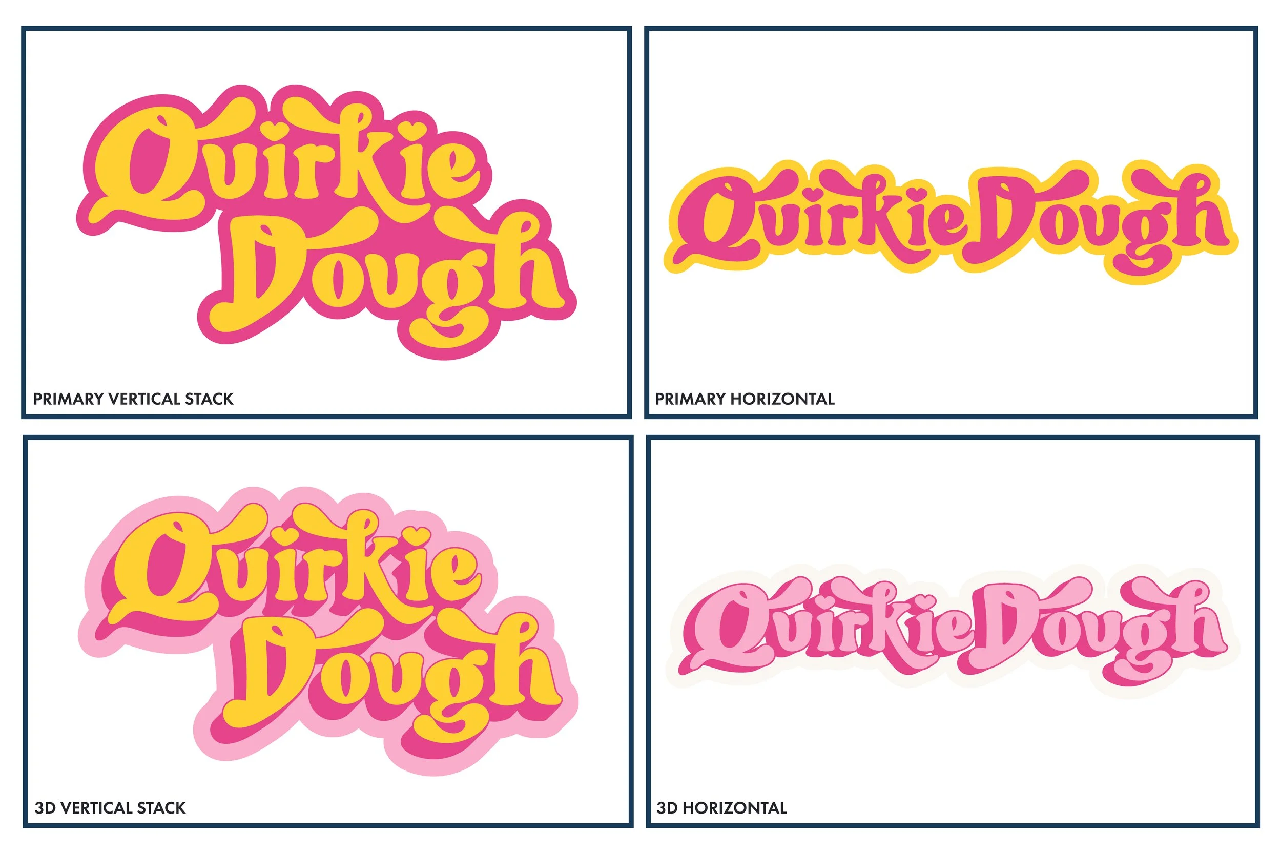
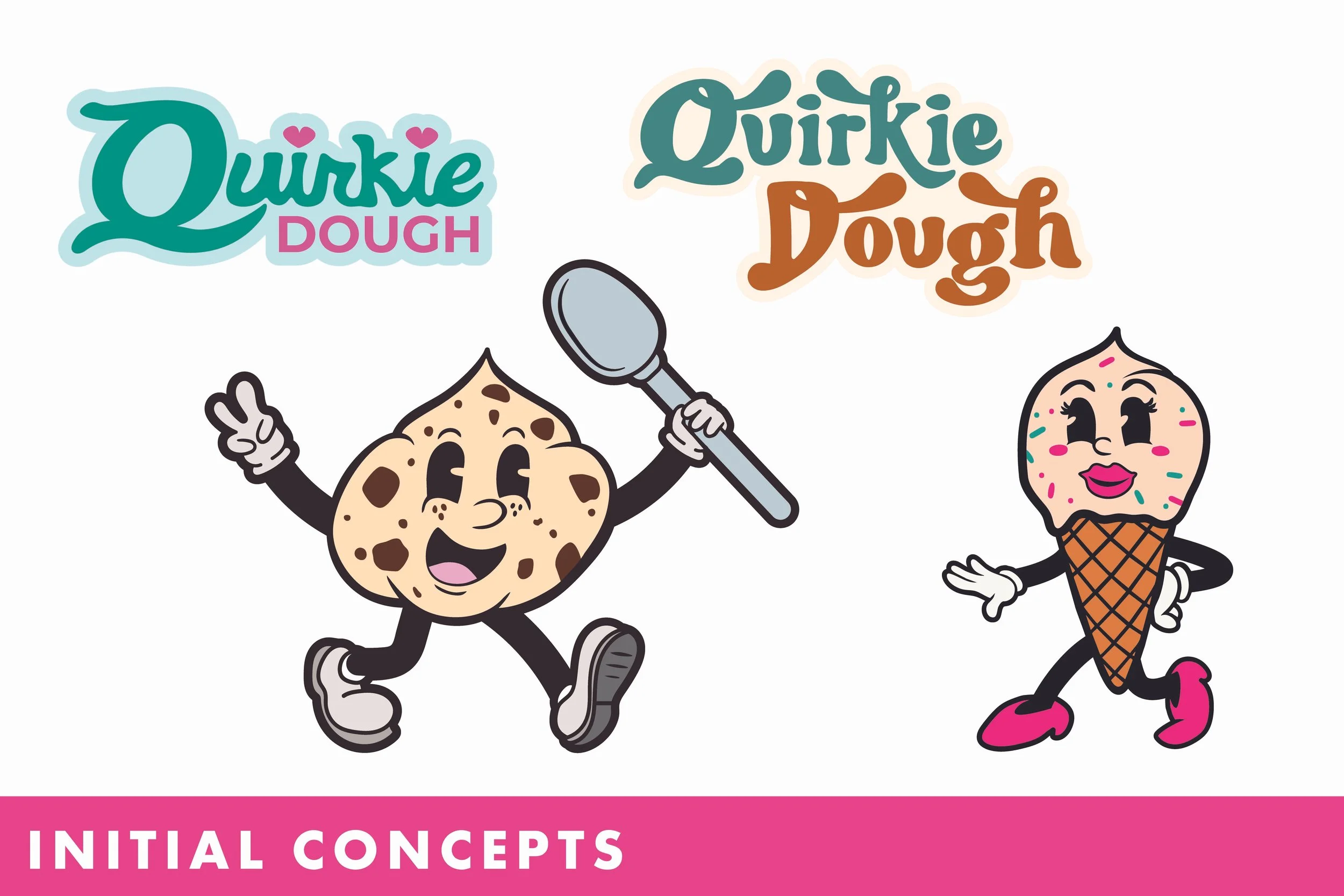
I wanted the Quirkie Dough wordmark to feel like the product itself: thick, soft, slightly stretched, and doughy. I started with an existing typeface and heavily customized the letterforms until the logo developed a personality of its own.
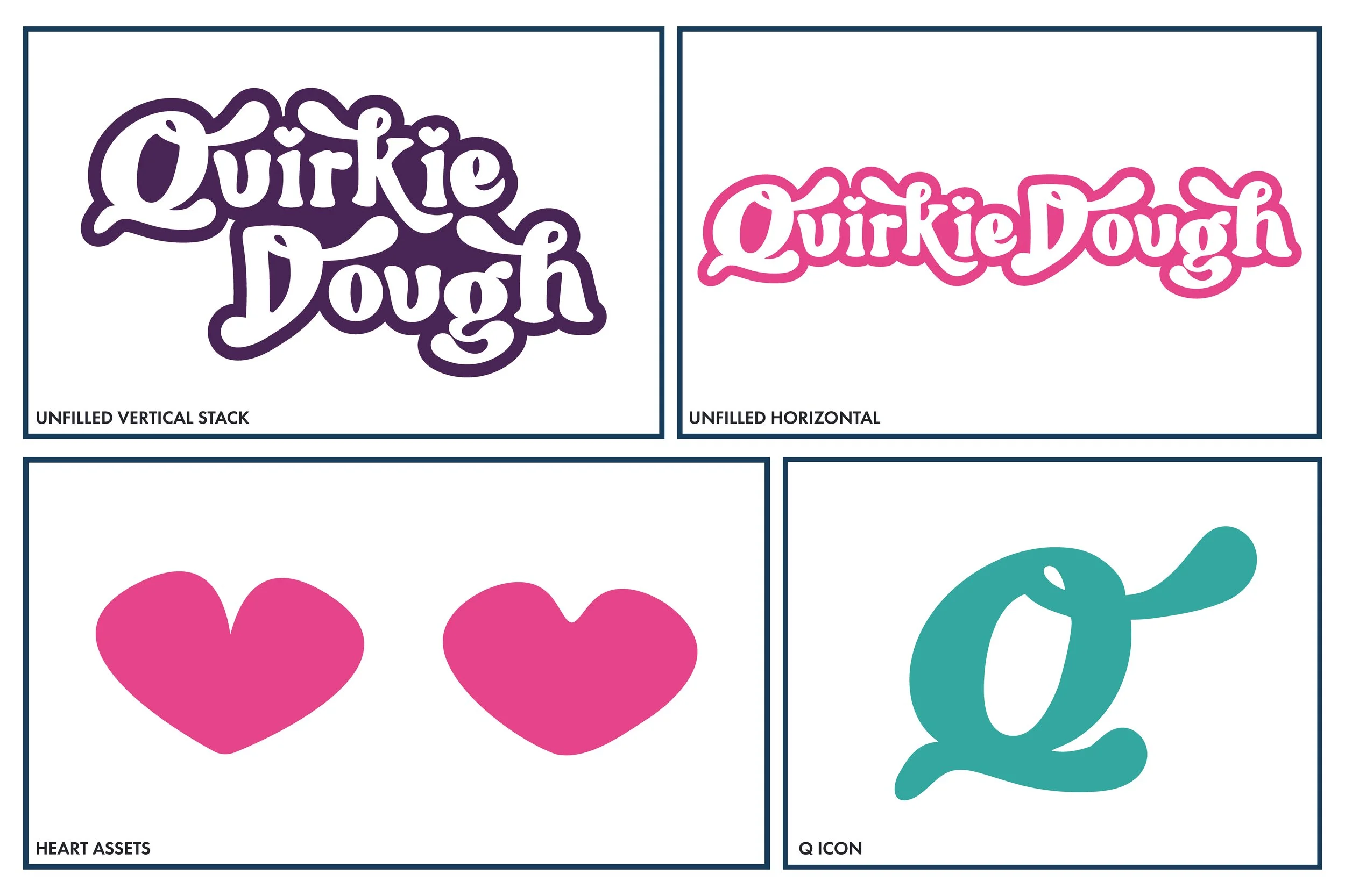
The heart tittles were inspired by Quirkie Dough's audience: the quirky girls who might dot the i's in their names with hearts. It was a small detail that captured the hyper-girly, youthful energy of the brand perfectly.
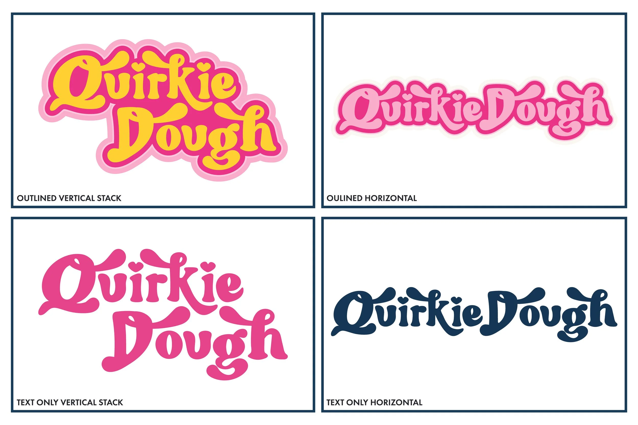
The final wordmark grew into a flexible logo system with multiple lockups and treatments for everything from signage and merchandise to smaller, more functional applications.
Meet The Cup-ple
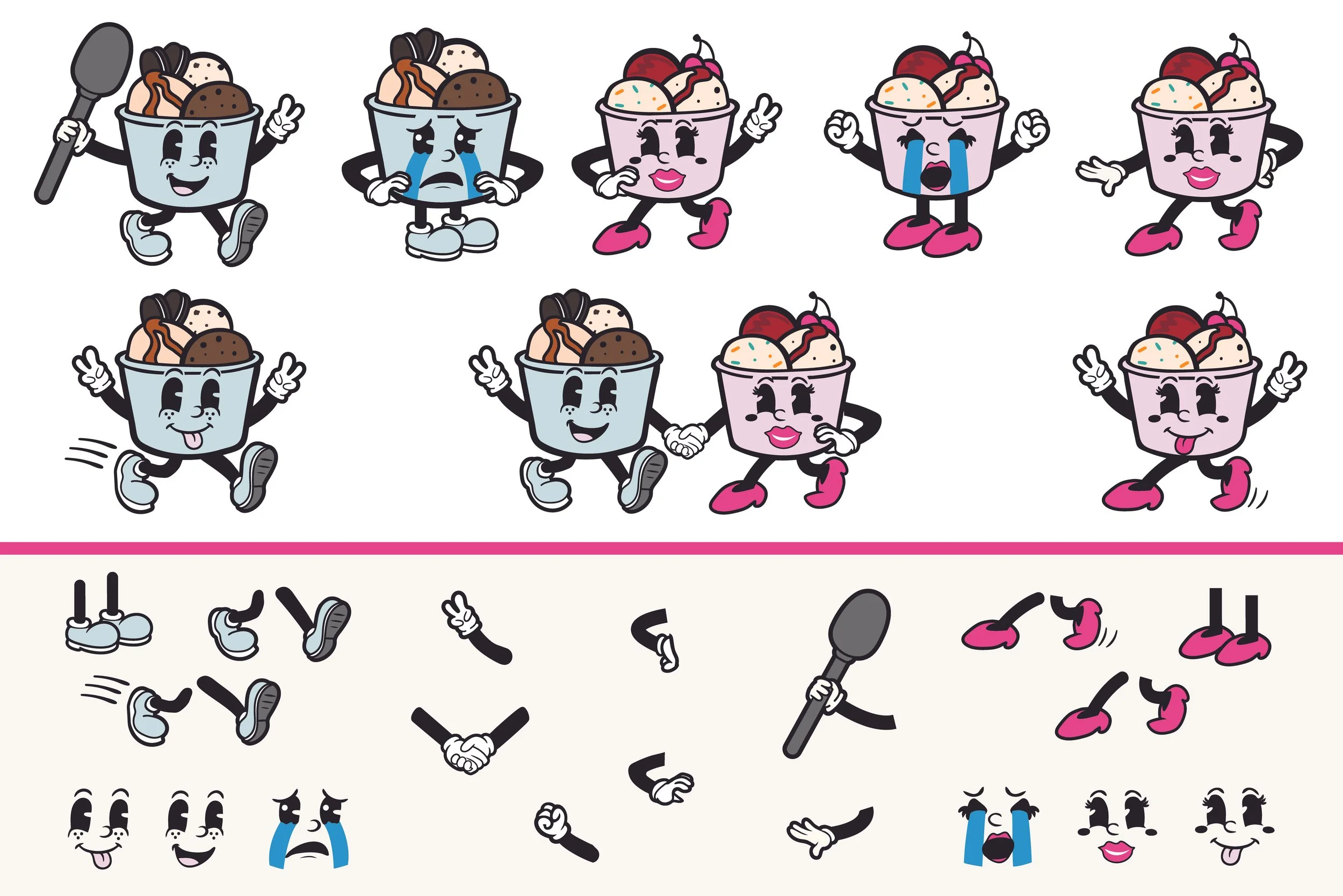
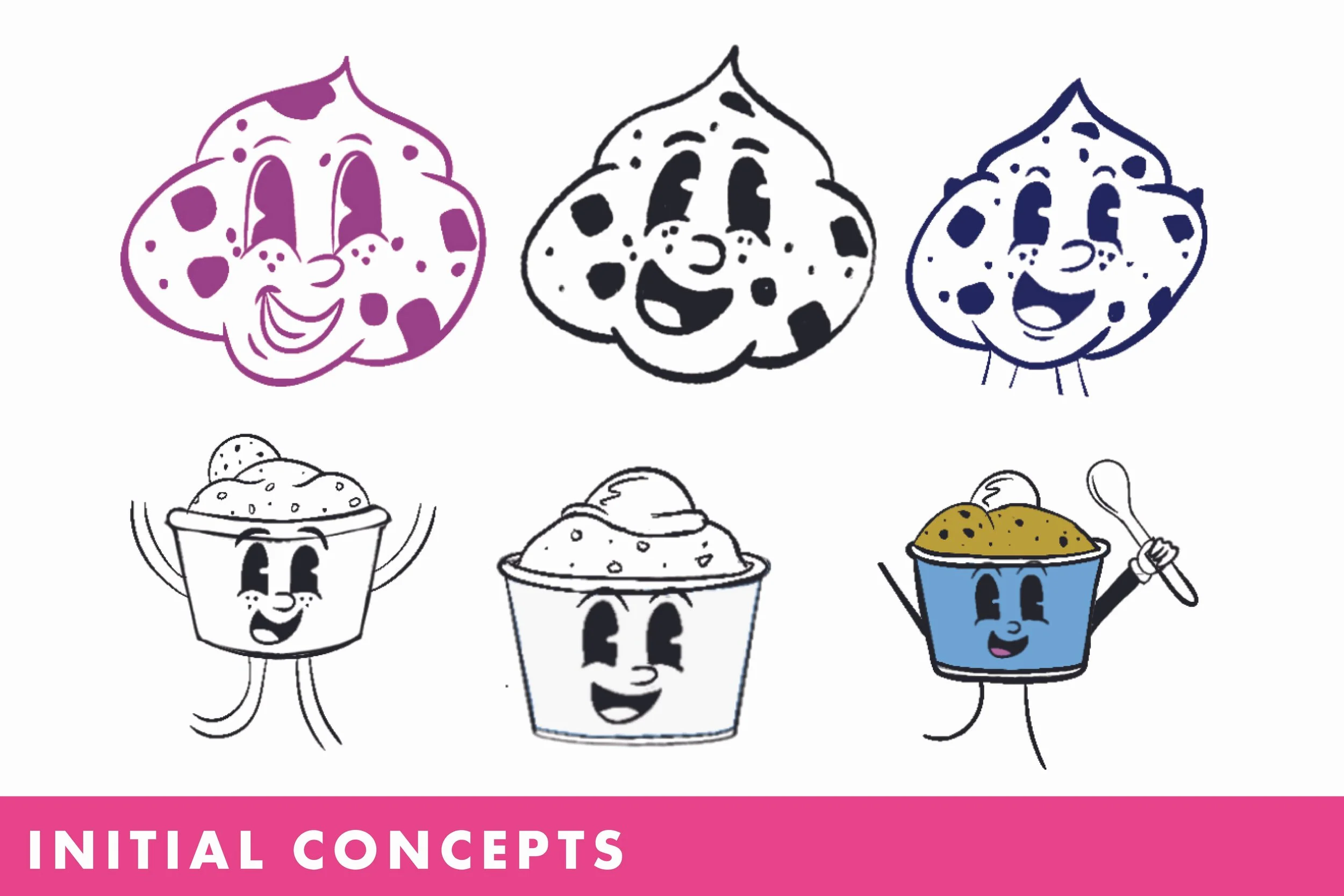
The mascots started as literal pieces of cookie dough, but without any context, they could be interpreted as... a lot of things. Putting the dough into a cup made the product immediately recognizable and gave me a much stronger character to build from.
I did extensive research into rubber hose animation and character design, studying the exaggerated limbs, simple shapes, expressive poses, and vintage personality of the style before developing the mascots further.
Eventually, one cup became two, and The Cup-ple was born.
I developed the pair into a modular mascot system with their own faces, shoes, expressions, and personalities, along with interchangeable arms and gestures. This gave Quirkie Dough a cast of characters that could keep changing and interacting without losing what made them recognizable.
Color System
Quirkie Dough needed color. A lot of it.
The final palette centers around raspberry pink and goldenrod yellow, supported by deep text colors, soft pastel backgrounds, and bright accent colors. The variety gives the brand plenty of room to play while keeping the signature pink and yellow at its core.
Typography
A maximalist brand needed a typography system that could embrace a little chaos.
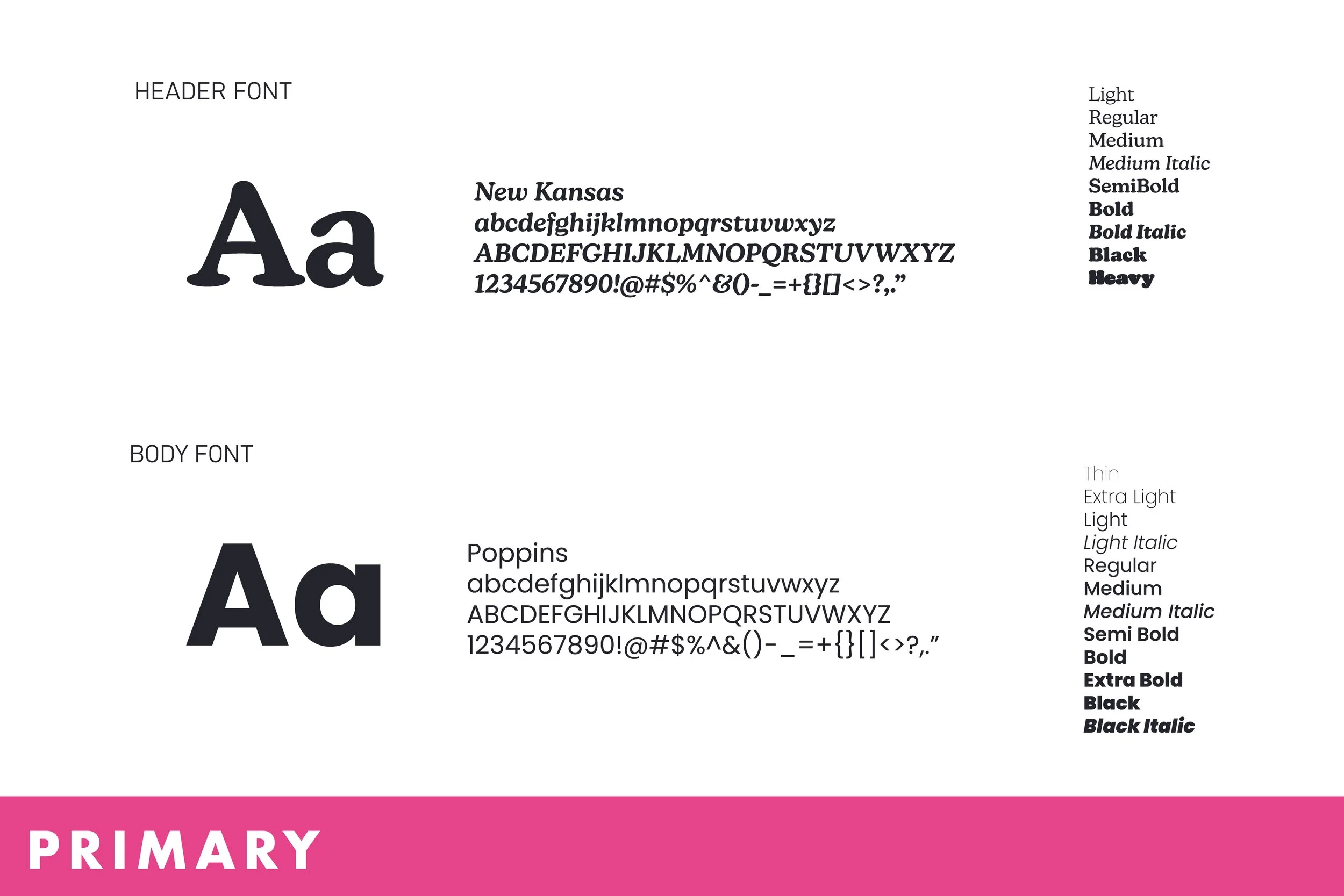
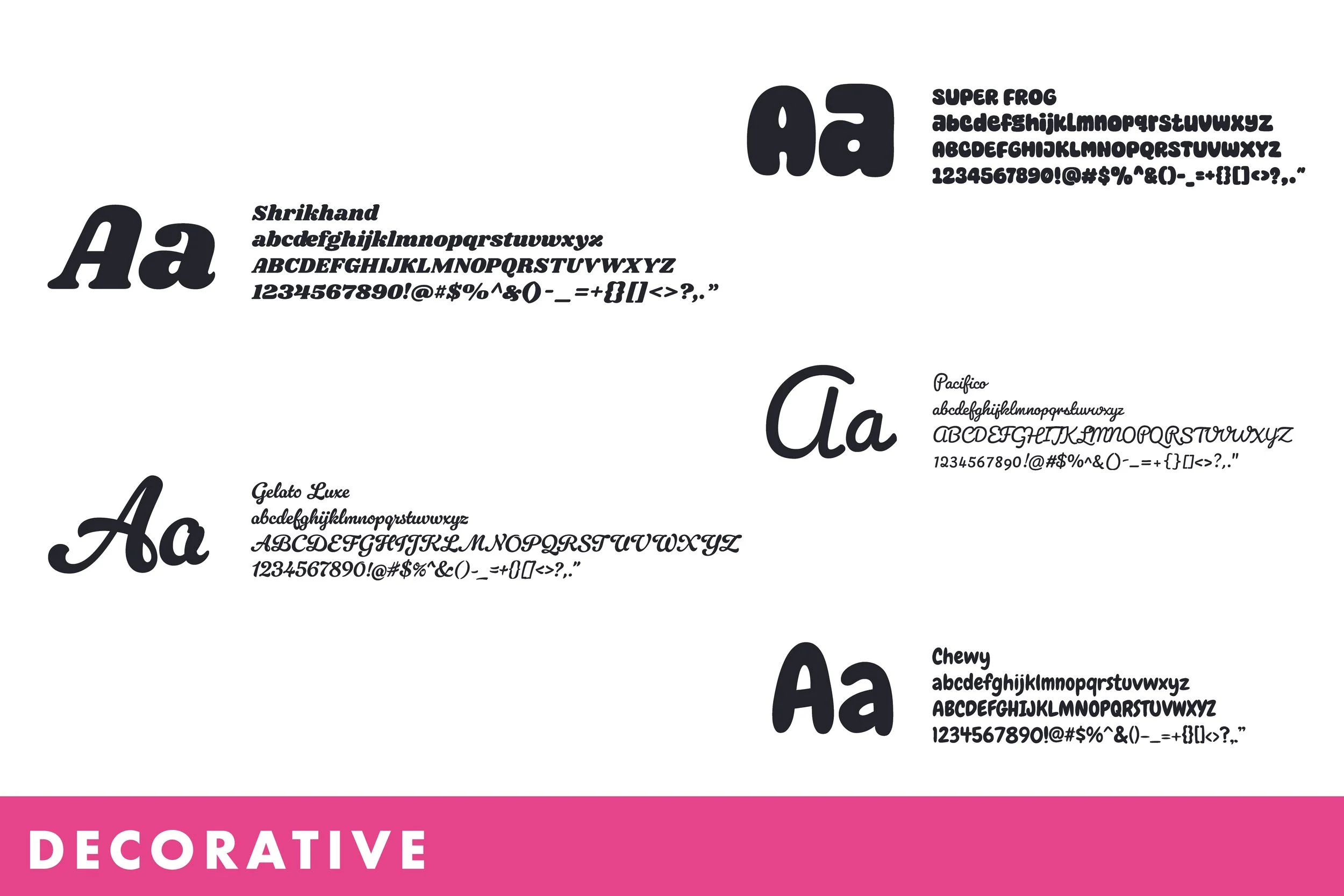
New Kansas and Poppins provide a consistent, readable foundation, while a collection of expressive display typefaces gives the brand room to change personalities across graphics, signage, and marketing.
Mixing typefaces isn't something the system tries to avoid. It's encouraged. The goal is to keep things joyfully busy without losing readability or consistency.
Website
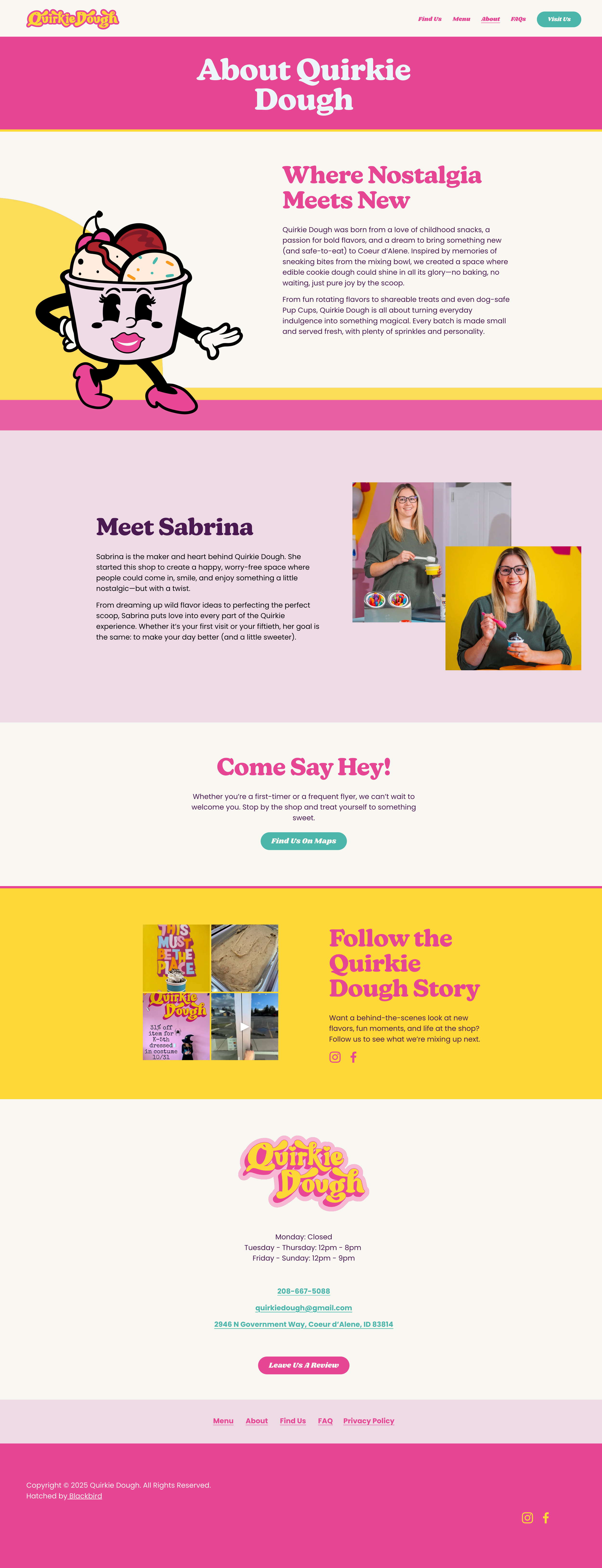
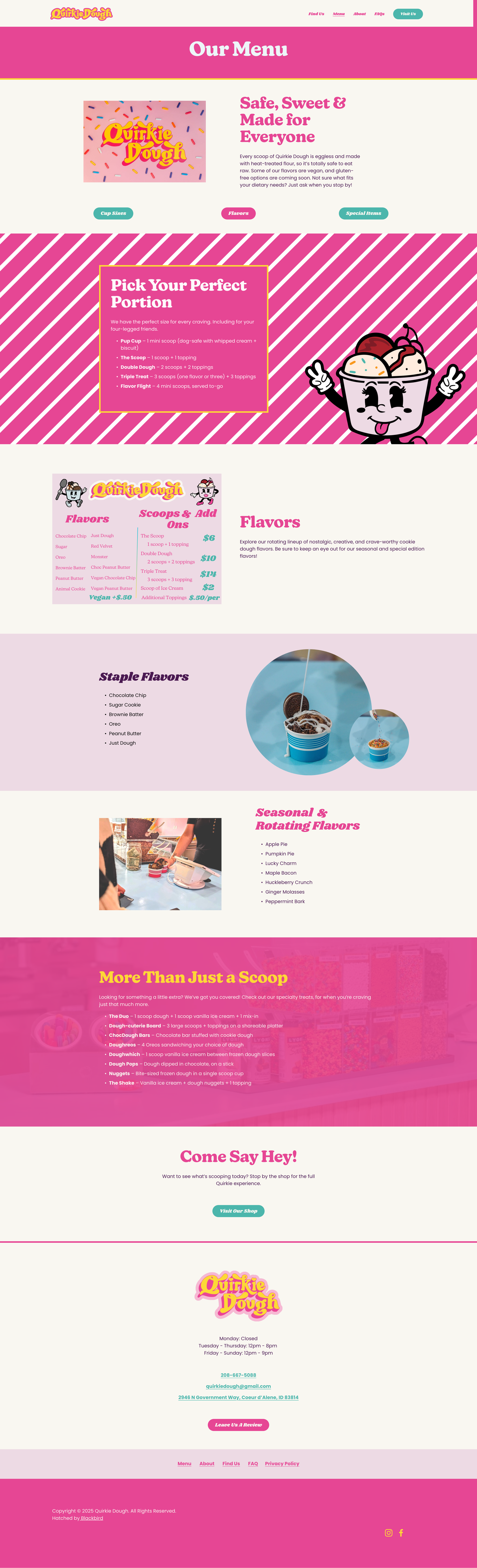
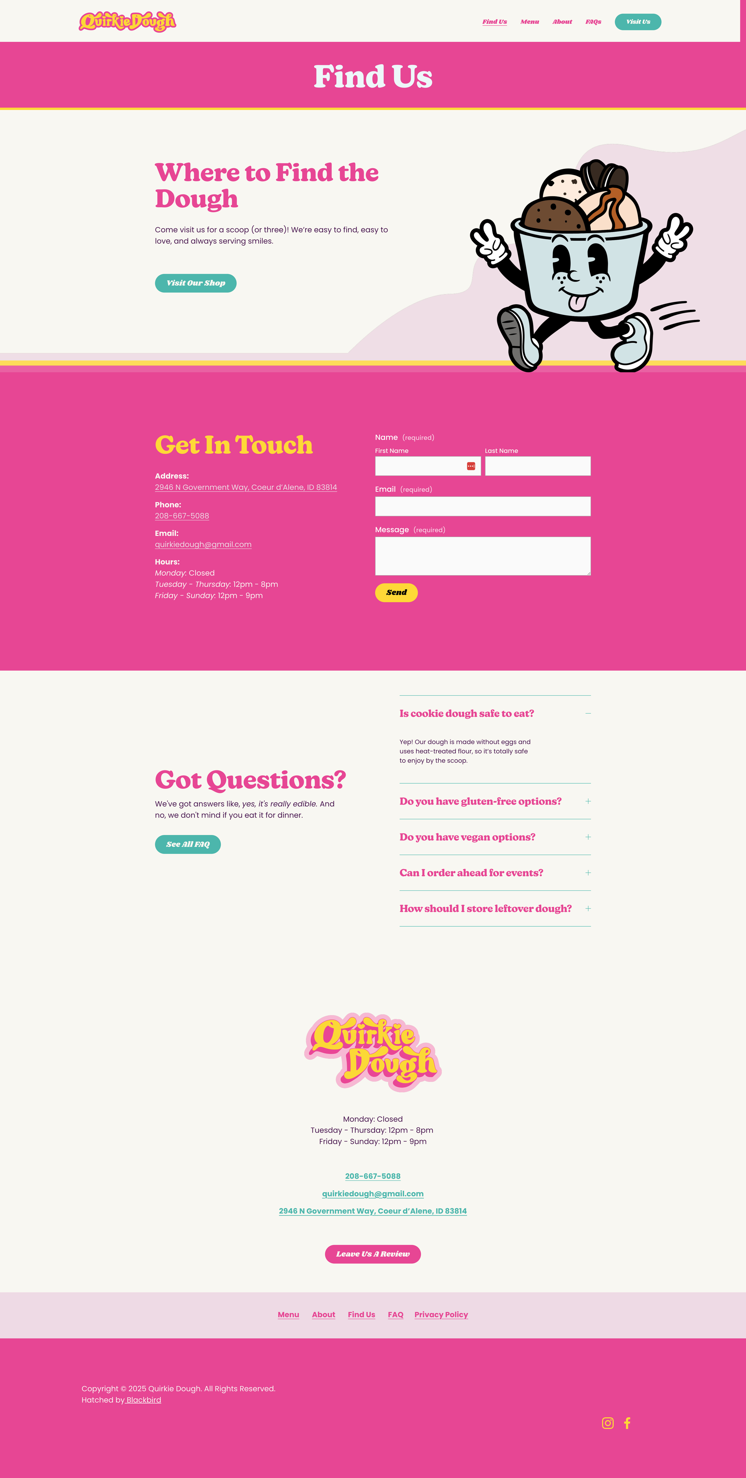
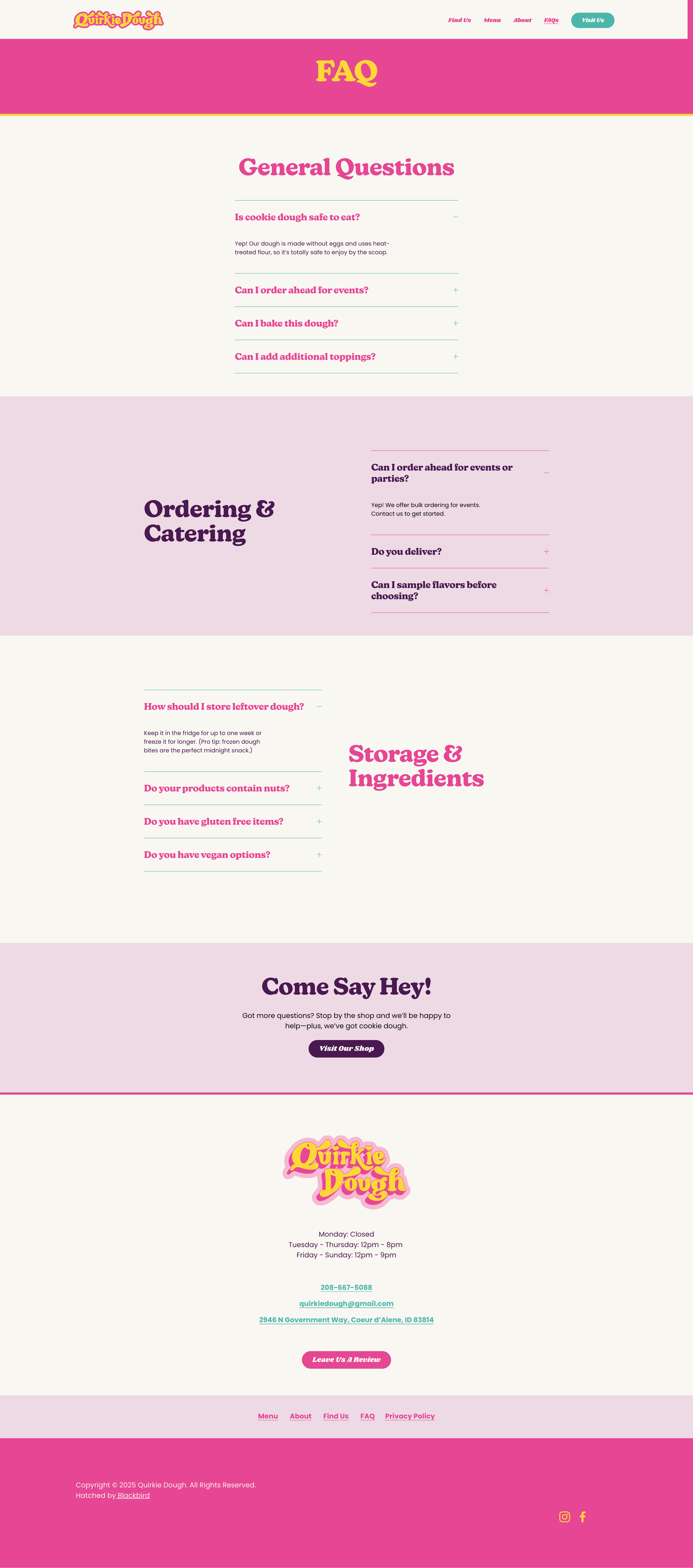
I carried the identity into Quirkie Dough's website, bringing together the color, typography, custom lettering, mascots, and playful visual language into one digital home.
Rather than toning the identity down for the web, the site gave the entire system another place to play while still keeping the content clear and easy to navigate.

In the Wild
One brand. A whole lot of places to play.
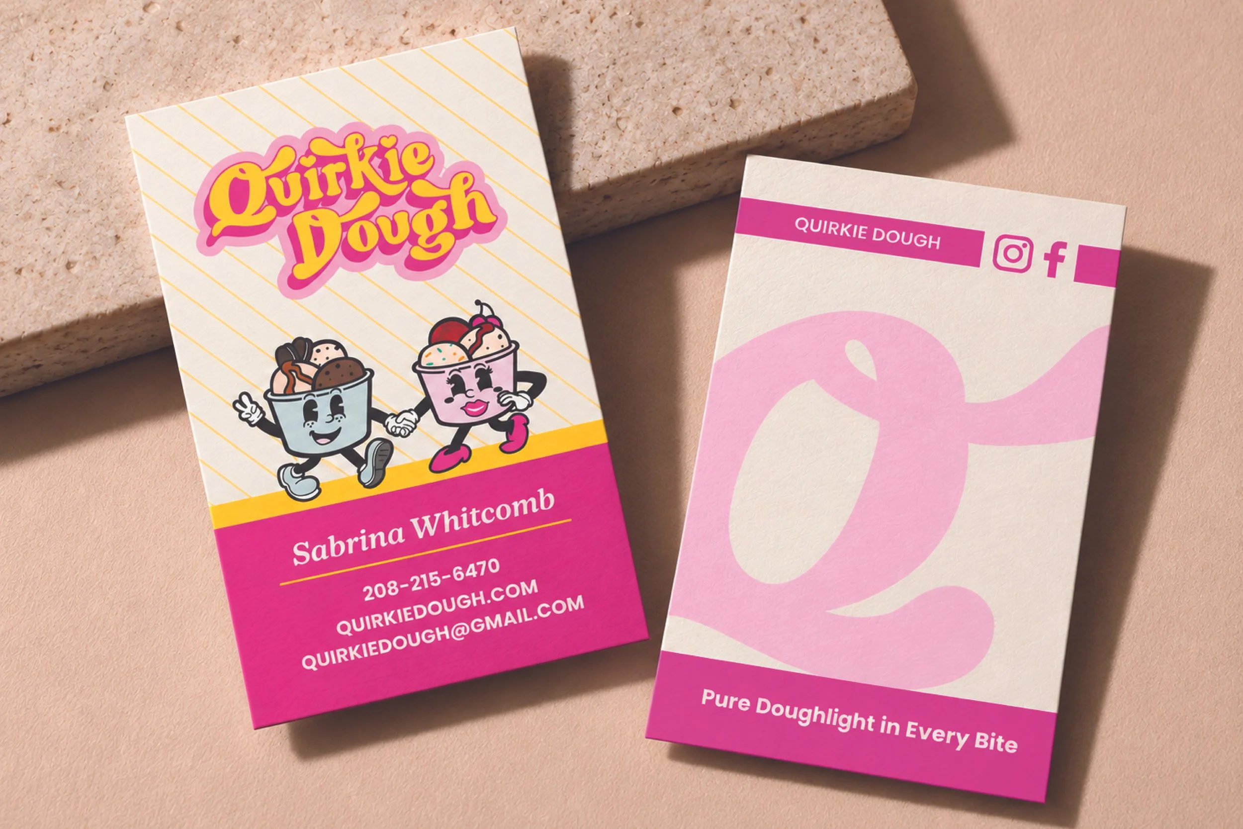
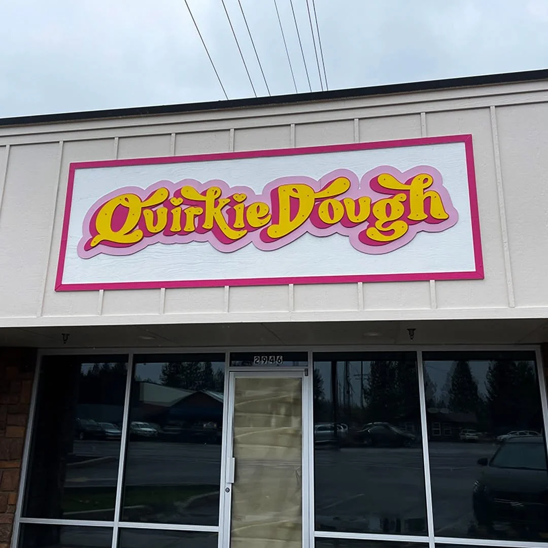
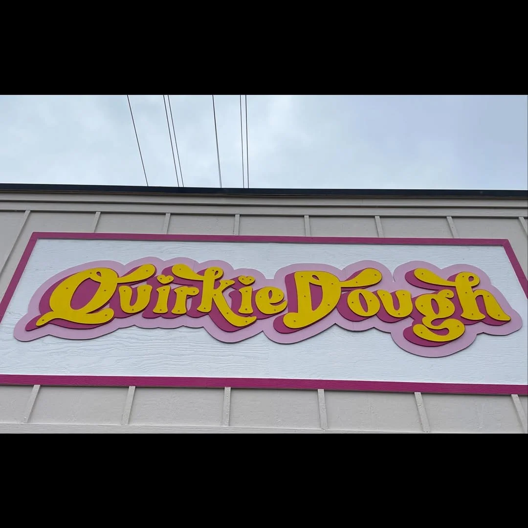
From business cards to signage, the Quirkie Dough identity was designed to stay recognizable without making every application look exactly the same.
Project credit: Created for Quirkie Dough during my time at Blackbird Digital.
