Tahoma
Tahoma is a Washington-based cannabis brand with a name inspired by its location in Tacoma, Washington. The project began with a creative direction that brought together Pacific Northwest landscapes, Coast Salish-inspired artwork, and the recognizable shapes of national park badges. My goal was to turn these influences into a distinctive packaging system that celebrated the region while bringing bold color and personality to the shelf.
Finding The Direction
I began by researching Salish artwork, studying the shapes, patterns, and visual storytelling found throughout the region's artistic traditions. Because this was a style I hadn't worked with before, I spent considerable time learning its visual characteristics and sketching in Procreate to explore how I could translate that inspiration into original illustrations.
The moodboard also brought in vintage national park graphics, Mount Rainier photography, and vibrant retro patterns. I wanted to find a balance between the natural beauty of Washington and the bold, expressive style of the artwork, bringing both together into a single visual direction.
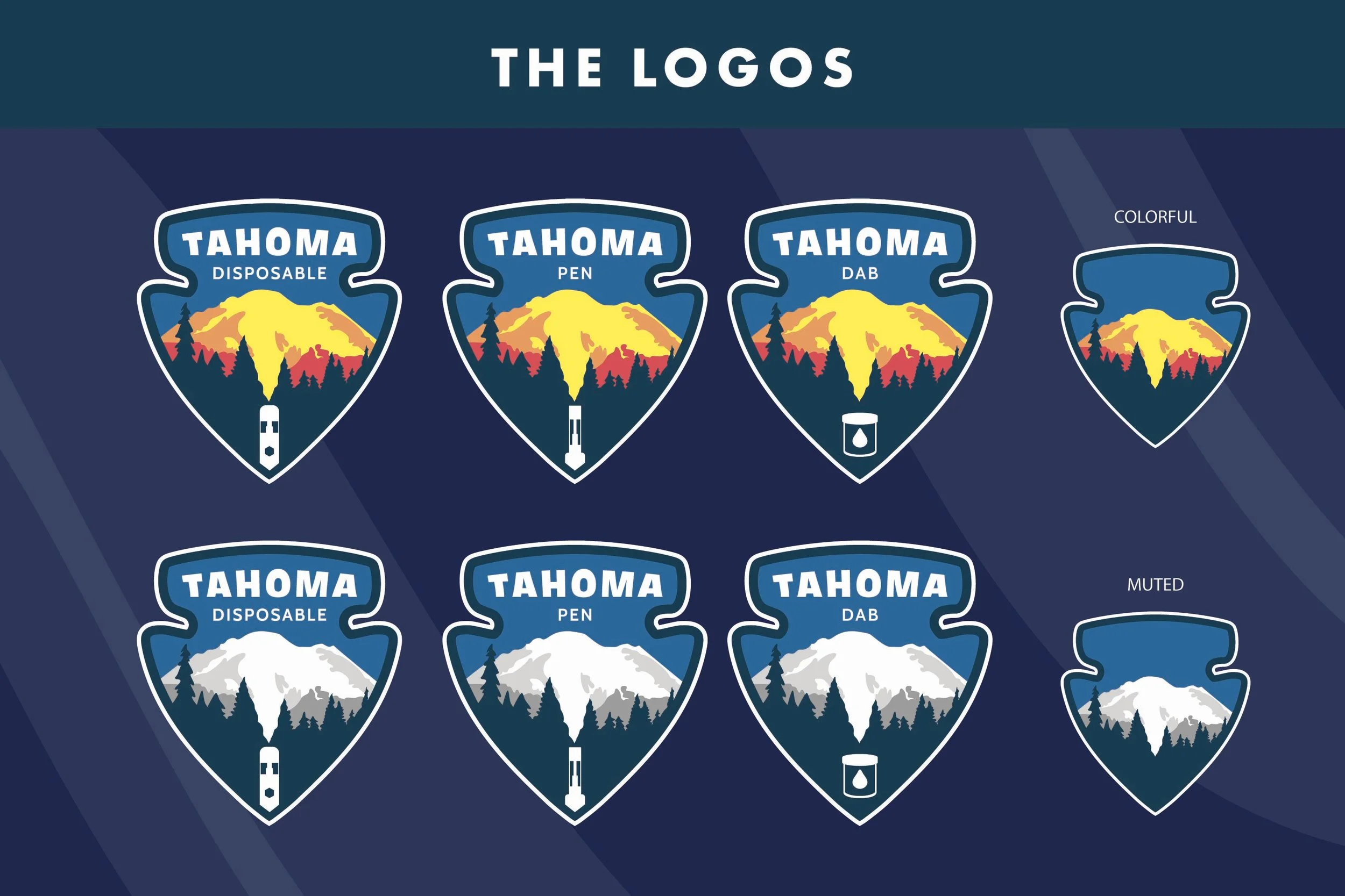
The Logo System
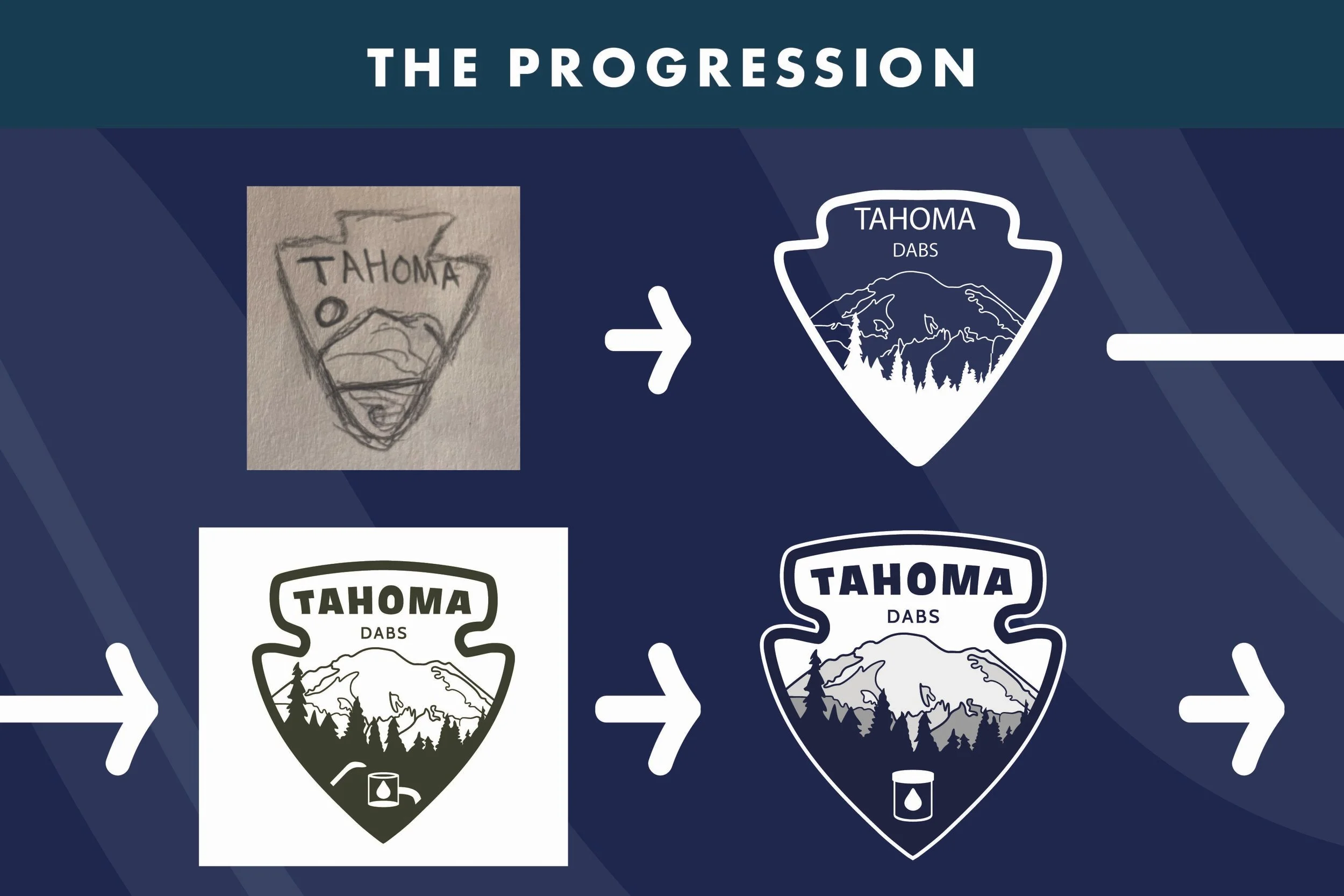
Mount Rainier became the centerpiece of the identity. I studied the mountain's recognizable silhouette and built it into a custom badge inspired by national park emblems. I also shaped the landscape to subtly resemble rising smoke, creating a connection between the mountain and the products themselves.
The logo developed through several rounds of sketches and refinements before becoming a flexible system with colorful and muted variations. I also incorporated small product-specific icons, allowing the same identity to distinguish different cannabis products while remaining consistent.
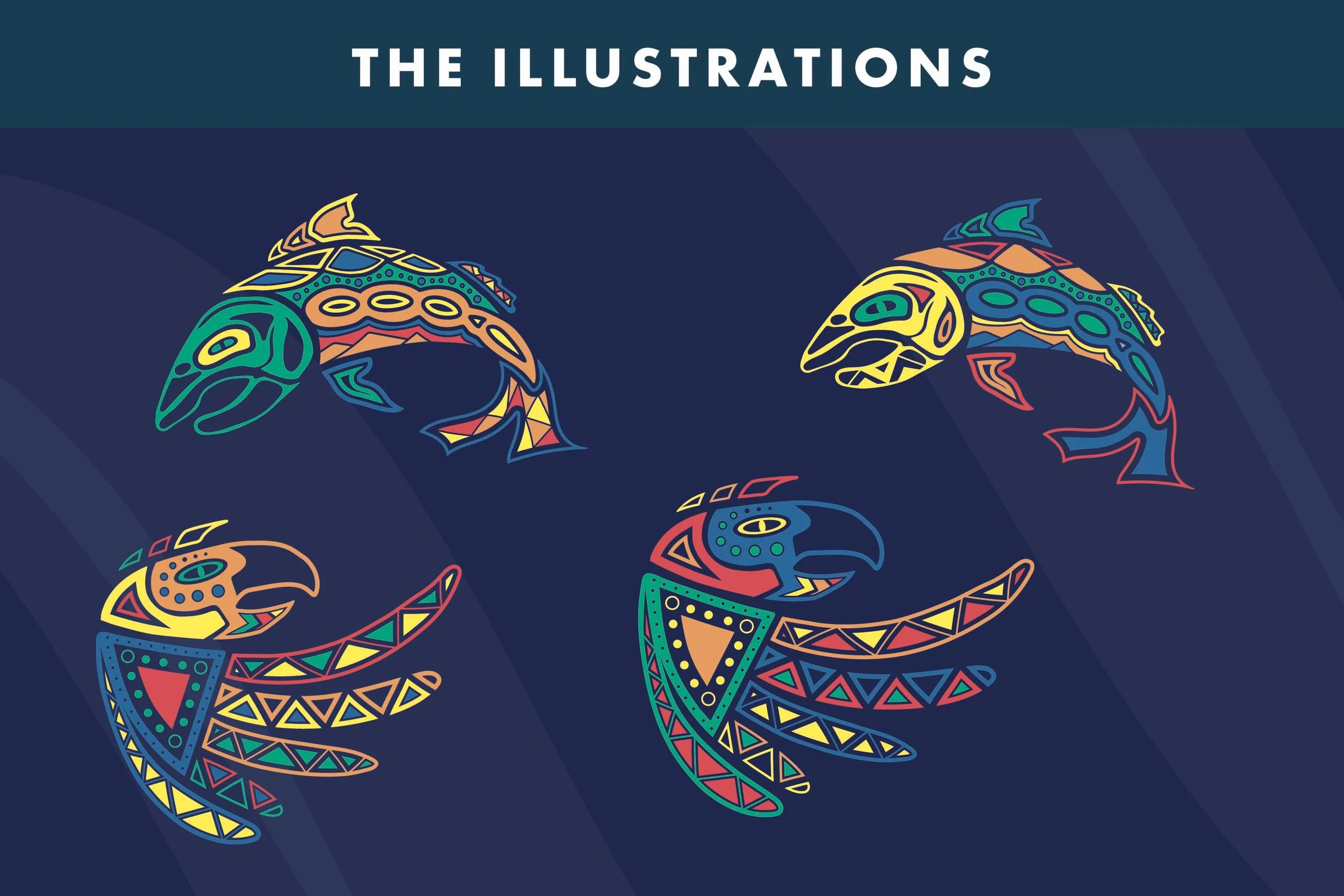
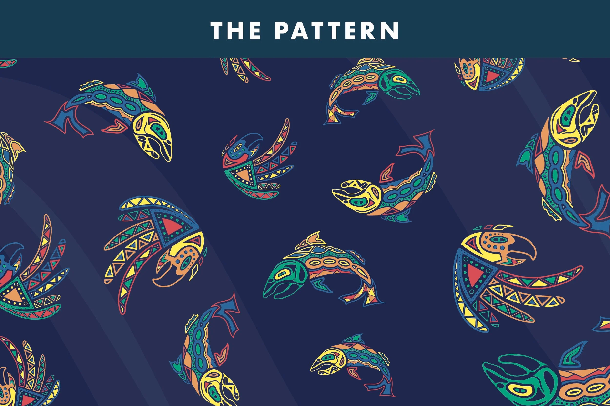
Custom Illustrations & Patterns
To build out the visual identity, I created original illustrations of regional wildlife, including fish and birds, drawing inspiration from the forms and patterns I had researched. I explored bold outlines, geometric details, and vibrant colors to give each illustration its own personality.
These illustrations eventually became a repeating pattern that could be rearranged and scaled across different packaging formats. The pattern added movement and visual interest while giving the packaging a recognizable look beyond the central logo.
The Packaging Concepts
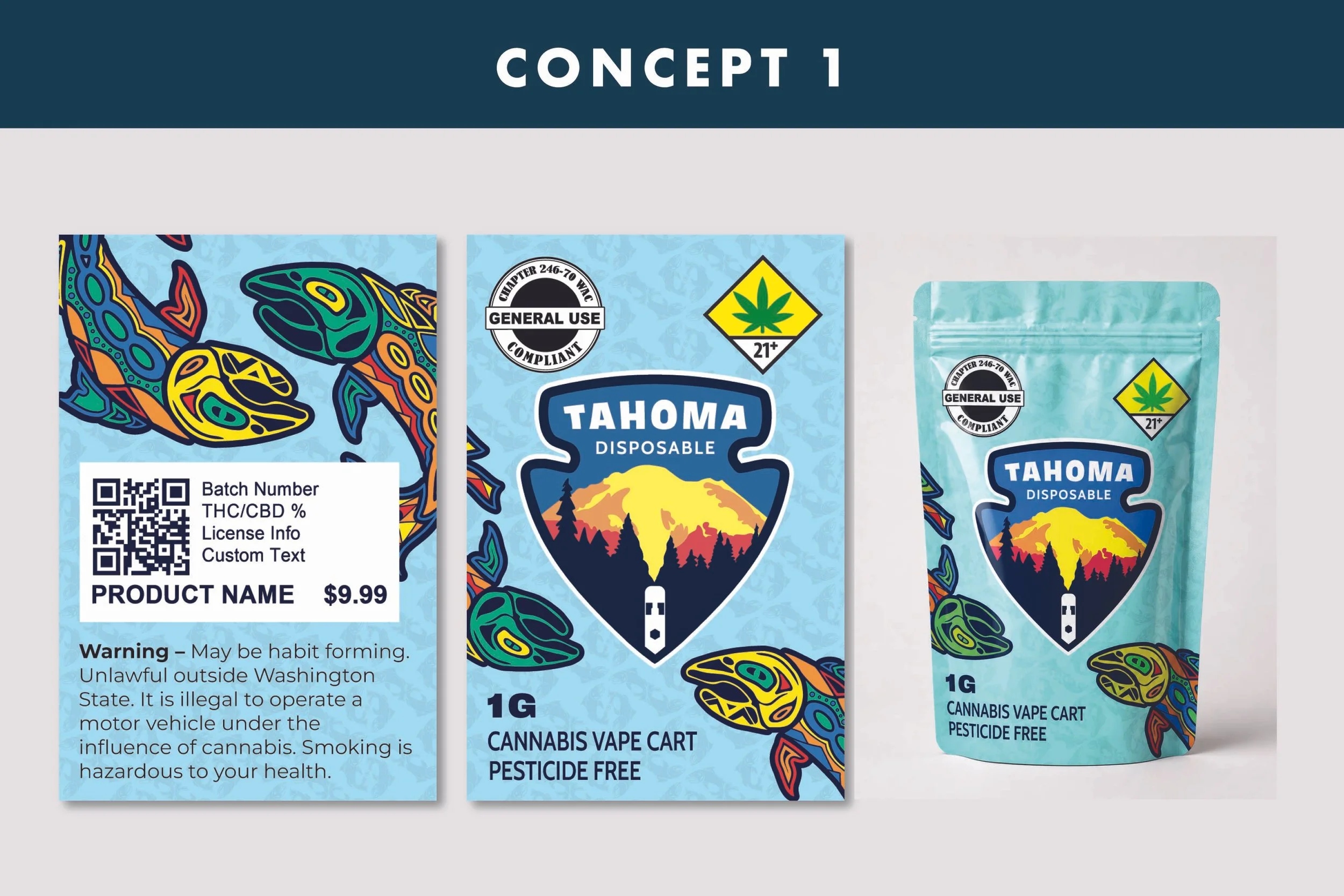
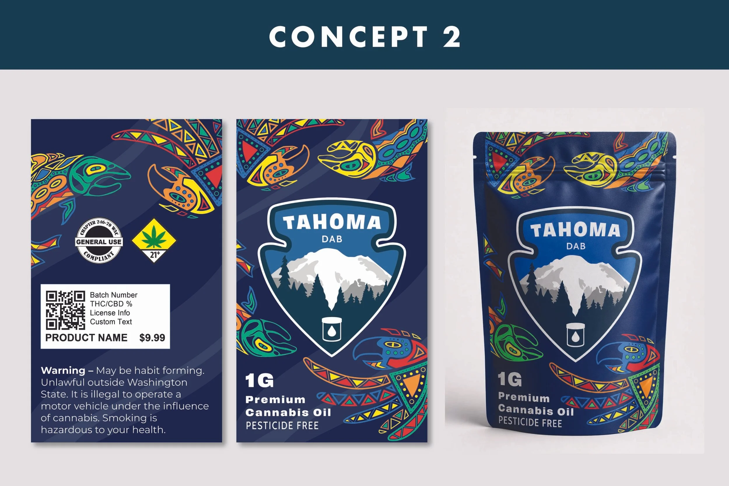
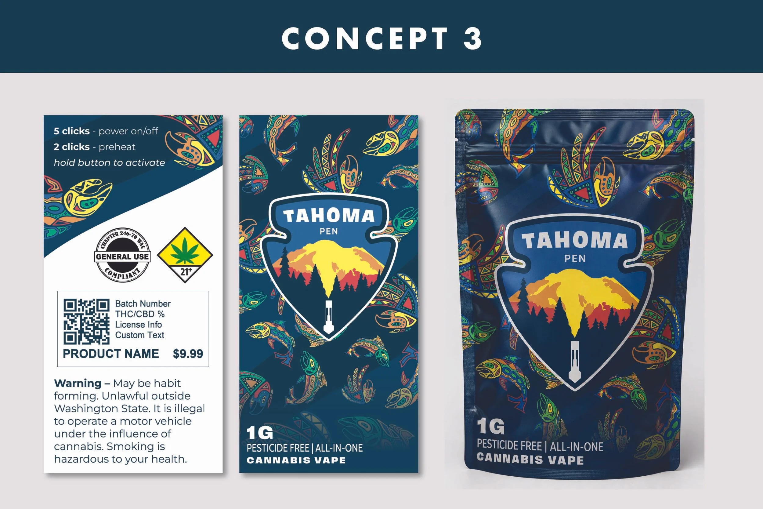
I developed three packaging directions to explore how the visual elements could work together. The first introduced a lighter, more playful approach with a bright aqua background and colorful mountain badge. The second leaned into a deeper navy palette with a muted mountain illustration, creating stronger contrast against the vibrant wildlife artwork.
The third concept brought the elements together in a denser, more energetic pattern, allowing the illustrations to become a larger part of the packaging's personality. Each direction considered product identification, required labeling space, and how the artwork would translate onto the physical pouches.